Typophile

Socialist features of a typeface

shessler0 votes

A tricky one, perhaps: What features would be regarded as "socialist" or "left-wing" in a typeface?

I am here looking beyond the cliché of old russian revolutionary posters with condensed sans-serifs and cryllic-inspired features. Are there any contemporary typefaces made today that would be regarded socialist?

I'd say a bold sans serif in white on red/black will do nicely. No fancy ligatures or elegance here...
There's a left wing party here in The Netherlands (SP) having their campaigns in that style.

Just my 2c.

Cheers, JB

Yeah, that is a tricky one.

I don't think you can define such features as features of the font. As JB suggests, it's more a matter of use and presentation.
Or, if your intent is satiric, you could use a font with only left pointing serifs ;-)

No Gotham jokes? Fish in a barrel.

There are several typefaces available today that were designed at Typo Art in the former East Germany. These typefaces were mostly for books, and they did try to instil them with "socialist" ideas. For instance, the types shouldn't to too showy, or take up too much space. In other words, they should allow for easy-to-read, economic setting. Look for Karl-Heinz Lange's typefaces at PrimeType, or Lapture at JustAnotherFoundry.com. Lapture is Tim Ahrens's revival of Albert Kapr's Leipziger-Antiqua. Maxima, from Gerd Wunderlich, is sort of experiencing something of a comeback in Berlin and Leipzig, I hear. You can get a digitisation of the fonts from URW.

Search around for a a few more! Also for the Grafotechnica typefaces from the former Czechoslovakia. Some Czechoslovak typefaces from the communist era have also been revived, like Tim revived Leipziger Antiqua into Lapture.

Dan, what you mention has *nothing* to do with socialism or socialistic appeal of any typefaces. Or miss I something?

Oh, Andreas, I disagree! The people who made these typefaces thought that they were putting socialist features in the typefaces. They said that they were doing this, and they wrote it down. They wanted people to know what they were doing, why they were doing it … and they wanted to be viewed in a certain light. So, if one is looking for a "socialist" typeface, one could consider designers' intent as a possible factor in the selection process. Otherwise, I don't see how you get away from the kind of clichés that shessler is trying to avoid.

As for a "left wing" typeface, I have no idea what could make a typeface left wing. Although, the suggestion to look at what left-wing politicians use in the campaign graphics and literature could be interesting. I doubt much, though, that typeface-choice is that clear cut. I think that, in most republics, the left and the right wings of a political system probably use the same basic pool of typefaces.

The absolute uniformity of Helvetica was called socialist, but then Paula Scher said that was absurd, considering it's the typeface of so many corporations (capitalism).

A EULA that claims you are entitled to use it provided you pay your taxes.

Trevor thanks for getting to the point.

Dan R.: The people who made these typefaces thought that they were putting socialist features in the typefaces.

No they were not.

… They said that they were doing this, and they wrote it down.

Can you prove this?!

Even IF they were doing so? just an example. I know G. Wunderlich from my student days. I know his Maxima typeface. And I know that he, well, was not an opponent to the then political system (to say the least). BUT: this is no agreeable reason to define a typeface as being “socialist” or whatsoever.
Maxima is as “socialist” as Univers is “capitalist”. This is rediculous.

Gill Sans Condensed was used for signage in former GER. Does this make it socialist? I agree with Andreas that it is nearly impossible to attribute such a feature to a typeface. And the mimickry of typefaces from the Russian revolutionary era definitely aren’t either. I wouldn’t know, for instance, how to put a religious feature into a typeface. Accentuating cross elements in letters, would that make it a Christian type? No, it would just be a special design treatment. But you can’t put belief in a type.

A typeface can have political connotations, but political features? Maybe in the next revision of the OT spec?

Andreas, are Kapr's late-1970s Ästhetik der Schriftkunst and early 1980s book of collected essays not enough proof? I could look for more, if you want. I think that his writing is fabulous, but he has a clear bias, and writes repeatedly about a socialist program of book design, and also typefaces. There was also a (half-hearted) effort across several Eastern block countries to establish a complete suite of typefaces for all text applications, into which Maxima and Leipziger Antiqua both fit (and rather well at that, too!).

Dan, wasn't there a recent ATypI talk on this subject? ;-)

Computer Modern, or anything released under GPL might be viewed as 'socialist', but this is a licensing feature rather than a design feature.

André

Without specifically referencing socialist realism or constructivist art or the hammer and sickle (☭) an A is an A, a B is a B. It'll take content to make it either Commie or wing-nut.

my 2 cents.

R

Road sign fonts: designed for the public good with tax money.

I think to talk sensibly about the issue you need to distinguish between what inspired some work, and what qualities it has to the reader who doesn't know the story behind a design. All kinds of political ideas have influenced people, but in the end a typeface can at most convey a mood or feeling, not a political philosophy. By cultural association it can be more political, but that isn't inherent in the design. Personally I find the innocence of type one of its charms.

@ Dan: Albert Kapr was a communist, already during the third Reich. So it is hardly surprising that he incorporated thoughts of the sort into his writings. But his typefaces (and other designs) show just excellent workmanship and the taste of the time. There is nothing socialist about it even if he would have claimed that it be so.
The propaganda can hardly be the relevant reference. Under the Nazis every rolling wheel was a an approach towards the endsieg, under the Kozis every letter standing upright was a contribution to the final weltrevolution. Do we care?

For Kapr’s works see http://here

The Nazis incorporated Futura into their corporate identity (after they realized that they are failing to be modern with blackletters), which caused Paul Renner stomach-ache, but Futura did withstand this ideology and was never thereafter connected with the Third Reich again. It became very popular again in the 1980’s.
So, like William said: type is fairly innocent.

Things are very complicated. As we are designers, our task is (at least trying) to create better solutions. So we should be conscious of broad complexity of certain problems.

First, let's notice, that speaking in language of economy, the systems installed in the countries of the Eastern Block were nothing else than a variety of capitalism, called the state capitalism. (Yoy can agree or disagree, but the above statement isn't important). That slowly lead the economy to ruin, and was - as long as possible - maintained by violence. However there is no denying that these countries maintained some elements of socialism, like free education, healthcare, social security, space planning, etc.

These so-called "achievements of socialism" are not obvious, however. Particularly looking at the example of Germany, where after the unification, some solutions were found to be quiet compatible. In contrast to East Germany, Poland found itself in a difficult geopolitical situation, with the advent of market economy, and today we are dealing with a deliberate and progressive destruction of those (after all-) achievements.

This generates some kind of nostalgy, which is very similar in forms to German Ostalgie. Probably we all miss those anchors of a lucky childhood: symbols of little stability, small prosperity, safety. And probably we don't really miss socialism at all, but just elements of well designed past. I don't care if athors, illustrators and typesetters of my fairytales were socialists. I saved the books, and me and my son use them with joy now, because they have been damn good, despite of poor technologies.

I belive, that the connotations of the idea of socialism can be achieved in typography, only through appropriate, wisely balanced context. If we're fascinated by lettering of propaganda posters, we must be aware that behind the appropriation of avant-garde aesthetics stood the terror apparatus.
If, however, the applied arts of one of the former socialist countries inspire us, remember that it is one of the local varieties of modernism (or whatever else) - and as such will not be properly read everywhere.
The Cyrillic-like games aren't only cliché, but have literally nothing to do with our memories, nor with the topic.

I cannot point any typeface and any formal solution, which could be regarded as "socialist", without knowing a purpose. I can only write, that (both times for NGO's) once I used Chaparral to say "we are here and we demand respecting rights" (and it worked), and Museo to say "something is going to change" (and nothing have changed).

Any open source font.

Any open source font.

HA-HA-Hahaha !!!

touché.

"Socialist" is a term that is used so loosely, and with so many diverse meanings, that if you don't specify what you mean by socialism, any discussion related to it is almost sure to be a ball of confusion.

Any open source font.

As long as it's not too well made.

Road sign fonts: designed for the public good with tax money.

The first time that was done in the U.S. was back in 1948 when the original Highway Gothic Series fonts were developed. Then again in the early 60s with the addition of EModified. And in the early 2000s when FHWA developed the horrible lowercase additions to Series B, C, and D.

As long as it's not too well made.

That is true. Some of the best looking open source fonts are merely autotraced capitalist fonts.

I believe, that as designers, we are committed to market a good, thoughtful products. Not for the same input, but in order to - hopefully - improve the quality of our common life. The same principle, I think, also relates to any ideologies that we - sometimes unintentionally- redistribute.
I've got used to that, for most people, we - the ones dealing with and interested in typography - are harmless idiots, and the things that we do are worth the garbage.
That's unfair from our perspective. But I can understand, that from "their" point of view, replacing "us" with a crap, is a step in the business side to understand.
Now, let's turn the situation inside-out and see what's wrong with descripting "socialist issue" as something crappy.
If we write that a font is "socialist" as long as it's not too well made, or that it will be clumsy font merely copied from a "capitalist" product, then we spread the unjust and false belief.
Unjust: at first to those people of a good will, tortured and murdered, who insisted to us without knowing us, the rights obvious to us right now.
False: because one can give numerous conterexamples, like fonts included once with the graphics program by a Canadian company, that were also stolen and badly executed - and yet by the capitalist hands. If we say, that "socialist" is something poorly made, then after having a look at the lists of top ten richest, most innovative and most developed countries, we'll find a bunch of countries with very strong social sector there. Let's be objective.
In fact, this is not the ownership of the means of production depends on the quality of products. Spiekermann's work for the German government isn't executed worse than the work for VW, which is a private company. (And Mr Spiekermann once said, that he prefers to see his fonts stolen but well used, than bought and missused. The message is clear, and far above the copyright discussion).

Probably even if we are those, who should "inform" people, "help them to understand", in cases of dealing with such broad and unsharp abstractions like capitalism or socialism or whatever else ideology, we just need a cliche to communicate...

Are there any contemporary typefaces made today that would be regarded socialist?

I'll try again: Any open source font that's not basically a copy of a well-known classic font. There are a lot of useful opensource fonts to choose from.

I've seen some open font sites where the majority of original fonts are "so-so" quality. When they're seen alongside adaptations of Avant Garde, Helvetica & Franklin Gothic the contrast is stark.

Open Font Library is not like this. Most of the fonts are original and they've obviously picked some of the best ones. The adaptation of older fonts on http://openfontlibrary.org/ seems good to me; they look pro.

I have seen a lot of attractive auto-traced classic open source fonts on other open source font sites. With some open source font sites where there appears to be a low quality bar, the auto-traced classics stand head and shoulders above. That's what I thought Nick meant.

Perhaps a crowd-sourced, open source font would best represent socialism. There's kind of a similar thing going on there.

I'm glad you're not using typical Russian constructivist fonts. If anything it would lead people to believe socialists are incapable of drawing letters without a graph paper and ruler.

What I meant was that professionalism is more capitalist than socialist.

Says who?

Awww, Nick. Now I have to re-engineer by all my careful back-pedalling.

I'm out.

Says who? Not Lenin!

But with regard to type, as I understand it, creative type design ceased during the Soviet regime, because types were considered to be capitalist tools of consumerism.

Helvetica. Yeah that'll do.

@Nick - Only in terms of professionalism as expecting money or other remuneration in exchange for your skills. The other type, that of wanting to be "the best whore in the whorehouse" is not restricted to any one country or bloc.

it is very simple thing:

in real socialist typeface all letters must be equal. and equally ugly. no that ascenders, descenders. best if they all looks the same: ie. like comrade H.

These guys are all the same height and width.

Nick: But with regard to type, as I understand it, creative type design ceased during the Soviet regime, because types were considered to be capitalist tools of consumerism.

My understanding is a bit different, based on Maxim Zhukov's account and on the contents of the 'big grey book of Soviet typography'. Creative type design flourished: what did not was manufacturing of type and technological innovation. Foreign technology was suspect and importation strictly controlled (ironically, at the same time as export to the Soviet Union was limited and controlled from the outside). Hence, most of the people we would identify as type designers worked as 'lettering artists', and much display 'type' was rendered by hand and photographically reproduced.

Choosing a typeface to evoke a particular ideology is hardly enough to do the job. Much of the tone is set with how it is used. You also have to ask what aspects of Socialism are you emphasizing? Is this the early revolutionary writing of movement leaders or just a discussion of socialized medicine in long-established governments today?

The proof is in the pudding, not in just one of the ingredients.

How about,

A capitalist font is a collection of beautiful letters.
A socialist font is a beautiful collection of letters.

(to paraphrase)

Fonts can not have any intrinsic philosophical or political meaning on their own without the obvious references to Constructivist, Socialist Realism and the hammer and sickle (☭). Fonts are vehicles for messages. Not messages.

Just my 3 cents.

The medium is the message

Much of the tone is set with how it is used. You also have to ask what aspects of Socialism are you emphasizing?
That's the point. Paraphrasing Vignelli, you can write it with Helvetica Extra Bold or Extra Light.

Unemployment by Eric Gill

Gill was a distributist, not a socialist. Distributism combines Proudhonian anarchism with Catholic social teaching (especially the principle of subsidiarity), favouring broadly spread, direct ownership of the means of production, contra either centralised state control or concentrated capital control.

If Massimo were setting "The Diary of Anne Franck", would he have chosen Helvetica Extra Light or Helvetica Extra Bold?

There have been very few new typefaces designed in the USSR between 1917 and late 1980s. Older designs developed mostly by German-Russian type foundries were used for decades. They were endlessly recycled and repurposed, and adapted for the new typesetting technologies: linecasting, photocomposition, digital. I have no exact numbers (I wonder if they exist) but it feels like, say, 75 per cent of Soviet print was set in Romana-like Latinskii, a.k.a. Literaturnaya [garnitura].

Allen Hutt, the renowned British expert in newspaper typography, a communist, and a frequent visitor to Moscow, who probably shared the values and the ideals of “British Typographical Revival”, felt so offended by the ubiquity of Literaturnaya in Soviet print of the 1960s that he wrote:
The survival of this De Vinne-style type, from the worst design period of old Imperial Germany, in the premier Socialist country in the latter part of the twentieth century, is a typographical phenomenon as unique as it is deplorable. (Hutt A. “A revolution in Russian typography”. In.: “The Penrose Survey“. The Penrose Annual, Vol. 61. Herbert Spencer, ed. London: Lund, Humphries & Cº., 1968.)

This is why, to a considerable degree, Latinskii/Literaturnaya may be regarded at the very least as a first runner-up to the crown of “The Soviet Socialist Type of the Century”.

Another likely candidate could easily be the type used in the first line of this broadsheet:


This typeface must have been initially used for the iconic nameplate of Pravda, the organ of the Central Committee of the Communist Party of the Soviet Union. The same typeface was used in the dozens of ‘lesser Pravdas’: Pionerskaya Pravda, Komsomolskaya Pravda, Pravda Vostoka, Vostochno-Sibirskaya Pravda, Minskaya Pravda, Kaliningradskaya Pravda, etc.

Izvestiya, the second-largest daily of the USSR, also had a title piece in the Art Nouveau style…

Come to think of it, in this part of the world, not only in Russia, the Art Nouveau typefaces were often used for the nameplates of newspapers, not necessarily Socialist: e.g., Politika, Helsingin Sanomat, Rudé Právo, Robotnik.

As offtopic, while I can't load the picture: I guess, Vignelli would use Garamond or Times and Futura.


...so here you have the largest daily newspaper in Poland, an equivalent to Soviet Pravda. Analogous to Pravda, which meant "Truth", but didn't contain too much truth, Trybuna Ludu was the organ of the Central Committee of the Communist Party inspite it's name meant Tribune of the People.
The newspaper used to spread in millions, because it was made of a scarce commodity(it was usually used as a shim under the boots, wchich was trendy and cool).

@ myself. A capitalist font is a collection of beautiful letters.
A socialist font is a beautiful collection of letters.

I should have said, "...
A socialist font is a beautiful collective of letters.

Socialist or not, beautiful or otherwise, there was in fact a typeface called, yes, Kolektiv. It was designed by a team (Stanislav Duda, Karel Míšek, Josef Týfa), hence the name. Kolektiv was issued by a Prague-based type foundry Grafotechna in 1952.
And in case you are curious, yes, there was a Cyrillic version of Kolektiv.

"And in case you are curious, yes, there was a Cyrillic version of Kolektiv."

LOL, Maxim!!! or should I say "Duh";-)

I AM THE 99‰

@John: Creative type design flourished: what did not was manufacturing of type and technological innovation.

It's not type design if new fonts aren't being made from the designs, if the effort is being applied to lettering.

How about typositor styles?
Surely it wouldn't have been too much of a technical difficulty for the Soviets to manufacture a phototypositor, even though out of the loop of more sophisticated Western type technologies.

Indeed, every technology, developed no matter where, was available and in use. There were schools, research institutes, publishing houses and type designers. But just around certain centres. The new technologies didn't spread, they were controlled in various ways.

Nick, Soviet designers had no direct access to any typesetting equipment. You had to have a special security clearance for that; compositors did, not designers. The VGC PhotoTypositor never made it to Soviet Union; my first time seeing, and operating it was in New York, in 1977. In Moscow there were very few Berthold-built Diatypes, and I am not sure if any Staromats and Starsettographs were used—not by the designers, that’s for sure. Like Marcin wrote, it was all about control… Come on, even the typewriters were all registered, and their font samples kept on file. The only photolettering device I knew of, and used (for a modest bribe), in mid-1970s belonged to Mosfilm, the largest film studio in the country.

I heard about the typewriter registration. Even in the late 80's it was almost impossible get computer printers or fax machines.

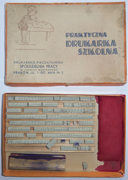
However, they forgot about this: "Children's practical printing house". It was my favorite toy. I remember my surprise when I noticed that also the adults loved it.

Looks like a very fun and useful toy. :-| (the straight-face smiley)

As a child, I had similer rubber type tool! I remember it fondly but have not seen it since the early 1950s ;-)

OMG… That was a blatant case of unforgivable slovenliness. Someone at the Służba Bezpieczeństwa screwed up real bad. Hope they’ve corrected that gaper. What a shame, towarzyszy!

pozdraw, Marcin

it's very cute!

only soviet printing toy that i have found in my childhood (but i had look for them very intensive) had only communist dingbats in case as stars, hammer-stickle and so on.

you ask me why? because commies always afraid of words, even of child's words.

I had this:
http://www.flickr.com/photos/wychbury/3199489226/

I also had Meccano, but didn't become an engineer :-)

My late Uncle J. Ben Lieberman, who was a printing fanatic and incredibly energetic and industrious, was active in the private press movement. He had done his PhD on freedom of the press, and was fond of saying that freedom of the press meant in the first place the freedom to own a press. He started the American Printing History Association, wrote the books Types of Typefaces and Printing as a Hobby, printed the preliminary edition of Mac MacGrew's American Metal Typefaces, and on and on. He was really tireless.

One of his less terrific ideas was a hobby printing press for children, something like the box above. Except it could use real metal type and printer's ink. However, it didn't ever work that well, alas.

A few years ago I saw a demonstration of the Ellison die cutting machine, and saw it as a version of Lieberman's idea that actually works well. It does paper cut-outs beautifully, and a lot of elementary schools have them. I told the lady that they should adapt it as a press for the kids to do printing on, but I don't think they have done anything. Their set up would work as a small printing press, as the both roller and press styles develop a lot of pressure. I also told them they *had* to do dies of Century Schoolbook as one of their cut-out fonts. They had others, not as good. Don't know whether they adopted that idea.

Bill,

Today's kids have laser printers and inkjet printers so the level of interest is greatly reduced from kids of or era. Besides that,they have Skype, iPhone, Gameboy, Playstation, etc... In our day, we had only marbles and sticks ;-)

I know Chris, but those laser and inkjet printers just don't have the romance of letter press, with its depth of color and tactile quality. I still think the kids would find it fun.

Romance to you and me ,Bill, to them?

Magic.

By the way, Lieberman would have been totally delighted with desktop publishing, as his passion was for widespread ownership of the ability of people to print. Incidentally this is the opposite of socialist as far as printing goes. He thought it was crucial to have widespread private ownership of printing, and not to have it all in the hands of the government, as in the Soviet Union. And I've heard that Soros' giving Xerox machines to Eastern Europe did play a role in the fall of regimes, though I don't know how true that is. In a way the internet has taken this same idea further, as everyone can now publish worldwide, electronically. And it has had a huge social impact, not least in the Arab spring.

Bill, I tried to order his book a few months back and they said it is out of print.

Chris, Oak Knoll has it and other stuff he wrote. It looks like the second edition of Types of Typefaces is called Types and Typefaces, and is expanded, and was printed by him (the Myriade Press was his).

There seems to be many of the same book with a confusing array different prices. Which one is the most current edition?

Types and Typefaces is the title of the revised edition, 1978. The different prices are I think because some of them, and maybe all of them, are used books and in different conditions.

And I've heard that Soros' giving Xerox machines to Eastern Europe did play a role in the fall of regimes, though I don't know how true that is.

Xerocopy and copy shops appeared in the early 90s, after the transfer of power (at least here). From what I remember and from what I saw during selecting materials for an exhibition about the "Second Circuit", until 1989, underground publications were printed using the strangest technologies (from PVC carving to computer lineprinters), but certainly were not reproduced on Xerox machines.

More information here (automatic translation).

PS: Paradoxally, some of samizdats were generated thanks to the state Institute of Literary Studies in Warsaw. I was told in ILS, that they used to press the counterintelligence and the security service to get the censored and confiscated publications, because the ILS's goal were research and studies on Polish literature, no matter of what source. And as you can imagine, "each secret hole has it's secret mole":-)

Captured from web.archive.org on 21 Sep 2019. view this capture