Typophile

It’s new and it’s free: CoreHumanistSans.

alex scholing

It’s more rational than Helvetica or DIN, but also more friendly. A stricktly neutral international typeface for everyone.

It’s accessable and open and it reads well. It comes standard with small caps, old style numbers, table numbers, ligatures, alternative glyphs for a, e, g and E, arrows in all directions and last but not least: Central European Language support.

For some reason I don’t seem to be able to upload images to Typophile right now so here’s a link to a PDF:

http://www.alexscholing.nl/images2/CoreHumanistSans_specimen.pdf

You can download CoreHumanistSans for free at http://www.alexscholing.nl

Hope you like it.
Cheers, Alex
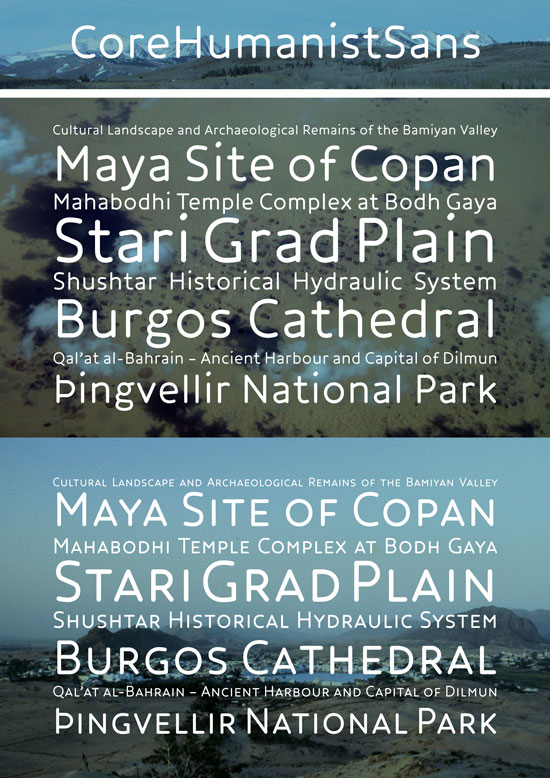
And yes, a picture!

Interesting design. I'm downloading it now.

My only criticism is that your EULA document has some corrupted spacing, and is impossible to read (at least for me, in Safari).

Try it in a dedicated PDF reader. It's quite reasonable anyway. Commercial use OK. Hacking for own use OK. Flash and PDF embedding OK. @font-face use OK but conditional to attribution in CSS. No derivatives save for personal use. No redistribution.

IMAO, that's downright liberal for an EULA.

Funny thing with this EULA PDF. Half the time it’s as it should be, the other half it’s indeed messed up. Replaced the file several times (different settings) but to no avail. Still figuring it out.

Nice work Alex. Geometric but very warm and friendly. Thanks.

thanks chris!

This is nice and certainly no one can gripe about the price! Thanks for sharing!

Chris already said it. I really like it. Thanks

Captured from web.archive.org on 16 Apr 2015. view this capture