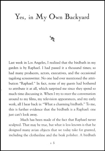
I was recently asked for advice about book design by a university student. He was asked to design a book about language (specifically about english words that have originated from the arabic language), the writing style is personal(lots of stories about the authors childhood and family), casual, quite humorous and very readable.
Now I am not the most experienced designer so I wasn't much help to him.
His typography skills were exceptional. he set the text in Arnhem (only,, & cant remember seeing more than one pt size for everything), flush left, ragged right, folios and header wer aligned left with the text. the layout and quality looked like something that could have been done by Hyphen Press (he did have a copy of ''what is a designer'' by norman potter on his shelf and may have tried to copy that style). But it just seemed wrong for the specific book he was designing. it seemed weird to read those words in such a serious layout.
I didn't really know what to tell him, the book was beautifully designed and basically did its job very well ... it just felt wrong to me, in the same way drinking beer from a wine glass seems wrong.
any opinions?