Hi,
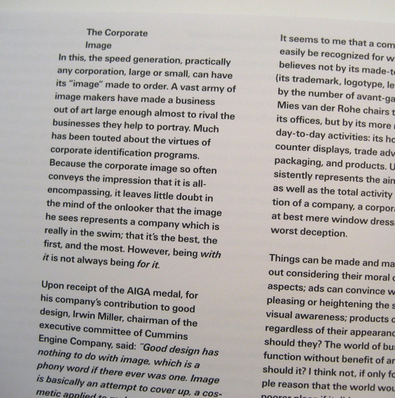
I'm designing a book which heavily references the late 70s/early-80s, particularly European trends during that time. I was a wee baby in the early 80s, and my print archive has very little from that period. Plenty before and plenty after but during that period is a bit of a blind spot.
I think the body of the book will be set in sans serif type, but I'm not sure what was popular then. Image searches reveal a lot of Avant Garde for headlines/display but I'm not going to set page after page of text in it.
If anyone was designing a lot of books then, what faces were they using? I'm guessing Univers was popular, but anything else used a lot then would be great to know about. Am I wrong and should be looking at a serif face?
Any thoughts/contributions would be most welcome.
Thanks