Hello Typophiles.
It's been a long while since my last post here (so long that I originally posted in the wrong place).
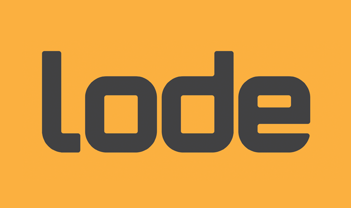
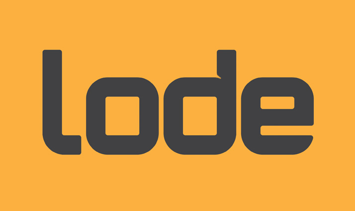
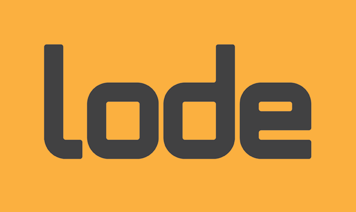
If it's not too much trouble, I'd like some feedback on the below logotype (currently in development). The 'e' specifically is bothersome.
It has been some time since I worked on an identity from scratch without using existing typefaces and to be honest, I'm a little rusty.
It will be accompanied by a simple icon (concept also under development) that reflects the choice of name for this project. I'll bring that to the fore later in the process.
Ownership isn't an issue as it's completion will mark the long awaited launch of my own creative studio. After reading the 'some things to keep in mind...' thread I have no problem with openly discussing this within the forum.
Here goes.
Initial render of the proposed logotype.
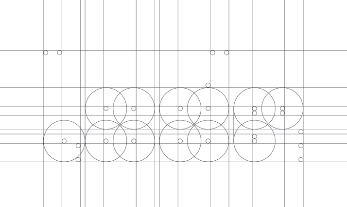
Geometric breakdown of proposed logotype.
James