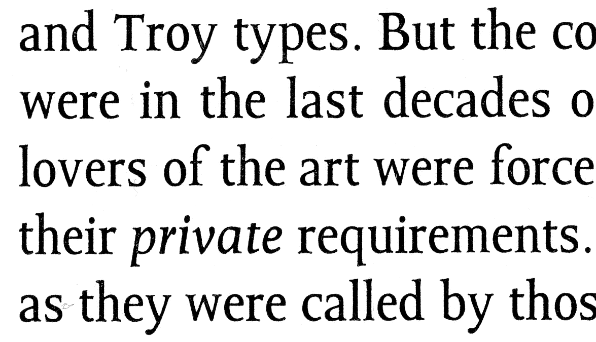
This is something I've only just started to work on and is based on the lettering of renaissance cartographer Christian Adrichom. The proportions are pretty extreme, so if it were to be used for setting text the leading has to be reduced as it has in the sample shown here. I wanted to post it before I did any major work on it so that I don't end up wasting a bunch of time. Although, I must say that this seems much easier the second time around.
 preliminary spec sheet adrichom.pdf (13.9 k) |