Typophile

Selectric Composer Typefaces

John Savard

I don't know if people here will consider this to be a valuable resource or not, but I had been looking for something like this online before and could not find it:

On this page just click on "here", and you can download the complete portfolio of typestyles for the IBM Selectric Composer.

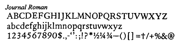
These include Aldine Roman, similar to Bembo; Journal Roman, similar to Garamond; and of course Press Roman, similar to Times Roman.

Thus, one has a list of the most "essential typefaces" from at least one perspective:

Bembo (imitated by Aldine Roman)
Baskerville
Bodoni
Century Expanded (called Century here)
News Gothic (sort of imitated by Classified News)
Copperplate Gothic
Garamond (imitated by Journal Roman)
Times Roman (imitated by Press Roman)
Memphis (imitated by Pyramid)
Optima (imitated by Theme)
Univers

Of course, the Selectric Composer could only set text, not headlines - for that, you could always use Letraset.

Thanks for the link John - remember the Composer well - we used to set whole publications with one before computer typesetting.

Garamond (imitated by Journal Roman)
I always thought that Journal Roman was IBM’s version of Janson, not Garamond…

Ah, the one eventually found to have been designed by Nicholas Kis. No doubt you're right; I just went by the fact that it looked like a Garalde, and thus assigned it to the most commonly known one.

.

Interesting "at" symbol in Journal Roman. I thought that was a more recent invention.

The link given above no longer works. Fortunately, the document has been cached at luc.devroye.org here - but I have even more exciting news.

A different document, also displaying the IBM Selectric Composer fonts, but with better resolution, is available here:
(https://www.box.com/selectric/1/218213190)
as ComposerTypeDesigns.pdf . However, it is an older document, and thus does not have some of the typefaces from the other one.

Captured from web.archive.org on 27 Aug 2013. view this capture