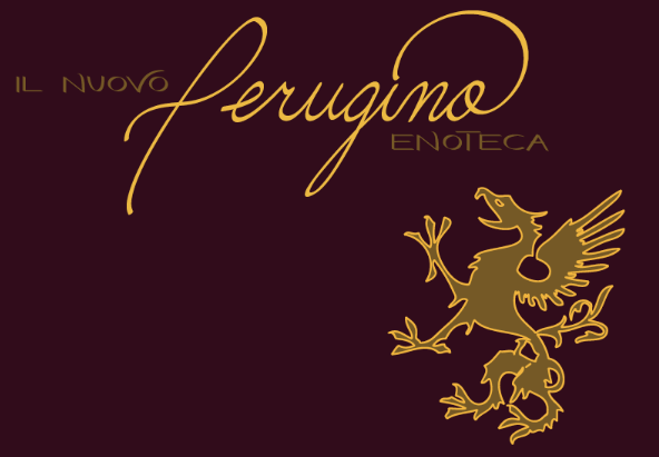
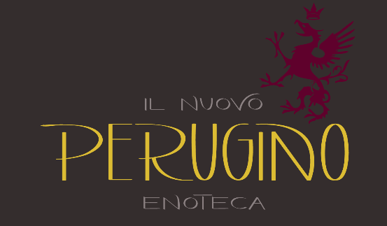
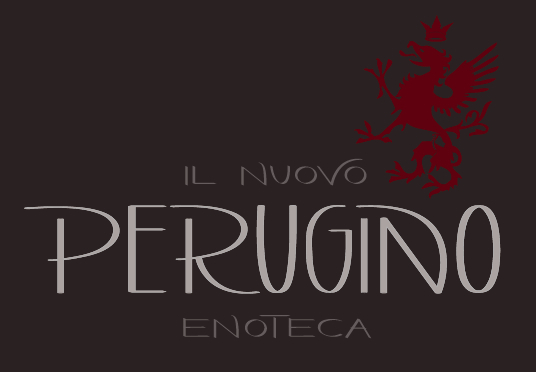
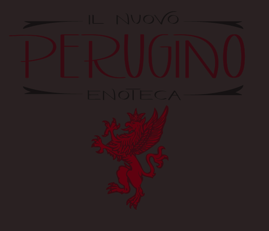
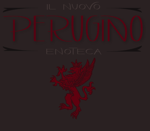
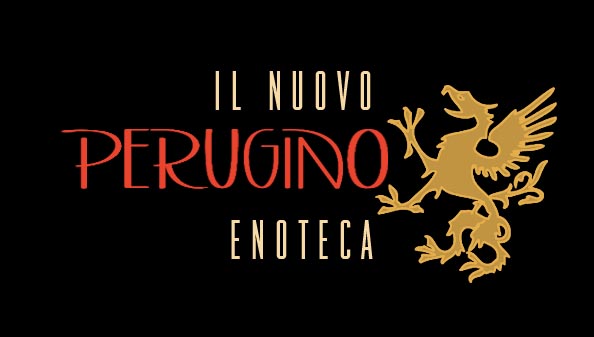
Hello Everyone, I would greatly appreciate your help with critiques on these logos. Here's the backstory: It's the logo for an italian restaurant that is reopening with an updated name. It will be a casual elegant, lunch and dinner dine in restaurant with a wine bar. It will also serve as a business lunch and corporate event restaurant on the side.
The client requested a griffin to be part of the logo. There are 2 basic logo variations, one with the main name in print and the other phrase in cursive; the other logo has the main name in cursive with the other phrase in print. The layout and color scheme is not finalized, so I would also appreciate any feedback.
After showing a preview to the client, he requested to see a no cursive, all print logo, a crown and implied penis added to the griffon...(Last image)
*This is my first post, if I am missing any needed info I would be happy to add. I appreciate all your help! Thank you.
| Attachment | Size |
|---|---|
| Screen shot 2011-09-13 at 12.47.19 PM.png | 78.67 KB |
| Screen shot 2011-09-13 at 12.51.08 PM.png | 70.57 KB |
| Screen shot 2011-09-13 at 12.28.13 PM.png | 84.81 KB |