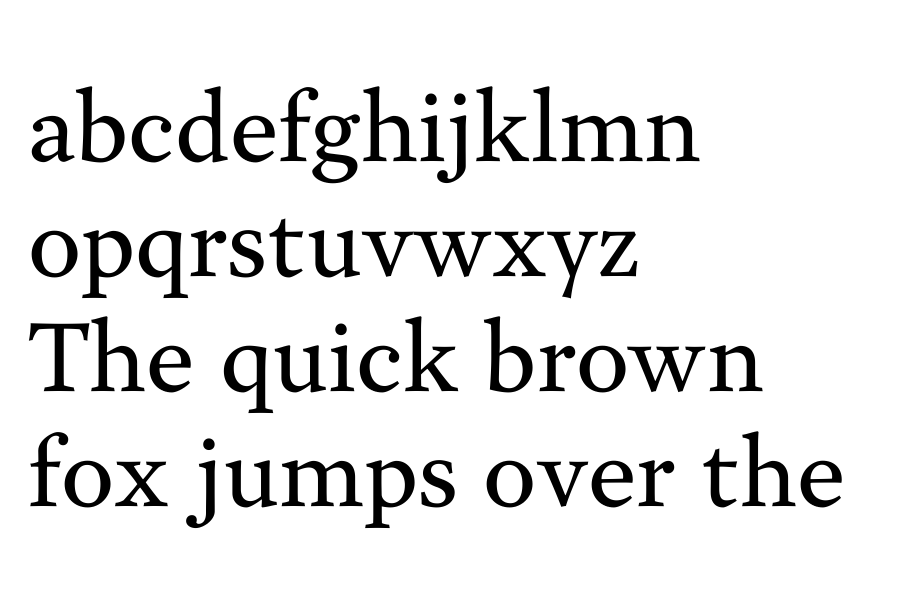
I've decided I'm not going to be able to get what I wanted out of my typeface in its semi-serif form so I've decided to go ahead and make a true serif text face.
The gaps between serifs are really small now (look at /m/ for example). It feels a bit like Mrs. Eaves now :-).
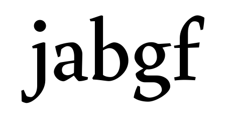
That /g/ needs work. I see that you're trying to be original, but it just doesn't look right. Look at the /g/ in calluna, lexicon, mrs eaves, and some other serif typefaces. Make a couple variants of a /g/ for your typeface. Choose the best one.
Cheers! jasper
Jasper,
I've worked on adjusting the serifs (it becomes slightly problematic in the heavier weights).
The /g/ is something I've been struggling with for a long time. For some reason, I was able to get the italic double-story /g/ the way I wanted with very little problem; the roman, however, is not so easy. I like the /g/ in Calluna but I fear I might be making a clone of it if I keep adjusting it the way I have been. I'll post an update with the /g/ when it is further along.
Thanks for your help!
Alright, since I can't upload to Typophile, I've uploaded my newest PDF as a Google Document.
https://available here
I've included, in the sample text, a few lines of bold and italics.
Hmm...
Maybe http://this
Another week, another update. I've really been working on spacing and consistency within the contrast of the forms. At the moment, I'm considering whether or not the thicker horizontal curves on the /bdpqhnm/ characters are a bit too thick in the regular weight or, if the face as a whole is slightly too dark for text.
I have a new PDF available http://HERE
As always, all comments are appreciated.
Wow! Making progress here! Beautiful!
On the regular:
The node at the very bottom in /e/ and /c/ needs to be moved to the left (moving the control points with it), to make the curves fuller.
Try making the bottom bowl (tail) of g a little more narrow.
Somethings wrong with the curves in /e/. Compare them with the c.
The top curve in /a/ needs more strength. Move the horizontal control points to the left and allign them with each other.
The sharp style of the curves in /m n h u, etc/ is different from the softer, more round style in /d p q b, etc/
The thin strokes in /k v w x y/ should have the same thickness as the thinnest part in /o/.
/b/ and /q/ are begging you to add some sort of continuation of the stem towards the baseline/x-height. Most likely a triangular shap. Have a look at Garamond.
width of /j/ might cause trouble in some lettercombinations.
/k/ and /r/ are too wide
s needs reworking from scratch. It looks weak.
Make the bar in t a little shorter (and possibly also the tail)
Caps:
Thickness of thin strokes is inconsistent.
Bar in F should be lower.
C more like G. Wider and more open.
Let the tail of J descend a little further
Leg of R needs some curves.
S, same as s.
Keep going!
Jasper,
I'm really glad you like where its going!
I've taken a lot of your advice here and cleaned up the /b/d/p/q/h/n/m/u/ situation. Along with fixing some other things I think I may have made the bold a bit too light.
A new pdf is available http://Here
Good :-)
/b q s/ still need some work IMO. Put /q/ next to /u/ and you will find that /u/ suddenly looks too tall. This is because the q, for some vague and illusive reason, needs to align to the x-height stronger. Either you make the curve very flat at the top, or you add a little triangle, like Lexicon.
You might want to try increasing the contrast in the bold, as to make the thins the same thickness as the thins in the regular. The bold probably looks too light to you, because you put the semi-bold in between the regular and the bold. Bold has the same problems as the regular (b, q, and s), along with one extra: The whitespace in /m/ is not equally devided.
I get a very cosy Ms. Eaves feeling from this, which is good! Keep going!
I've done a lot more work on little issues here and there and I've been working more on spacing.
Jasper,
I'm really trying to stay away from adding a triangle to the /b q/, for some reason, I just don't really like it — I may come around, however. I have been playing with it a bit more and have straightened out the top of the q and the bottom of the b. The /S s/ still eludes me but I feel I'm getting closer.
I've posted a new update http://HERE
I also, for fun, tried manual truetype hinting for the first time.
The results aren't exactly astonishing but I was pretty pleased with my trial.
Jasper,
Thank you! I've also been running tests on various printers with various stocks – it's been a very enlightening (and occasionally disappointing) process but I've learned a lot more about ink traps than I was using the same paper and printer every time.
I have a new update http://Here
I've been trying something different lately and I'm attempting to create a type testing tool that is reliant only on HTML & CSS (no javascript) to showcase my typeface in progress.
It's nothing too fancy (yet), but the tracking and the fonts can be adjusted and all of the text sizes are editable so you can type in your own content.
A few quick remarks: Oldstyle zero is too thick. The thicks in /&/ need to be consistent. Also, fix /eogonek/, /gcommaaccent/, /Uogonek/, etc. The circumflex collides in your esperanto /hcircumflex/; use the capital circumflex instead. Equalize your scissors' stroke weight with that of the lowercase. Your /¿/ doesn't look as good as /?/.
Good improvements c:
LexLuengas,
Thank you for the comments! The oldstyle zero is still a remnant from the sans-serif face – I've yet to decide if I want to keep the stress the same or not. The ogoneks have yet to be completely finished, thanks for reminding me. Also, I completely forgot about the /hcircumflex/.
I'll look into the question mark issue some more (and the scissors weight).
RE: typetester
I noticed that if you double-click the first word to select it, it selects the "pt" part of the size definition too, thus making the selected text ignore keyboard inputs. Other than that, for me it works like a charm, even in Camino (not the most up-to date out there, but still my browser of choice).
If I select the 'Type something here...' and try to delete it, it just doesn't work. I can only delete it by deleting letters one by one, putting the cursor at the end of it and then pressing backspace constantly. I can write my own text infront of it, though, without deleting. The plus and minus bottons simply don't do anything. All That happens is that the scrollbar start going up and down randomly. Down for the plus, and up for the minus. Hope this helps.
Type show (http://www.typeshow.net/) doesn't offer many functions but I like it's simplicity.
Very nice design! It reminds me a bit of Geronimo by Mário Feliciano. I think the weight in the bowl of 'a' could be a bit more horizontal though. M/N/S are too heavy in the italic and the italic 'W' seems a bit too wide.
Why are the arrow symbols without contrast? The scissors look deformed as the grip seems to be too thin.
Right now, I'm leaning towards Bantam or Essex. Both appear not to be taken.
I don't like having 'sex' in the word. Actually it doesn't make me think of sex but of Sussex. Both are associations I would avoid though.
Garvis somehow makes me think of a web font, which makes it sound cheap. Really, this might be a very personal association and has nothing — necessarily, anyway — to do with the quality of web fonts, but I still think it should be avoided (if others make the same association that is).
Bantam is also not fitting. It's a good name I think but it fits a more horizontal serif better. It would also be better to take a name without double letters though I certainly don't always come up with names conform to this "rule".
A "few" names right off the bat (I haven't checked whether any of these exist already): Diluran, Atina, Nelan, Manora, Harmen, Werder, Coldre, Sermior, Beldor, Nuave, Myre, Verton, Ciller, Rezden, Pranu, Lisar, Solur, Betarn, Mastun, Abeling, Groze, Veltura, Denerim, Salmert, Perusal, Banewick, Greven, Jaborandi, Eupal, Unstemar, Mardine, Hamewick, Piasoli, Molgen, Trigon, Gritude, Cheloir, Ratite, Nelwing, Dorman, Revenam, Eggerbit, Mitser, Santil...
It's not too hard coming up with names which sound good I think (unless you insist on using existing words). Just look at your typeface and try to make sounds which fit the style and atmosphere. Another good method I think is think of keywords which fit your typeface and come up with words which loosely relate to that keyword in terms of sounds or use of letters. For example, I derived 'Eupal' from 'euphoria', 'Gritude' from 'gratitude' and 'Santil' from 'sand hill'. Not that these (key)words fit your typeface but the derived names just might. Some of the names I mentioned are just rather obscure words (at least to me as English is not my primary language).
Martin,
Thank you! The italic capitals are, at the moment, little more than slanted Romans. I've been meaning to work on them but keep getting sidetracked.
The arrows need some work (as do the scissors). I wanted the scissors to be based on tailoring shears as my background is originally in bespoke tailoring.
You tips about naming are exactly what I need, Garvis is still something of a placeholder. I will definitely spend some time trying to come up with something a little more fitting.
A brief update and something of a test but I've decided to use my typeface as the text typeface for my website (thanks to fontsquirrel). I'm actually fairly pleased with its rendering however, the spacing does seem a bit too tight onscreen.
The site is a little bit of a mess at the moment as it is constantly changing but the link is below:
Thank you both! I was shocked at how clearly it came out (without any manual hinting of any kind).
Nina,
I work from a Windows machine 90% of the time (the typeface is being designed on one) and the rendering seems fine; however, I've yet to test it with cleartype off.
the ear of the g is something I've been reconsidering for a while – it's on my list of items to re-investigate.
By the way, I didn't mention this before but I really like how much the ball terminals go inwards. I think that and the design of the serifs — which fits beautifully together — is the character of this typeface.
I'm on Windows 7 and your font looks beautiful on your website. I've only tested in Safari though. I did see an issue which I experienced myself recently. When I select text, the letters wiggle around. The same happened to me when I added a few codes to force cleartype rendering as my client reported the text looked horrendous in Internet Explorer. I thought the wiggling around of the letters was an absolutely undesired effect so in the end I removed the code and went with a typeface which seemed to be hinted better so it looked good in all browsers without the code. I recommend to optimize the font for web instead of relying on your code.
Martin,
That means a lot – thank you!
Regarding the web rendering issues, I didn't do any truetype hinting (I simply uploaded it to FontSquirrel). It was more of an experiment on my part to see how it looked and what hinting needed to be done.
I'm not quite sure what you mean by the text "wiggling around". I tried to replicate it but couldn't produce the results you described.
> Remember: Greece is (still :-) part of the European Union,
> which means that any piece of typography for the EU must
> be set in Greek as well!
What are the chances of specifically your Greek typeface being used in the context of the EU compared to a whole nation of Cyrillic users? I'm sorry, but I still think Greek is left behind no matter how you look at it.
Don't get me wrong though, I'm not saying Greek isn't worth it. I just think if you were to choose, I would go for Cyrillic. And again I would ask myself why I would even add Greek. For me personally it would be for the experience; not because I find Greek so relevant.
Hrant, could you tell us in short why there is a good reason for designing Armenian? I know little about it.
From your perspective I guess it would be in the way
you see Greek: the experience. But maybe even more so.
In a way designing an Armenian font brings you back to
the basics: the number of characters is not many since
not much beyond the alphabetics is required, but we have
around 10 letters of the complexity of the binocular lc "g".
And since a person is unlikely to be able to read Armenian
text, it becomes a powerful and rewarding abstract exercise.
There are "rules", but a lack of nativity means one has to
learn to figure them out, and the lessons then apply nicely
to other non-Latin attempts. Armenian basically becomes
a superb introduction to non-native design, after which a
person might move on to things like Arabic and Devanagari.
hhp

Here's the text weight now. I'm happier with it – it seems more cohesive.
I think my issue before was that I was looking at this as "making a text typeface" and not "making a typeface which I would be excited about." This led to me overlooking little issues and thinking I would take care of them later.
Now that I've had some time off of this face and I'm able to come back to it, I realize that if I'm not making something I would be excited about using, I may as well not make anything.
It's getting better and better!
Nice inktrapping! It does look a bit exagerated in /m/ next to /p/, though.
/f/ is a little light on the top left.
/c/ is a little light right above the terminal
/r/ and /g/ look a bit unhappy with their terminal
/t/ has gotten very wide, not sure about that
outward curve on the bottom of /b/ needs some finetuning.
/j/ is a bit wide in my view
I'd get rid of the straightening of the curve at the bottom of /e/, /a/ and /c/. It only makes sense at joints. I quite like it in /t/ though.
Perhaps it's just my humanized eyes, but I always feel like an /o/ should have a bit of diagonal stress for it to look perfectly vertical.
Diagonals in /v w x y/, might be a bit thin.
Keep it up! Cheers, jasper
Although in some ways it's becoming more mainstream, it's also starting to click - good job. There's a nice Fleischmann flavor, but it's not at all a revival.
The main thing to me is that you have a tricky decision to make: how far out on a limb do you want to go? Look at that /j. Fabulous. Dangerous. I think it's exactly the sort of thing a real text face needs; neutering it would constitute giving in to display setting, to superficial type design. If you're worried whether you've gone too far with it, remember how things that seem garish at large sizes blend in to the overall texture at text sizes - just look at Schwartz's Houston Chronicle* face, to me a pinnacle of functionalist bravado. But that does mean things like that /j have to make sense in that overall texture, and some other glyphs are not pulling their weight in that respect, so the whole is unlikely to be cohesive. The /y for example completely clashes with the /j; I would either give it a ball (quite possibly with a the Fleischmann "flipped" structure) or a big rightward serif** (or maybe double serifs, like in Bembo's italic). Similarly /k/x could benefit from having much more character, and /f could take the attitude of /j and -thanks to its bar- push it even further. And /g is also too conservative, too polished.
* http://www.christianschwartz.com/houston.shtml
** What famous font is it that has that?
Another thing I noticed is that some key glyphs are unusually wide - the /a/e/t. That does amplify the design's overall butch character, but know that it also reduces readability (at least I strongly believe so).
The /f/r should have longer rightward footserifs.
BTW, it's always good to figure out what point size a given font likes most. For this I myself am seeing 11 pt. Just know that -at that size- the color is going to be somewhat darkish (something I personally value).
hhp
Jasper,
Thank you! I'm glad you like the progress. I think I agree with all of your comments, except I might keep playing with the lower terminal on the /c/e as I like the idea in theory. I've yet to really draw an /r or a /g I've really been completely happy with, although I think I'm getting closer.
Hrant,
I'm glad you understand what I'm attempting to do (Fleischmann-inspired but not strictly adhering to his work), I suppose that means I got something right!
I ended up toning down the /j a little. I have another project I started a while ago (and then forgot about until now) – I think you would like it – it's essentially my attempt at trying to push characters like that /j further than it is here while still making it work at small sizes.

You're right about the /y. At the moment, I'm playing with the standard ball terminal (since this is for extended language support, I need to leave the right open to fit some diacritics). Also, the /a/e/t where too wide.
My intention was something that works around 10-11 point.
By unusual, I meant stylistic choices that could either be misread as a diacritic (a hook or a horn or something similar), or could interfere with the placement of diacritics (as was the case with my trying to have a rightward serif on the /y's descender).
It's also my first "real" typeface so I wanted to really understand the fundamentals of type design before I did anything too crazy.
JamesT: That was just me trying to put words to my amateur's impression. I find it hard to put a finger on what gave me an impression of "old-fashioned"; the ball terminals perhaps? The slightly droopy-eyed |a|? The strong weight and shape contrast in the serifs/terminals between the |r| and |v| in "Garvis"? By "not classical" I meant to disambiguate from fonts that feel old but timeless (such as Garamond, to my eye).
Actually, looking at your PDF sample and at larger blocks of text, I'm starting to like the feel of it. Some letters are also quite elegant up close; such as |b q n s t|. I like club-shaped tails on |y|, but perhaps yours could use some more weight? The |k| is somewhat club-footed.
And yeah, I guess in the end, I just don't like ball terminals much...
This would be of great use in typography logos
James, congrats on making the cut (pardon the pun):
http://typographica.org/typeface-reviews/garvis/
hhp
Captured from web.archive.org on 25 Mar 2017. view this capture