
Hey people,
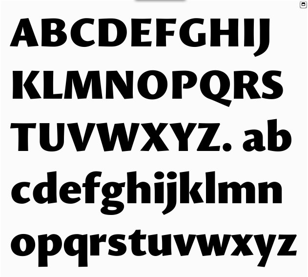
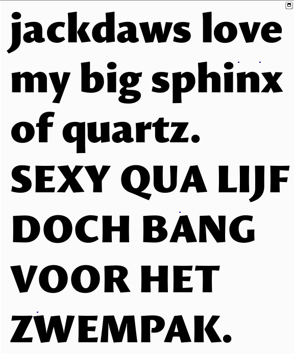
It's been a while, but here's Sensato Black. As always, ALL feedback is much appreciated. Enjoy!
Hey people,
It's been a while, but here's Sensato Black. As always, ALL feedback is much appreciated. Enjoy!

Just after a quick glance i feel that the downstroke of A is too heavy. The A itself could also be a bit wider. Maybe Z could be wider, too. The N looks a bit out of balance? The difference between the two counters is maybe too big. Y is too heavy on the left stroke, and the right stroke of V is too thin. Compared to M and N the tapering on the baseline of V and W is stronger. S and s lack dynamic standing inbetween other characters, for my taste (see daws, e. g.).
Go on, great work!

Jasper, is it possible to see this with the other styles in the Sensato family? I'm a bit lost about how it all fits together conceptually and visually.

A few of the glyphs seem to give off the appearance of being angled to the right - especially /A/ /w/ and /x/ look like they're leaning a little bit backward. I'd reconsider the angled stroke endings in relation to the baseline, maybe a shallower angle/bigger overhang would balance it out?
@Juergen: Thank you. A lot of useful feedback! What do mean by 'daws'?
@Ben: Sure it is, I'll upload a picture :-)
@Johan: Thank you. Yes, a shallower angle is likely to help. I'm not sure if I get you correctly though. "Angled to the right" and "leaning a little bit backward", are to oposites, no?
Here's a pic. I can understand your confusion. Originally, Sensato also had an interpolatable Display variant, namely Sensato E, but I decided to drop that for now. I want this thing released. I've been working on it far too long...
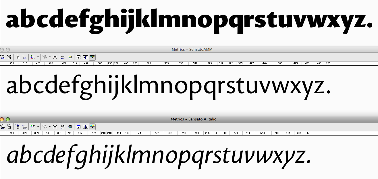
Ohh, darn. Sorry for the wide pic -.-

It's looking good.
The closed counter of /A/ is too small. And perhaps the closed counter of /a/ as well.
"Angled to the left", sorry. :o Or, actually, more specifically, rotated to the left - to a certain extent it feels as though the whole glyph has simply been rotated a few degrees anticlockwise.
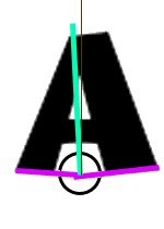
Take the /A/. The slight taper on the left leg - and the lack of any other horizontal lines, and the angled right leg stroke ending - creates an optical illusion that the stroke ending of the left leg that rests on the baseline is actually angled slightly. My eye reads the axis of the letter as being the bisector of the angle formed by these two lines, as if both were angled equally in relation to the main axis. This bisector leans one or two degrees left. Extremely crude illustration of what I mean:

Jasper, a suggestion: do a print-out with all of the text mirrored and have a fresh look at that; you’ll be able to better see those slight imbalances that you don’t see now (because of your vision being conditioned).
@Johan: Thanks or explaining. I'm not sure how I feel about it, but I'll see wha I can do.
@Bert: Thanks. I'll give it a shot :-)
Jasper: with ›daws‹ i was referring to the part of the word jackdwas in your text sample.

The W in particular feels a bit too unbalanced too me. I understand that the irregularity of the characters is stressed in such an extreme weight, but the forms still need to feel grounded by the baseline.
Update. Enjoy!
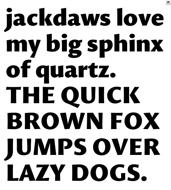
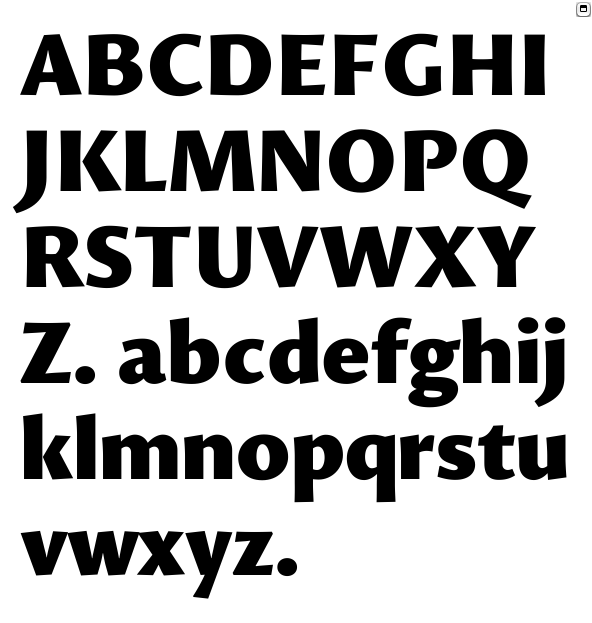
Lowercase vertical stems, particularly those that ascend or descend, look a touch too dark to me. I would narrow them ever so slightly.
Is /y/ too narrow?
/A/ could be wider at the top. /K/'s arm looks a touch weak. /S/ may be very slightly too light.
Any more narrowing of /W/M/ and maybe /w/m/ you can manage would be helpful.
Hi again Jasper :)
There are a couple of things that strike me, but take with plenty of salt of course:
G: perhaps the stem is too light?
K: Something bugs me about it, perhaps it's what Craig just said about the top arm. Or maybe I'd bring the connection a tiny bit closer to the stem.
M and W: agree with Craig.
Diagonals (UC and lc) are rather lively with all their terminals. How do they work in text?
p and q look to have descenders longer than the ascenders of b and d.
I was also going to comment about the A and a, but someone else mentioned those and it looks better now.
X and x: I'd offset the upstroke more, only because of personal preference. Cap VWX seem to me to be falling right, but that could be my eyesight!
I'd love to see a pdf with the regular and black alphabets (UC and lc) compared. If you don't want to post a pdf here, I'd be happy to receive it by e-mail, if you'd like further observations.
This is going to be a very interesting and attractive family.
@Craig: Noted and being worked on :-) I can't manage any more narrowing in /W/M/w/m/ without making them look too dark. Sorry ;-P
@Ben: The stem in G is indeed too light. The problem is that the inner shape and width of the G has to stay balanced. I'll work on it...
Regarding the long descenders, you might want to check out this: http://www.typophile.com/node/85601
VWXx look fine to me...
I'll upload a pdf with the next update :-)
Thanks guys!

What's going on with Sensato? I haven't seen it since last year. I really want to be able to use this lovely face you know! Also, do you think the break in the 'P' is working on the black?

The descenders are too long.
hhp
Hrant, I started a new thread with an update on Sensato. Let me know if the descenders are still too long.
Captured from web.archive.org on 14 Apr 2015. view this capture