
Hello everyone, I'm posting a sample of a font I've been working on for the last few month now. I'm aiming to do a modern sans-serif with a bit more friendliness than the usual spurless fonts. My goal is to design a text version and a condensed version with light/regular/bold/black, with italics, so 16 fonts in total.
Even though this is still a bit early stage, I'd be quite interested to know what you think about the general design of the font. I live in Perth, Australia, and there's not many font designers around as far as I know, so thanks to Typophile, I should be able to finally get some constructive feedbacks :)
I started this font design by looking at fonts like DAX or AKKO. I tried to keep the shapes very simple and not too rounded to stay modern, but at the same time, not too square to keep the friendliness in. It is quite a low contrast for a text font, but I think that the open shapes and a largish width should be balancing this.
In the attached sample (it's the bold by the way), some glyphs are grey because I only added them to give a general idea of what I want to do, but I'm not happy enough to consider them as part of the family yet. I really struggle with few letter, mostly lowercase like the y, a, g, or x. The capitals are a more recent work and I think doesn't have as much character as I want it to have yet, except for some letters like the A, R and P that I'm quite happy with for now.
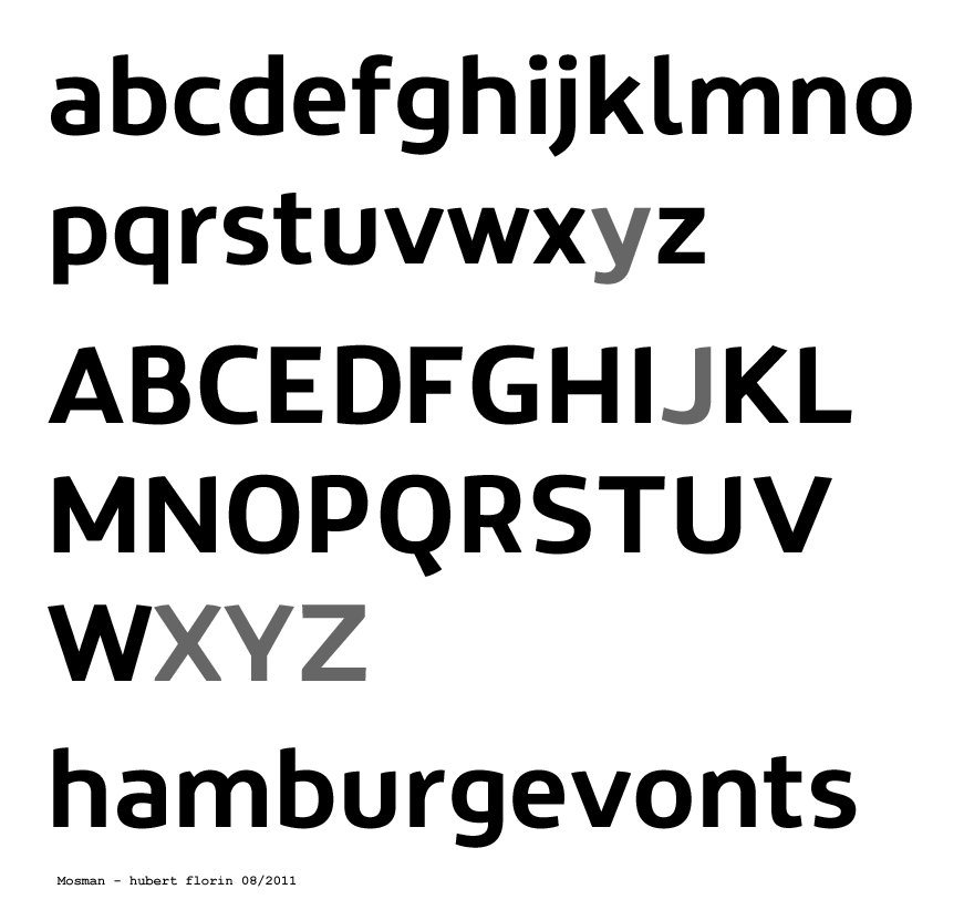
Thanks in advance for your comments.


