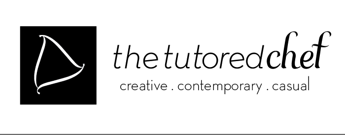
This is a brandmark concept for a student run restaurant, the word chef is hand drawn lettering and creates a subtle heart in the negative space of the f. Don't know if I should go with the top or bottom.Comments? Critiques? let me know the good the bad and the ugly. Thanks