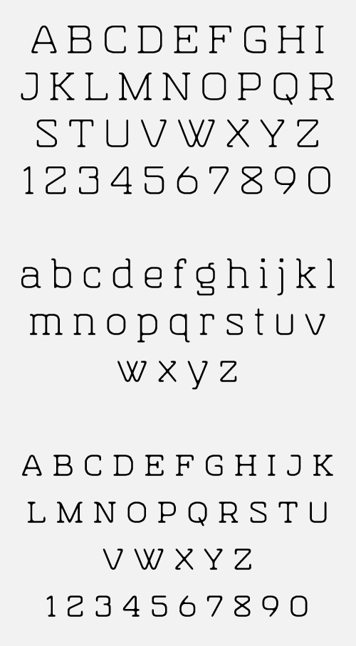
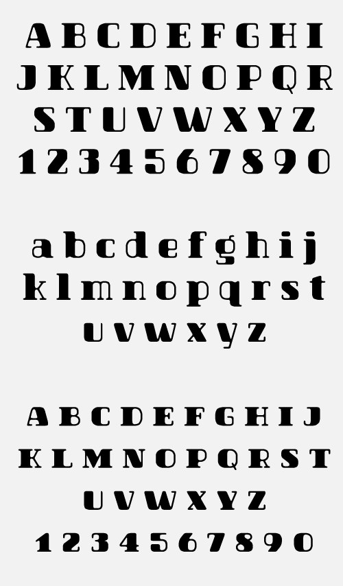
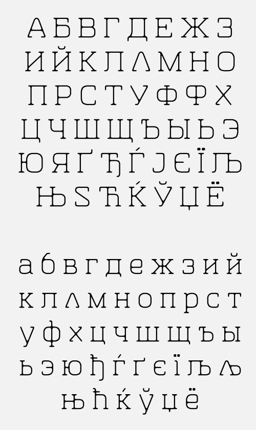
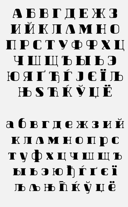
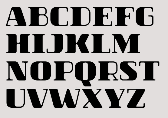
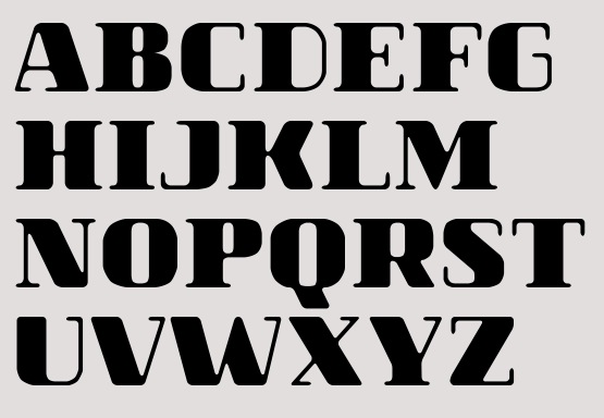
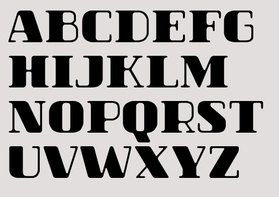
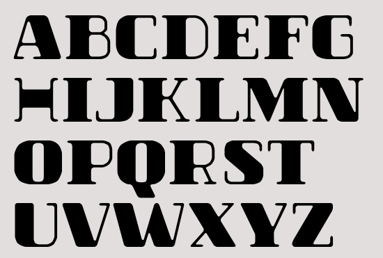
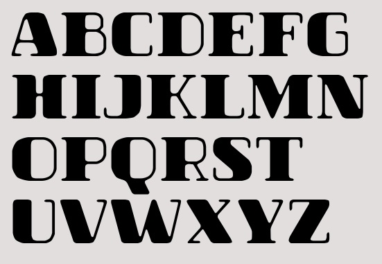
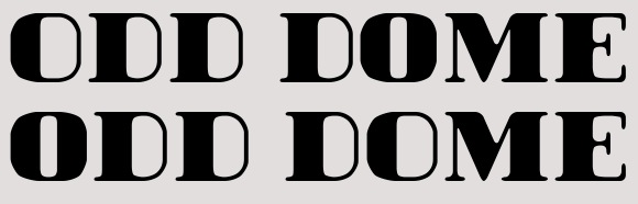
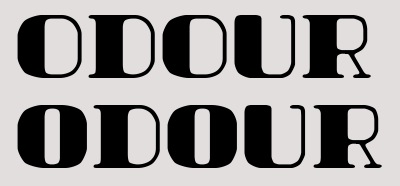
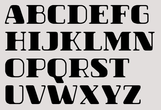
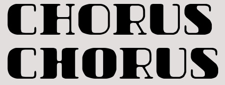
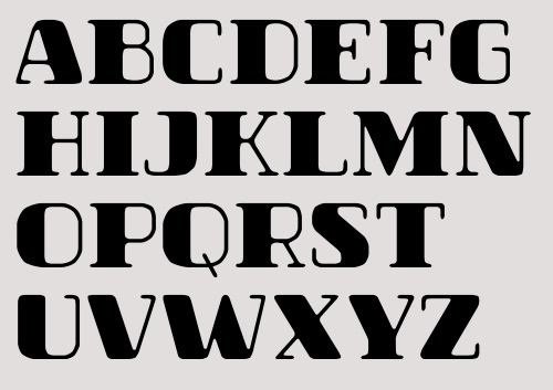
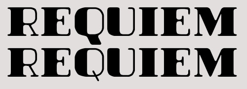
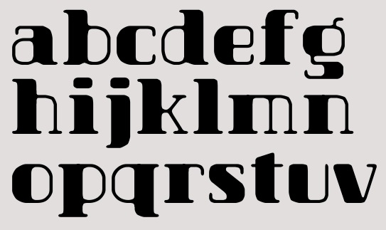
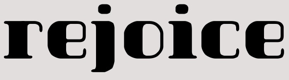
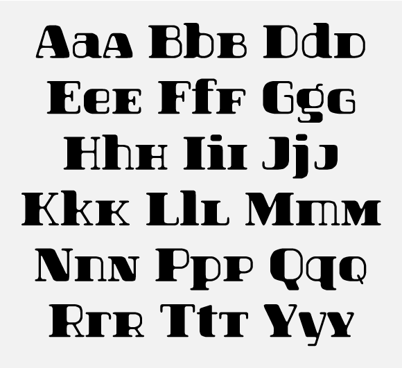
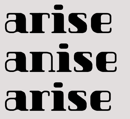
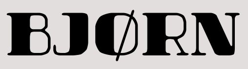
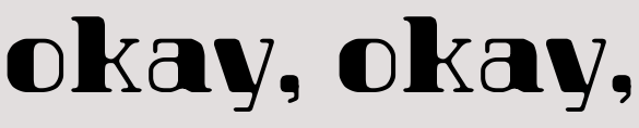
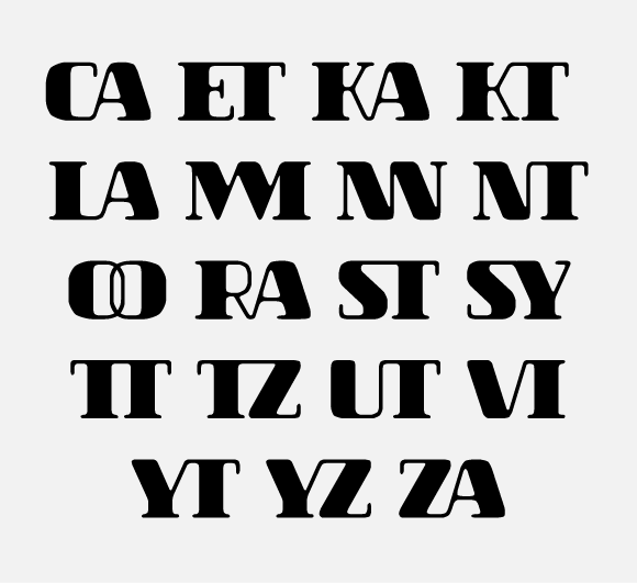
*** Images are from 1 version earlier. /T is now wider and /S straighter. ***
Still haven't decided about title.
What started as quick, for-fun, only-caps font, is turning out to be a multilingual family of 2 weights that could be counted as 6 fonts. Because there are small caps, swashed style and alternates for both of them. That's even not counting ligatures (for Cyrillic too!).
Plus manual T1 hinting.
Update 4 (2012/V/30)
pdf's:
http://cl.ly/H06i (Light)
http://cl.ly/H03z (Dark)