
I'm trying to track down as much information as possible about a decorative metal font called Koster Initials, apparently issued by the Cleveland Foundry in the late 19th century. Any help appreciated.
hhp
I'm trying to track down as much information as possible about a decorative metal font called Koster Initials, apparently issued by the Cleveland Foundry in the late 19th century. Any help appreciated.
hhp

Laurens Janszoon Koster?. (koster is sacristan). there is a book "a short history of the printed word" by Warren Chappell - that talk about Koster and Gutenberg - who was the first to print etc etc. [sorry. that is for now. i just busy, and saw that today. maybe this weekend i'll have more time to find out what do i have]
oops [....that talks...]
> Laurens Janszoon Koster
That's the Dutch guy who supposedly invented printing before Gutenberg, right? Not that either of them were earlier than the Koreans.
But this is a 19th/20th century font.
hhp

Sorry, the script seems to be stalling before I can get to the image upload screen. Let's try again:

No problem (I hope):

Reminds me of Tiffany a bit. (The typeface, not you, Tiffany. :-)
Here's a better scan from a larger sample:

Both samples are from old photo display face specimen books. I've only ever seen Koster in that form.
I remember it was part of the type library at a magazine publisher I once worked for. I could never figure out why it was chosen. I think some of the people in the typesetting department had different tastes than the art directors. We thought it was kind of a joke. I don't think anyone ever used it.
I don't know where Koster came from. It could be the same one Hrant is researching, but I don't know. The photo display version was part of the VGC Photo Typositor library.
Tiffany (Ed Benguiat, 1974) was more or less based on Ronaldson Old Style (1884).
...recent trends, the return to victoriana, it might be useful though?
Ugh. I hope not. I do appreciate and enjoy old Victorian design and typography, but it's so set in its time. It's difficult to do that style without it coming off as parody or ironic or nostalgic. On the other hand, I do think the Victorian spirit is alive and well every time I see design where style and form completely upstage the message.
I don't know, that Victorian style seems to always be around in some form or another. In the sixties, it seemed to be equated with comedy, probably a reference to Vaudeville. Then there was the whole (ironic) counterculture/rock adoption of the style (Sgt. Pepper, Rolling Stone magazine, etc.). I'm sure this sort of thing will continue to happen.

>
Punk Victorian. I can't wait.
Mark, interesting. "Your" Koster seems to be a tamed (yes!) version of "mine":
http://www.themicrofoundry.com/other/koster_b.gif
It's 72 point, and you can see the bottom 12 point span has been mortised to allow another 60 point font to start setting nestled!
BTW, I wouldn't call it Victorian, more Art Nouveau. Although it's a mix of rigidity and organicity (is that a word?), so it doesn't fit very well in any category I know.
hhp
There's a sample of Koster (the tamed version) on page 204 of American Wood Type, by Rob Roy Kelly. Not much info, unfortunately, except that it originally came from MacKellar, Smiths, & Jordan type foundry. Although it's in the book, it's not clear whether it was actually a wood type.
Hmm. Maybe one of these was a knock-off of the other.
> it originally came from MacKellar, Smiths, & Jordan
Not a bad lead - thanks!
hhp

Though theft and borrowing was fairly rampant among nineteenth century foundries, I doubt the Cleveland version is based on the MS&J. Bit more happening with the former. They usually don't clean up this well. Could very well be the inverse. Hate to call any of this stuff Victorian. What actually is that? I think you need to look at late eighteenth century French foundry specimen books to find the origins of many of the Anglo-American nineteenth century display faces.
Hrant
The specimen Mark showed are indeed the Koster Initials as orginally designed by William J Jackson for MacKellar Smiths & Jordan. Patent design 1888.
This means that the initials you are asking about, with the Cleveland pinmark, are misidentified.
Cleveland Type Foundry went from 1875 to 1892 when they were absorbed by ATF. Several catalogs were issued during this time period.
In looking through the Bidwell book on the acquisitions of ATF I would guess, based on a showing of very similar initials from Cleveland that these are actually called the Euclid Series. But without the face in front of me I can't be sure.
Gerald
Hmmm...
OK, I'll interrogate you on it tomorrow! :-)
hhp
So Gerald showed me this book of "lost" American metal faces (I forgot the title, but it was edited by Alexander Lawson, and published in 1981) and Marks' Koster was in there, as was... a face called Euclid (like Gerald said) by the Cleveland foundry which matches the font in question! It actually has a full alphabet with lc, and the stuff I've seen is the swash caps.
However, I'm still looking for info on this font (so Euclid, not Koster) like
who made it, was there an earlier version, etc. Thanks for any leads!
hhp

So don't wait, terminaldesign; check out "steampunk" on any search engine.
----------------
Ile of gramarye.

The swash characters from Mark's specimen matches a specimen from a friend's personal collection of metal and Ludlow type. This was back in the mid 70s and I think he used to buy old type cases from out of business printers. His sample is marked Antique Initials No. 2, which was probably a drawer separated from the regular complement. It looks like a 48 pt. sample.
Sorry for the poor repro, my scanner at home needs reconfiguring, so I tood a quick snap instead. I can get a cleaner scan tomorrow if you'd like, but there's no information on the type source.
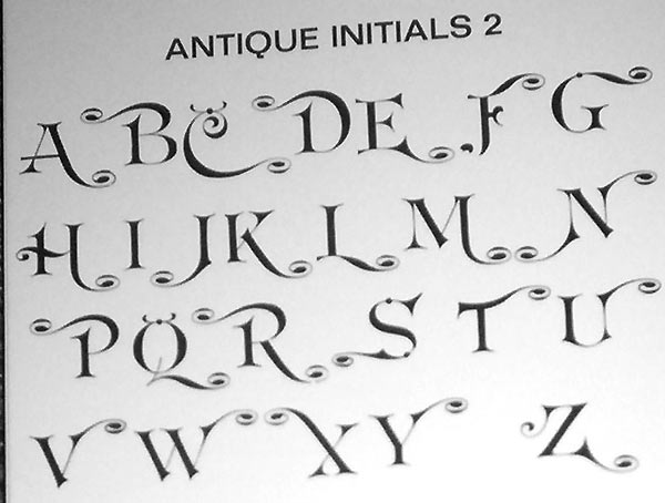

This is no help, but I just had to say how beautiful I think the swash caps are!
(so Euclid, not Koster)
So Hrant, is it info on Euclid that you are looking for?
Do you (or anyone) have a sample, because I have a sample of Euclid shown in an old CG specimen book and listed as a "Compugraphic Exclusive". This basically meant that it probably came from the collection of antique types they purchased from T.J. Lyons in Boston.
Does this match the Euclid you've seen?
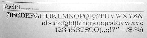
Nope, look at the "B" above:
http://www.themicrofoundry.com/other/koster_b.gif
But please don't kill yourself tracking down more info,
we both have bigger fish to fry I'm sure*. BTW, what do
you guys think the market is for a CD with hi-res scans
of the UC set? I could picture how they might make for
some funky compositions (like using them as initial caps
in an otherwise "normal" paragraph, or as background
images) but I'm not sure if sales would be enough.
* OK Chris, that's your cue to start a pun volley with Norbert. ;-)
hhp
Oh, sorry, I missed that.
I could picture how they might make for
some funky compositions (like using them as initial caps
in an otherwise “normal” paragraph
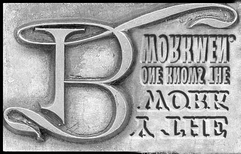
Just thought I'd see what it might look like.
Yeah, yeah, where are the individual type block outlines. Hey... just think of it as a logotype.
Norbert, the S and X in your sample look upside-down.
I don't see an X...
Yes Mark, they are. I didn't notice until you mentioned it.
Plus, I notice the cap S is different than your sample.
The specimen was pulled by a friend Jimmy Jacques for a little sample book of his collection around '79 or so.
(David, it's the Antique Initials 2 specimen above.)
(David, it’s the Antique Initials 2 specimen above.)
I see now! I was trying to look in your latest adventure into what the B would look like as an initial cap.

"...we both have bigger fish to fry I’m sure*"
Don't worry Hrant. Be Happy! Here is a bigger fish that I just fried for you :-)
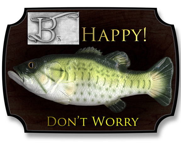
ChrisL
By the way, in these pre-Typophile-redesign discussions, some of the comments (by moderators I think) are missing, which makes me sound like one end of a phone conversation above. It'll be nice when (if?) these are restored.
I'm pretty sure it's the anonymous (no TPhile ID)
posts that have been axed (or at least filtered).
hhp

Graham Meade (Typotheticals) has created a set of fonts based at least in part on the images posted in this thread. The VERY inexpensive set of 9 variations is available at MyFonts:
http://www.myfonts.com/fonts/typotheticals/koster/
- HVB

Mark -- This is pretty. No wonder drinking Absinthe was
the next natural step. J/K -- Is there any way that you could
enlarge the swash cap B 300% and post that alone? Thanks!
Hrant! Look at what Mark posted!
Yeah. I can see what you mean, Mark. It does look like that face. It couldn't be me, I'm not that flamboyant. It also reminds me of another face (the non-swashy version) that came with TypeStyler when it first came out. But, I can't think of the name. Hmm. Where did you get this sample? It isn't digital, is it? McGrew?
Thanks, Mark -- do you think in light of recent trends, the return to victoriana, it might be useful though? OR NOT. Hmm. Which came first, Koster or Tiffany?
I had no idea that Tiffany wasn't an original.
My question of which came first was not well thought out. I'm sooo embarassed.
=O
Trend. Not the right word. I'm thinking along the lines of the sign painter types being created. That is hardly a trend. Allow me to slap my own hands.
Nah, this isn't organic "enough" to be art nouveau. I think I like James' term, Punk Victorian.  Although, the swashes on your version, Hrant, are more art nouveau than those from Mark.

The typeface Koster was designed and engraved by W. W. Jackson for the MacKellar, Smiths & Jordan typefoundry of Philadelphia. It was given US Design patent No. D18269 issued April 24, 1888.
-Steve Saxe
Captured from web.archive.org on 25 Sep 2019. view this capture
