Hey Typophile
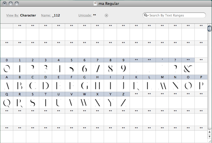
I have been fairly inactive for a while but we put our typographer shoes on a bit ago and have been dancing and working on a stencil font that would highlight the spaces in between.
We also realized that the space in between doesn't have a name. Some have tried 'pylon', but that just didn't make sense. We think " ma" works as its that non western idea of the palpable presence of the metaphysical; like the pause between two notes or the silence in the middle of a sentence for dramatic effect. This concept is imbedded in many cultures, why not a font.
Currently, we have only developed the "Ma" Caps at present.
We wold love to know what you think.
Without further ado.
| Attachment | Size |
|---|---|
| ma.png | 51.6 KB |