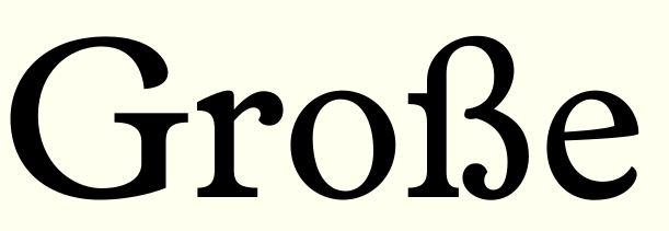
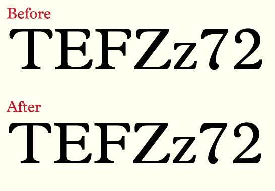
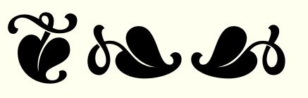
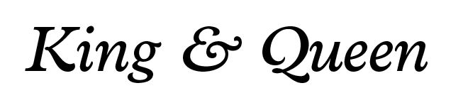
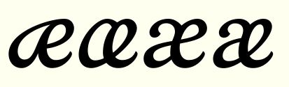
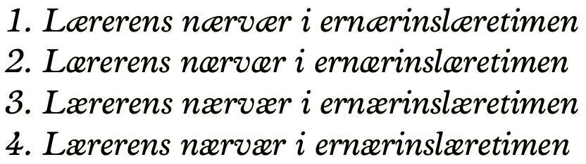
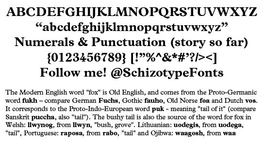
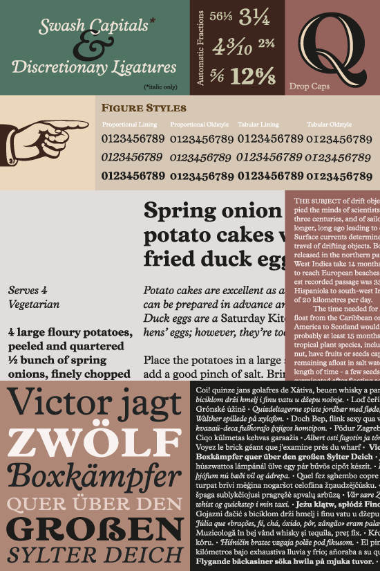
Here's my latest font in the making. It is inspired by a font ID request here on Typophile which went unsolved. Inspired in that I've taken the basic feel of that font and some of its characteristics (mostly the crescent shaped half ball terminals - I'm sure there must be a proper name for these) and 'transplanted' them onto a Plantin-based text font I was already working on. Please note the only thing I've taken from Plantin are the basic proportions and metrics (and for the time being, kerning, which I will no doubt scrap and start from scratch as the need arises). The outlines are all my own. What do you think? Specifically, what are people's thoughts on 'borrowing' metrics from other fonts. Surely this doesn't constitute any copyright infringement. I definitely remember reading an interview with a type designer recently (I forget her name) where she said she usually starts a new design from an existing one.
Anyway, any criticism is greatly appreciated. The aim is to make a readable text font (for print more than for screen) with a bit of character. I'm undecided on the Nike-esque swooshes, and I think the serifs being thicker than some of the thins maybe looks a little odd, but sometimes odd is good?!
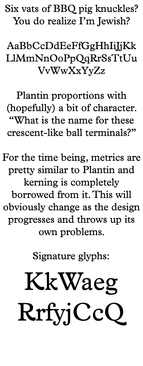
PS. nicked the pangram from Craig Eliason - one of my favourites
| Attachment | Size |
|---|---|
| Vulpa.pdf | 74.81 KB |
| Vulpa2.pdf | 48.78 KB |
| Vulpaitalic.pdf | 84.52 KB |
| VulpaBold1.pdf | 85.27 KB |
| VulpaBold2.pdf | 100.16 KB |