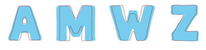
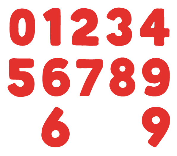
I'm working on my second typeface, working title is "Abraham" for now. This will be a real big, bold and solid one, intended for display purposes.
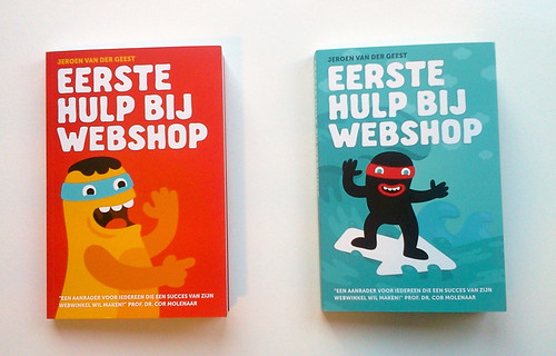
I've been drawing these for a while in cards and posters and bookcovers for example. Here are some examples of previous use (these are all handdrawn but I'd like to make this into an actual typeface)
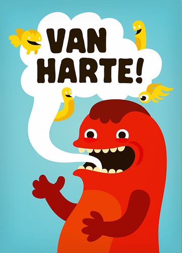
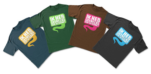
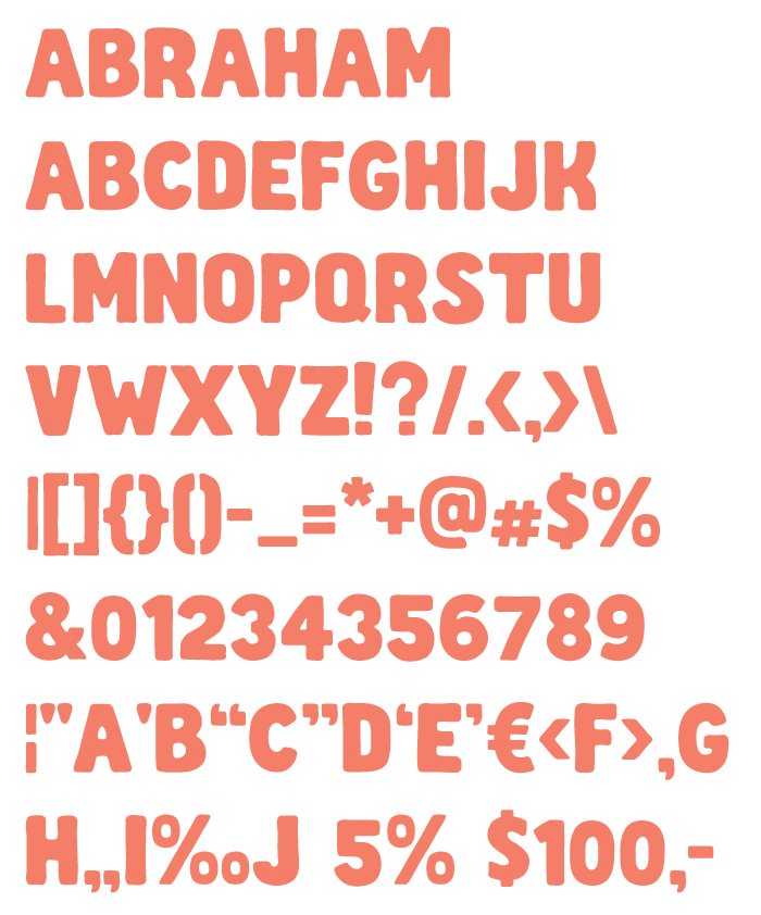
Here is a first preview of the basic characters:

Is this worth pursuing? I'm considering leaving this all caps and offering 2 or 3 alternatives per letterform (more?), so that users can set text that has a real handmade / random feel. Is there some kind of way to get open-type software to cycle through these alternates? The "Populaire" typeface lists that as a feature, although I'm not sure how the designer created this... http://new.myfonts.com/fonts/pintassilgo/populaire/
Suggestions welcome!