
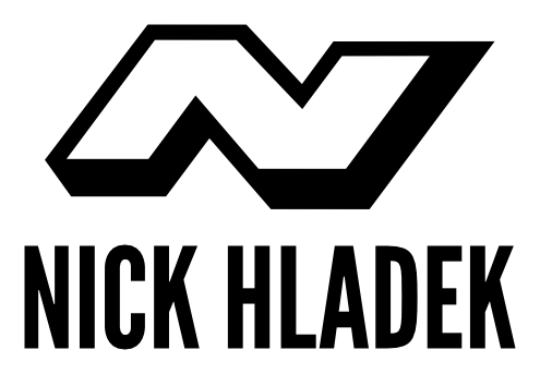
I'm trying to design a logo for myself because I'm beginning to get some leads for some web design and tech support jobs for some local businesses and I want to develop an identity and deploy my own web page (I know ... trying to start a design/tech support business on the side and I don't even have my own website. Let's just chalk it up to living a contradiction and leave it at that, OK?)
Please be as honest as possible with your critiques, keeping these things in mind:
- Currently, I have $0 to hire a professional (maybe in the future when I bring in some more cash).
- This is a learning process for me, however; an exercise in becoming self-taught.
- I know enough to know what's REALLY bad, but not enough to know what's really good, much less for a mark for my own business (I've seen more talented/professional designers than myself struggle with this kind of project—if you'll grant me the title of designer).
- The design is preliminary, but the one I liked the best based on a couple of pages of brainstorming with pencil and paper.
- I haven't kerned the type or payed a terrible amount of attention to the space between the type and logo.
- I've fiddled with the stroke width on the logo, but realize that it could use some more refinement/tweaking.
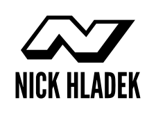
The idea I'm going with here is modern/tech-oriented monogram. I've attached large and small examples so you can see how it scales, as well as two different ideas for orientation between the type and logo.


Thanks in advance for your input, feedback, advice, cheers, jeers, etc.
Best,
Nick Hladek


