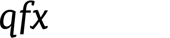
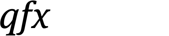
I recently had a closer look at Mark Jamra’s Expo Serif (which appears to be quite lovely, by the way—has anybody licensed it and is willing to share experiences?) and found myself bewildered at the following sight in the preview PDF:
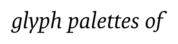
That’s quite short an ‘f’ descender, isn’t it? The ‘g’ is not as short as that, but also looks distinctly on the short side. The descenders of italic lowercase letters in every old style typeface I inspected, by contrast, all had the same optical length. The same seems to be true of every sans I checked—with the exception of Expo Sans:
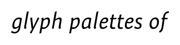
Do you know any similar examples? How do you feel about visible differences in descender length? I admittedly did not even notice this peculiarity when I looked at the Expo family for the first time a couple of months ago. Now it makes me shrink back from licensing. Thoughts on why the ‘f’ is so short are also welcome although, of course, only the designer can elucidate how this came about.
Thanks in advance for any helpful contributions!