
Hello all,
First I want to say I'm honoured to have an opportunity to join this community, this is a fantastic place.
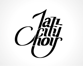
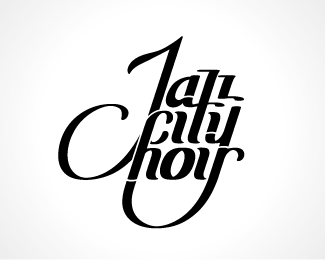
This is a logo I'm currently working on, based on a chosen concept. It's not polished but already been through many revisions.
I'd be really grateful for any knowledgeable input from you before showing it to the client.
Please be aware that it's my first attempt at designing type, so I'm kind of nervous, but then don't pull any punches, I want all of it!
First off, is this legible enough?
Then I have a problem with the 'a':
The entire logo is slanted, but you rarely (if ever?) see a 2-storey 'a' in italics (true italics anyway).
That's why I prepared a 1-storey version. I do like the 2-storey 'a' better though, but I wanted to confirm if it doesn't conflict with any sorts of typographic principles or is just a plain 'wrong thing to do' before deciding on it.
Thank you in advance for any comments!
PS. I'm planning to balance the 'o', I'm also thinking of making the whole thing less slanted, however I'm worried that 'z' would become less legible.

