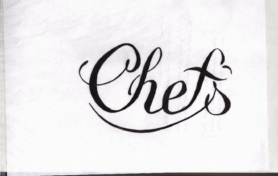
I need some opinions on the letter spacing in this logotype. Does the negative space between characters look equal/uniform? I've been staring at this thing for too long now, I could use some help from the pros.The logotype is for a restaurant that will be named Chefs' Palate. This lettering is all hand done so the line weights are still not equal, once I import to Illustrator I'll fiz those up but I want to get the letter spacing correct first. The crossbar of the f and the apostrophe form a heart, to add the element of love for what the chefs do.