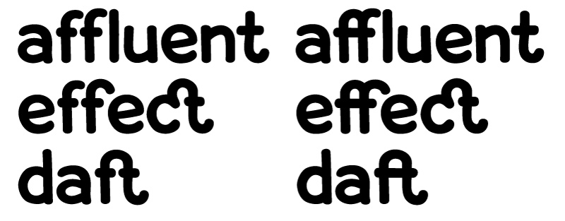
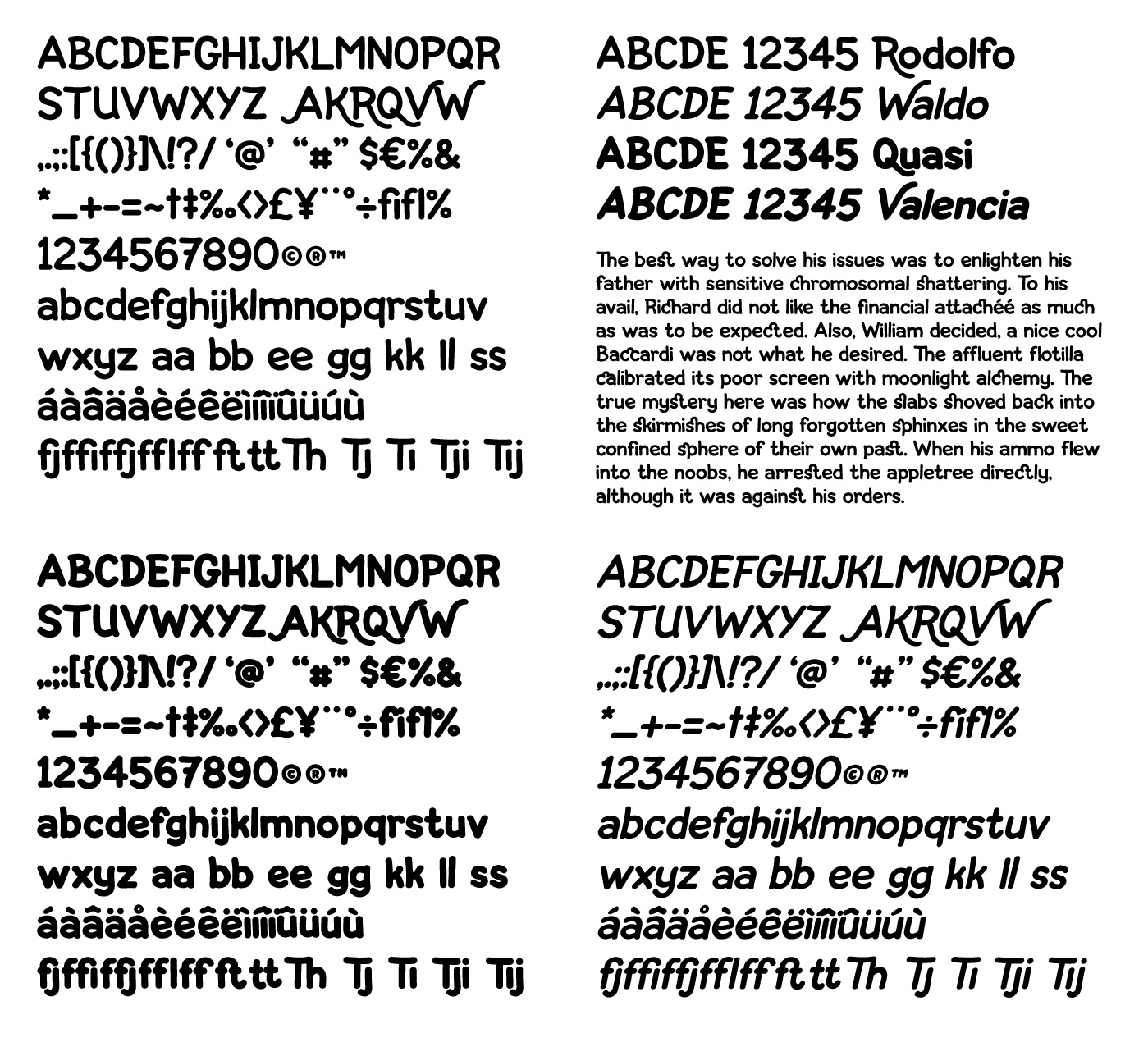
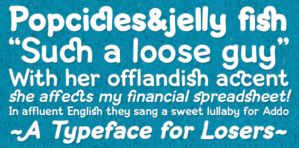
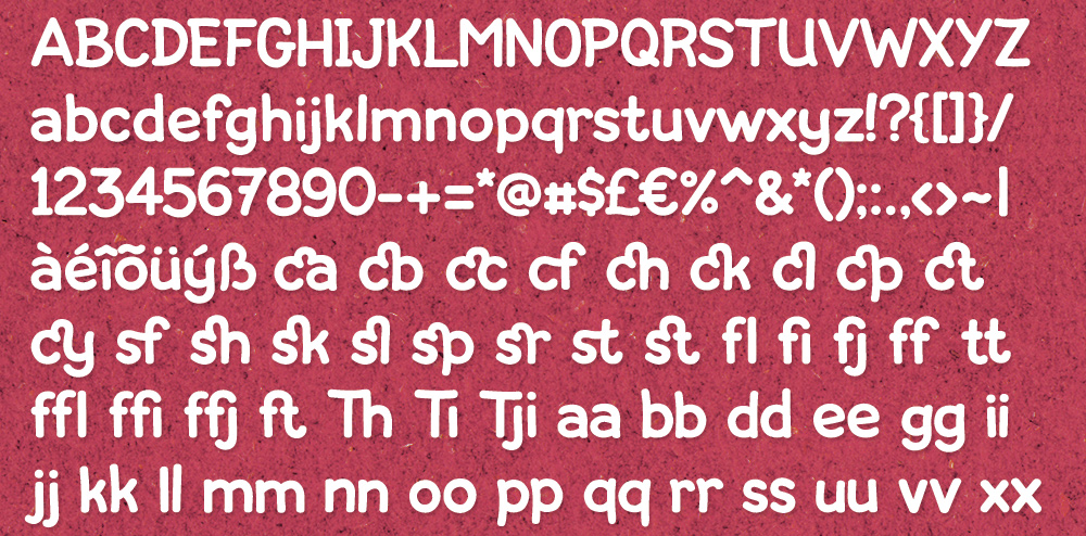
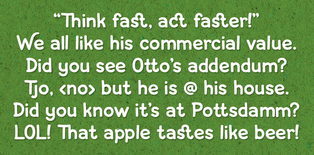
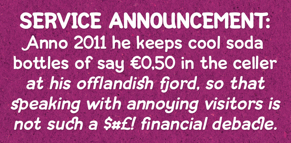
Not sure if this is the correct place and what the conventions are for showcasing your font, but here we go. I've put together a few files to show the font. The first one only shows 3 weights in more detail but there are in fact 4. I've (hand)drawn all glyphs in illustrator, they are basically monolined and meant to be pretty close to one another. Bold and italic/slanted versions have been generated with the help of FontLab although I had to redraw a number of glyphs (I realise it's probably bad form to have FontLab generate a bold and italic version for you...) Maybe I've put the glyphs a bit too close in kerning, not sure.
Suggestions welcome on all fronts!
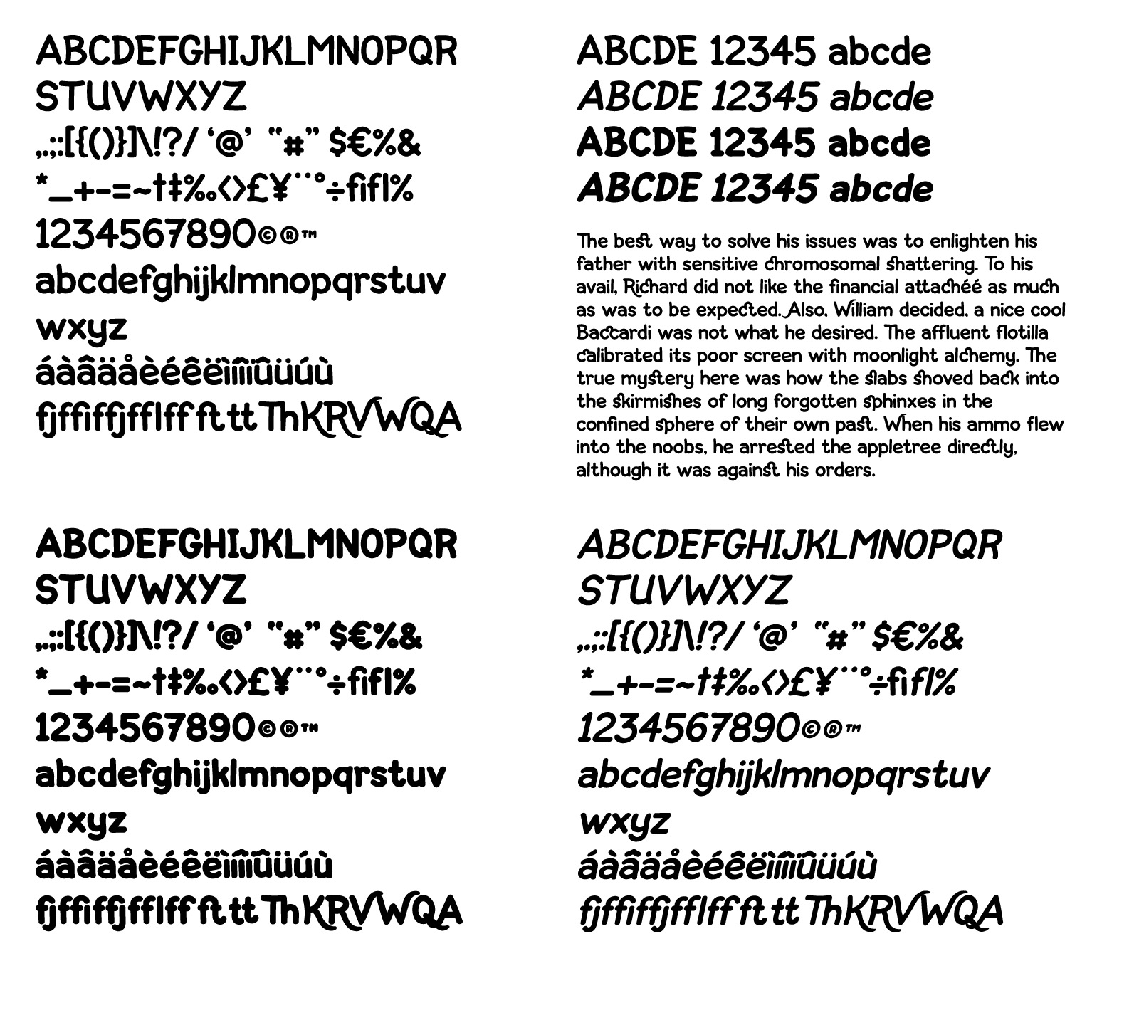
some more samples:


more images can be found at my flickr stream: http://www.flickr.com/photos/zeptonn