
My first post to Typophile.
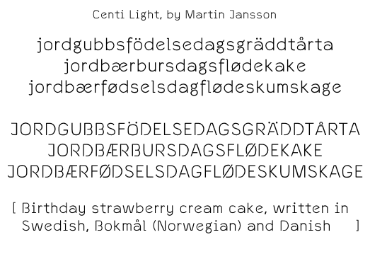
The Centi font is based on Swedish black-letter tradition (rather different then, say, German black-letter tradition), but also inspired by modern day Roman linears, I've consciously borrowed elements from Akzidenz-Grotesk, Univers, URW Gothic Light (a free (as in freedom) Avant Garde substitute, that is actually (in my opinion) much more useful then the original) and Microgramma (my font actually started as "Centigramma" and was intended to be a better Microgramma with lower case letters, but I got some new bright (hopefully) ideas after drawing half of the upper case letters and two of the lower case letters, and decided to do something more original).
The font is constructed primarily for use with Swedish and secondarily for use with Norse (Bokmål, Nynorsk) and Danish.
The font is planned to be released under the GPL version 3 license, with a font embedding exception (advice on choice of web communities where I can put it up to be downloaded, or for development collaboration, is appreciated).
Be aware that the font is still in alpha-version, but hopefully a beta will be available soon.
Give me good advice and criticism. Don't forget to mention if there is something you really like, that will make it more likely that I will keep that feature in future versions.
I have already noticed that something is wrong with J Ð Þ 2 and 3, they just don't fit in, but I don't know what to do about it.
Another annoyance is that g set in a small sizes, get a "blob" in the middle on low resolution/quality devices (a.k.a. LCD screens). I have no idea how to fix this. Is it possible, in an OpenType CFF font, to switch to another letter form at a certain resolution threshold? All the other glyphs work with small sizes on low resolution devices, so I feel that bitmapping is overkill.
I would also like to make p and q, n and u, and possibly i and j, more legible for people with dyslexia caused by rotating and mirroring. n and u are almost identical in shape (but I did draw them separately) and I'm unsure if the differences is large enough for p and q, and i and j. It would possibly improve readability to people without dyslexia as well.
There are some problem with line widths ever since I converted the font to a larger em-unit. Since fixing this require a large overhaul, I will try to discover all rounding errors before I correct this problem.
(I hope my Norwegian and Danish spelling is correct in the picture, I have never seen the words in writing and I have no Danes or Norwegians at hand to consult.)
Since I'm an ethnic Geat/Goth living in Geatland/Gothia, this is one of few modern typefaces that can be claimed to be a true Gothic typeface ;-)

