Hi everyone,
This is a class project: an identity for the Museum for African Art. I'm wondering if adding a custom typeface to the project will complicate it with too many elements.
Below are rough sketches:
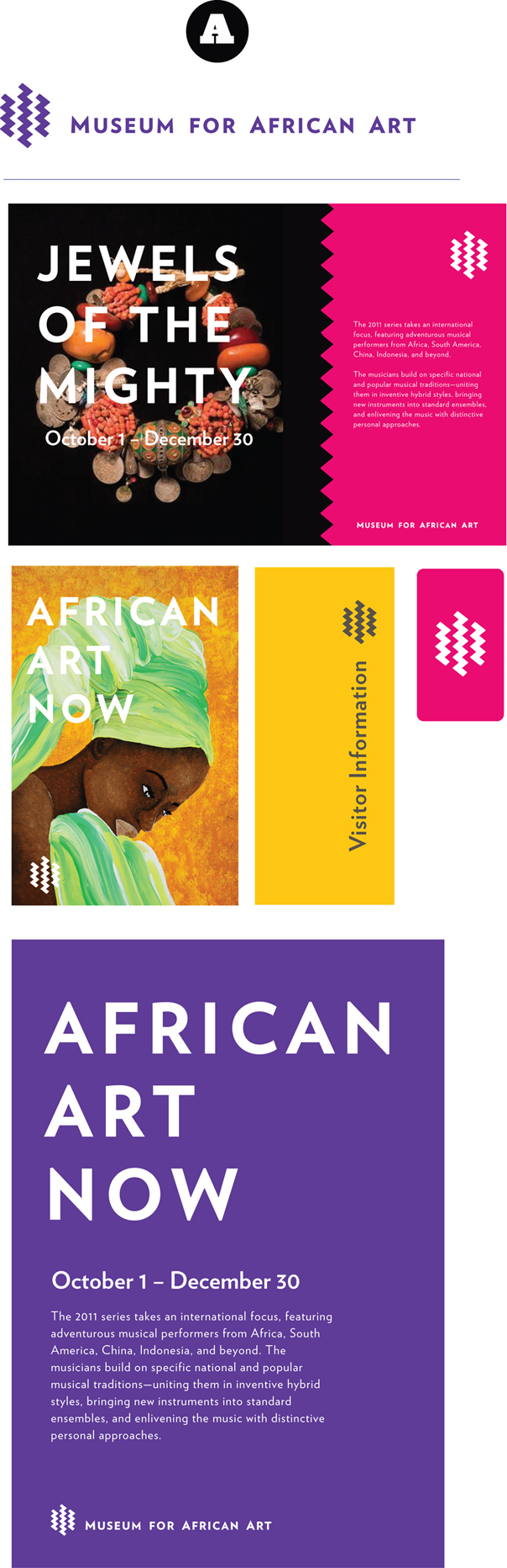
(A) My original logo concept: symbol with wordmark (in Verlag). Verlag is used throughout the identity as a display and text face.
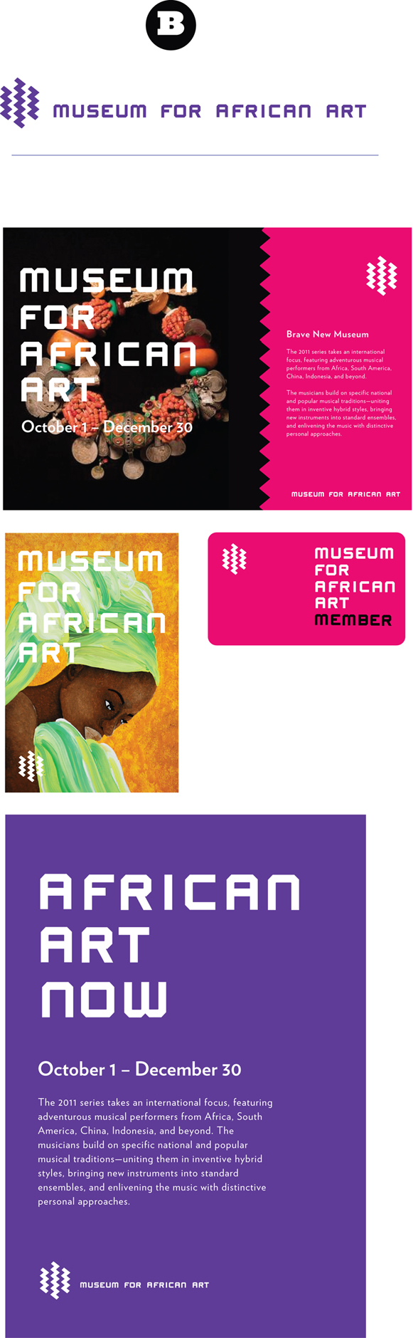
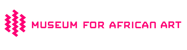
(B) Symbol with wordmark in a custom typeface (I haven't built out the entire font however). I like how strong the type looks when big and overlaid on an image, but does it clash/fight for attention with the symbol?
My gut says the symbol and custom face are both viable options, but maybe not when used together.
I've been wrestling with this for a while.
Thanks so much for your feedback!