
Hi everybody,
I posted a wordmark here and got some useful feedback. The final thing needs to include a symbol and tagline. I'd appreciate any comments on placement, how the elements lock up etc. Cheers.

Hi everybody,
I posted a wordmark here and got some useful feedback. The final thing needs to include a symbol and tagline. I'd appreciate any comments on placement, how the elements lock up etc. Cheers.

Is there supposed to be an Ichthus in the mark? Makes me think of some connection to Christianity. I am not really feeling the subtitle font, but I don't really have any suggestions. Feels like the wrong era or something. The icon could be a bit larger to balance things a bit more maybe?
Thanks Luma. Client wanted a pisces/fish reference for personal and work connotations. Hadn't thought too much about the Ichthus thing. Maybe 'fine jewellery' is too big, as well as the symbol being too small.

> Maybe 'fine jewellery' is too big
My first thought was that the tagline might become too small when the logo is reproduced in a small size.
> as well as the symbol being too small
Yes, I'd try the symbol a little bigger. Right now it feels like the name and symbol are too similar in visual weight; I think it would be better if one of them was more dominant.

FWIW, don't take it the wrong way, etc -- I think the logo is all over the place. The symbol is precise and geometric, 2nd like is quirky with a lot of character (i.e. the exact opposite of the mark) and 3rd line is more of a refined understatement and fairly far detached from the first two. It looks like a mix of 3 styles that don't mix that well together.
No worries apankrat, I tend to agree. Initially the idea was to use a fairly neutral sans serif with the symbol, but the client really liked the wordmark and it is well suited to her work/influences. I guess I'm looking for ways to bring the three elements together more. Will look at an alternative for 'fine jewellery'
Thanks.
First edit - reduced the size of the symbol to let the wordmark dominate more + changed the tagline. Reversed on dark cards/tags/boxes is how the logo will mostly be used. Any thoughts appreciated.
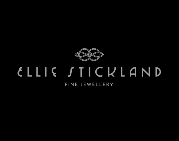

Really like the type for the name and subline is working well for me too. But I can't help getting a really strong keltic/new-agey vibe from the mark - intended?
I think you have illustrated why the icon is superfluous and should be omitted. If you must keep it, it needs to be at least twice as large as it was before. I would add ridiculous tracking to the subtitle if it were me.
The symbol has to stay as part of the overall identity, although there may be occasions when the wordmark alone is used. Thanks for the comments.
Better balance?
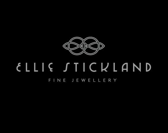
Have you tried going with a 'fill' rather than 'stroke' look on the mark? There are some very thin lines throughout and a couple of very awkward tiny dots in the middle of the fish tail that don't work even at this size. How about engraved on a ring? Maybe even beef up the subtitle a bit?
I would make the mark as wide as you have the subtitle here, yea, huge.
Or what about incorporating the monogram ES?
Rough sketch of what I mean:
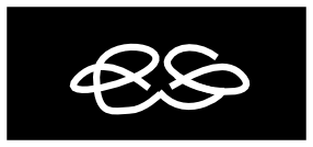
A thing to try/consider is to put symbol between the text lines and use it as a vignette. I would also try setting Fine Jewellery in the same type as Ellie..; and lastly I would also try and see if using symbol's ("hollow") stroke for the text would work as an option.
Sans for the Fine Jewellery is certainly a step forward IMO.
I'll probably fill the 'fish tails' in. As you say, the gap breaks down. The monogram would be a good idea but I don't think there's the time or budget to be able to pursue it. Thanks for the thoughts though, very helpful.
a couple more alternatives
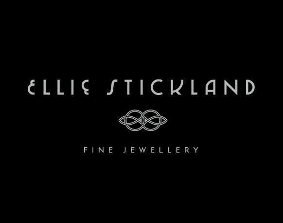

The stroke on the icon still feels very unresolved. The overly heavy fill on the tails, the rounded path around the top of the left tail and the bottom of the right tail, the visual tension happening in the center area where it feels a bit tightly crowded. I would rework the execution of the mark both to refine the form, and to compliment the wordmark better. But without time or money, you kind of have your hands tied in the 'quick, cheap, good - pick 2' adage.
Thanks again luma. Here's another reworking of the current elements. As much as I'd like to develop things further, I don't think I'm going to be able to.
No, no, no ... don't lose the the double stroke on the symbol. The last iteration makes it look like a trivial decorative knot/vignette and the eye just glances over it. Double stroke was what made it a symbol.
I would give another try the second version from 3:43pm, but making the stroke weight on symbol much lighter, and reducing the symbol by 20-30%.
@apankrat - aren't you the one who suggested using it as a vignette?
I guess it comes down to your vision of hierarchy. Do you want the symbol or the name to be dominant? What do you want people to look at first? I agree with apankrat that in the last version the name is dominant, and the symbol is downplayed. But that may be exactly what you want. To make the symbol dominant, you are going to have to beef it up more and make it a lot larger and refine the details. I think one reason the stroke wasn't working for me is that it looked like you clicked stroke and left it at that. The double line idea could work, but it would need a lot of finesse in the details, and probably reworking some of problems with congestion in the center. That would move it away from a stroke look to something more intentional and designed.
There is something smart about how the name is the only part with that weight and the rest is matched thin lines. It does create a clear hierarchy. The last version is growing on me. Good job.
Thanks guys. I think the lastest version does help with the hierarchy and balance, and the lines help tie the elements togehter, rather than having them sit there independently. Ultimately the name is the most important part. I'll have a go at resolving some of the issues with the symbol and post back, if anybody's interested. Really appreciate everybody's thoughts.

No rules above and below the logo. Getting too "design trickery"
The strongest part of this logo is the distinctive deco lettering for the name. As others have noted, the rest of the elements do not reflect this same design era. I think you can get away with it in the tagline (tho consider adjusting the E crossbars and the size of the R bowl, join of the N etc for a more arts and crafts feel).
On the symbol, consider a redraw finding your inspiration from arts and crafts sources. Eg Batch Elder tiles, Mackintosh, Green and Green etc. I can see it going more Japanese in influence or possible more organic William Morris. The direction should reflect the jewelry. It could even be that the fish/mark are a supporting brand theme vs part of the logo. Eg... A fish print varnished on the package. A koi papercut etc
Also not sure about the E and inverted E together. I'd just go with one.
If I had to choose from above I go with the "Better Balance?" one.
Nice job!
*update*
Just thought I'd post back with the final outcome. The client decided the icthus / celtic thing was too much of an issue, so we developed the symbol slightly. Business cards will be gold foiled on purple stock.
Thanks again for all the suggestions - very helpful.
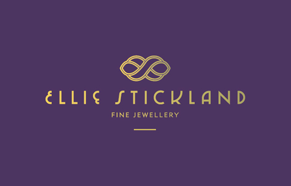
Nice update!
Captured from web.archive.org on 23 Apr 2015. view this capture