Typophile

Please Critique My First Logo Design

rob3rto

I wish I had discovered this forum before I "completed" my work. The Freelance Extremist logo is not only the identity of the designer but also the first design for the portfolio. I have been interested in graphic design for a long time and I have finally decided to start doing freelance work since no one will ever hire me w/o a portfolio. In this logo I wanted to convey my dedication to the profession by using elements of extremism.

I would love to get some criticism on my first piece of work, thank you.
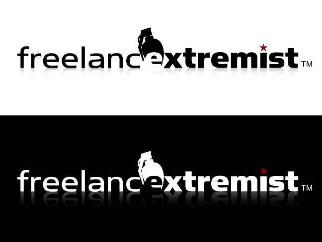
The word 'extremist' together with the grenade just make me think of terrorism.

That red star does’t come thru on the black background and is not very visible in its current form. The handgrenade is too fuzzy to stand up in small sizes and the knockout /e/ is a bit problematic — you should work on that a bit more.

A gradient reflection, swapping the tittle for a star and knocking out a letter over a bad clipart graphic is NOT logo design. It's not even design. Read this.

Well, I think there's issues with the name. Who are you trying to target for clients? I can't think of any client that wants to be targeted with a grenade.

Other than that, I don't think you gain anything by merging the 'e's into one. It just makes it a bit harder to read.

@Bert great advice. I agree, red star black background not working. Fuzziness is a problem. The grenade is very clean in illustrator. I need to figure that out.

@frode frank the gradient is not part of the logo; I should've included that in the description. I don't know the meaning of clipart I suppose. When I think of clipart I think of already made. I hand traced a grenade picture in illustrator. I am not defending it; I am learning and I really appreciate your link.

@aluminum the grenade is a little extreme; I guess I was trying to make an impact. I will rework the "freelance."

Thank you for taking the time to comment; your comments will help me a lot.

I'd suggest that you reconsider using "extremist" and the grenade. Though memorable they have a lot of negative connotations.

To a lesser degree, "freelance" can also have some negatives, for two reasons -- 1) It's vague. Are you a freelance screenwriter? Journalist? Programmer? 2) "Freelance" can conjure up an image of someone working out of their bedroom, which might not matter if you're just working for other designers, but if you want to develop your own clients in the business world I think it's better just to call yourself a designer.

start over :)

Want to learn from some of my heroes?

http://www.behance.net/LeGarconBleu

http://www.behance.net/Bitencourt

http://www.behance.net/rogeroddone

http://www.behance.net/maximalist

http://www.behance.net/robinssoncravents

What did I learn from them?

• Think before you sketch and sketch before you ever touch your mouse.
• People subconsciously like symmetry and math. So reason your design. Use grids but, but don't overdo it.
• Your logo should deliver a message. Always keep that in mind!
• Practice, practice, practice.

Hope this helps.

Good Luck!

"Your logo should deliver a message. Always keep that in mind"

BUT...don't read that as a literal rule. A logo can be literal, but more often than not, it makes sense for it to not be a literal representation but more of an emblem. It simply represents your company...not necessarily defines it. The logo represents the brand more so than it creates it.

I agree with many in here. I think it's time to do some more brainstorming...start back at the name. Come up with some more ideas. See where that takes you.

I agree with Frank.

Captured from web.archive.org on 5 Aug 2014. view this capture