Typophile

In need of some SERIOUS advice on designing a script face

Dan Apparatus

Hey All, first time poster, long time lingerer.
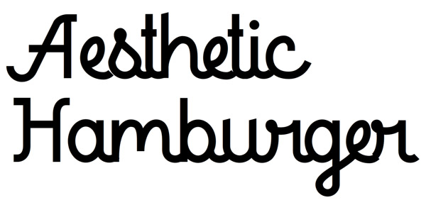
I'm working on an bold upright monoline script. But, I'll be honest, it's driving me nuts. I am an amateur typographer, so I'm guessing it's either just inability or maybe it was just naive of me to think that building an upright script face wouldn't be that dissimilar from designing some kind of "fancy monospace", but (as you can see) I am failing.

I'm almost there with my letterforms, but what I'm struggling with is the rhythm and logistics of actually building a seamless connecting script. I've dismantled other similar scripts to see if I can ascertain how they work, but it's not helped.

Right now all "connecting strokes" along the baseline are exactly the same. I had them of varying widths previously, but it definitely screwed up the kind of rhythm of the baseline. The face just didn't flow. But as you can see now, building of a sort of "monospaced" connector between letters is making for uneven and tight spacing between letterforms. The "r-g" relationship is confounding, and the "e" is just weird.

Any basic script face design advice?
HELP!
Try writing.

You've gotten the "c" pretty much all right; work from there...

That "Handwriting Repair" link was awesome.
Thanks!

Try getting a few years experience then try again.

I think your rythm Problems come from to many different ideas. Look at the tops of t h and H for example: flat, slant, serif - Pick a thing. Also there are some hills and valleys looking at the x-hight: the w for example. I always find it helpful to look at classic fonts that use similar shapes - Some aesthetic rools just never chanche.

@nick

By doing he is learning. That is how you gain experience.

That's right, but you can try to do something that is beyond your present capability, and only a few years experience can achieve the desired result.

I know, speaking from experience.

“Aim for the stars and you might reach the sky.”

"Don't run before you can walk".

The fact that he is asking for help is a good sign. If he posted that he had developed the best script face then I could see the problem.

There's nothing wrong with trying and seeking advice.

What Mr. Shinn said.

The edding is your friend.

@Dan: Is this personal, professional or academic?

Well, it's personal now. I have searched for this face for my own personal use for months with no luck.

Well you could look at Kursivschrift to pick up some tips.

(I'm melting)

..................................

James, why did you edit your last 2 posts? I thought the previous original ones were quite helpful.

You are right - designing a joining upright sans is probably the most difficult thing to do in type design - hence my previous posts.

why did you edit your last 2 posts?

Wasn't me, must have been those fidgets.

Try to write with some monoline instrument (felt-tip pen, for example) to understand the logic better. And i think you could make ligatures for the most difficult pair connections. Also you could have 2 or 3 forms of some letters to receive more accurate connections depending on what kind of letter in next (like in handwritten scripts).
For example your can use your present form of «e» as a beginning form and also make
a middle form with more elongated eye for a better connection with previous letter.
Good luck!

@Nick Cooke Such a pessimist.

I second the recommendation to try writing the letters first. I also suggest writing an non-connecting version of the basic letter structures and experiment with spacing these before introducing the joins. One of the most obvious problems with your design is the tight spacing and the imbalance of internal white spaces.

I suggest you look at the French upright script style that was developed in the 18th Century. This style was cut in type by Nicholas Gando, and revived in modern times by Matthew Carter. It is the best realisation of an upright joining script.

Realist.

Haha!

Captured from web.archive.org on 13 Oct 2013. view this capture