
http://typophile.com/node/84258
Holy crap, Monotype! What a piece of sßhit!
http://typophile.com/node/84258
Holy crap, Monotype! What a piece of sßhit!
Monotype just released a new version of Rotis Sans but are using the most putrid piece of crap graphics to advertise it! I wish I had not seen that just before lunch! Otl Aicher would also have thrown up at the site of it. Who designs that shit for Monotype?
Somebody should tell Monotype that there are thousands of very good graphic designers out there who need the work and would have done a beautiful job of it! They did not have to get a used-car salesman to design the damn thing!
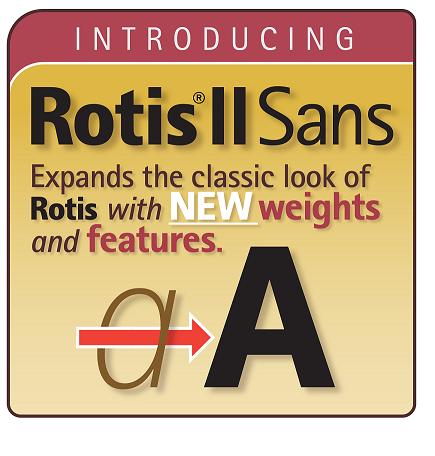

Maybe it's supposed to look like a pharmaceutical ad?
Perhaps a pharmaceutical ad for the Medellín Cartel ;-)

That's what you get when investment companies takes over type foundries. They have no frickin' clue… :-/
I wonder if there just might be a few graphic designers living in Switzerland who can do a better job of it? Maybe even some of Otl's colleagues?

I’d really like to know who’s responsible for this, management and design wise. It's easy to bash away on all channels (me upfront) but it doesn’t help anyone. One can witness a descent in taste for just about everything at Monotype and it’s subsidiaries for quite a while now (though Linotype is really trying to keep it up with the newly designed Fonts in Focus at least). But the stuff they threw at us this week just takes the biscuit. With icing.
Why Switzerland, Chris? Anyone anywhere would do.
Only because it would be the country of origin and one renowned for graphic design.
Actually, Indra, from the windows of Monotype's offices, the suits could throw a stone and hit anyone that would do a better job of design. This holds true even if the stone struck a dog relieving himself on a fire hydrant ;-)
RISD is just down the road from there. Any sophomore would certainly do better than this thing.
Holy Shit! Sorry!
I have an old friend Peter from Bern who was a good friend of his back then. The first time I saw Rotis was a prototype on a calendar that he made and sent to his friends, Peter was among them. Stupid me assumed he must be Swiss!
My sincerest apologies.
Chris
I have to apologize, vicariously. :)
LOL!
Before I give the impression that the designer of this is at fault, I would like to pose the notion that they acted as ordered, not as would be their choice. He/she was probably "following orders". I blame management for being so blind as to make this happen. We have all been gun-barreled into doing something we hated. I quit one job over that sort of thing.

My hunch is that it's simply about priorities. I don't know how much of Monotype Imaging’s sales come from what they call the "creative professionals" market, but from what I last saw of their public financials a few years ago it wasn't a high percentage. (It's probably not an accident that it's the last item in the "Markets" menu on their website.)
Yves may have a point: for this ownership it's all about columns in a spreadsheet. They are running a business, not following a passion. And it shows. Compare this output to any of the font vendors or retailers who are (still) run by people who really care about type and are willing to make decisions from time to time that don't necessarily enhance the immediate bottom line.
From the Monotype Imaging 2011 Annual Report:
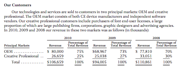
And: “We derive a majority of our revenue from a limited number of customers, in particular manufacturers of laser printers and mobile phones. For the years ended December 31, 2010, 2009 and 2008, our top ten licensees by revenue accounted for approximately 50.8%, 47.1% and 46.3% of our total revenue, respectively”
Monotype sells to other big businesses, not graphic designers.
I see what you mean, Stewf. Those numbers may be indicative of how Monotype has lost touch with creative professionals. Their percentage to them dwindles, yes, but what is the true market potential? If we could compare FontFont/FontShop and Font Bureau, I would bet that those two would have a greater share to design professionals than Monotype even in this crappy market.
Monotype may just say, hey, that is only 25% of our sales and just ignore it. A better business decision would be to see if there was room to increase that percentage. This is similar to what GM did several years back. They decided to ignore the European market because it was a small chunk of their sales. They assumed they had the American market all locked up with their big cars and always would. Along came Japan later and GM was left in the dust wondering why all those "Buy American" slogans were not working anymore. The Japanese built a better mouse-trap and the GM execs were left in their board rooms to to ruminate on their collective hubris.
Soon all those old guys who are the historic connections for sales in OEM will retire and Monotype will be left wondering what happened!

Chris, I take it you won't be distributing your fonts through Monotype/Faces/Linotype/Ascender/etc.?
Well, if I were to decide on the distribution on a percentage basis of FontShop, Font Bureau and Montoype …
I vote for increase the whole market, not the percentage.
(By the way all of the above offer their typefaces on fontscom.)
Nick, are you saying I have shot myself in the foot?
I am just hoping to wake them up before they become dinosaur relics. Quark never woke up, though. I went from one of their most stalwart supporters to one of their biggest critics. It is not about me, anyway. I just hate seeing an industry fail by self inflicted wounds. They have a long history and have spun off many a great designer. This all-the-way-with-MBA management style gets wacky when the market does not fit the mould they are accustomed to.
I feel bad for the good people who work there who deserve better.

The very first word that came to mind when I saw that graphic was - colonoscopy.

Somebody should tell Monotype that there are thousands of very good graphic designers out there who need the work and would have done a beautiful job of it!
Trust me, they have been told.

You might wonder how many of graphics similar than this set in Rotis can be seen in Germany. Yes, in pharmaceutical packaging for example. I’m far from defending this artwork but i think it hits the target audience (which are not solely graphic designers and purist Aicher typographers).
True Aicher epigones won’t be very amused about additional Rotis weights anyway. This is the perfect type package for designers working in the pharmaceutical industry.
Jürgen - This is just one example that may have mistakenly hit its mark as it stumbled out the door. The point is that the overall quality of Monotype marketing material is very low. For a more complete view, look at what ITC has become.
This may not be a permanent condition, btw. MT obviously sees the potential in webfonts, and even though that site too is pretty bad, they hired Happy Cog to redesign fonts.com, as Zeldman revealed on Twitter back in January.
Sure, Stephen. I agree with you there. Just this design and Rotis is quite a match ;-)
The ITC website suggests for years being a cheap or a freeware type shop. I’ve talked to people at Linotype about this non-interest in marketing design by Monotype. Apparently they’re only interested in counting sales figures at the end of the sales sheet. They haven’t figured out yet that design can sell, too. That’s how it is.
Maybe they realize, as you wrote in your last post, Stephen.

Can I be the first to say that Rotis is not that brilliant anyway. There, said it.
That ITC site sucks a big one! It is sooooooooooooo bad.
Allan Haley was quite open about Rotis detractors in his blog post.
While the design has been exceedingly popular almost since the original Rotis family was released in 1988, it is also one of the typefaces that some designers “love to hate.” Erik Spiekermann even went so far as to claim that it isn’t even a typeface. According to him, “(Rotis) has some great letters, but they never come together in one typeface.”
and
Rotis II Sans may inherit its predecessor’s approval rating – both good and bad

Ok. So I'll take that as a “NO” on this particular graphic treatment! Fair enough. From time to time we’re all guilty of putting out work that meets with some dissent.
That said, as Monotype Imaging’s new Creative Director, it is my intent to bring upon change and improve our brand presence. Believe me, I do hear and respect the underlying messages that have been sent!
Discourse brings about innovation. I want to hear your suggestions, your opinions… and your criticism. I am a student of our history and an advocate to our future.
My door is open.

@ Chris, L He/she was probably "following orders".
We've heard that one before.
:o)
"...as Monotype Imaging’s new Creative Director, it is my intent to bring upon change and improve our brand presence...."
Bravo! Go for it!

@Chris I like your creative swears. You could just spell it out: "Holy Esset." or "That guy's an asterisk."
@Stewf +1 for the graphic.

Believe me, I do hear and respect the underlying messages that have been sent!
Underlying??
Yes, "Underlying"? I didn't see any subtle read-between-the-lines comments here. It was more of an in-your-face kind of thing.
@Dennis Michael Dimos
Dennis, how did this thing come about and how was it ever approved? Was this a conscious effort to attract the crap design buyers?
The old Ciba Geigy ads were quite good, has that business moved to the dark side? Did you have anything to do with it? If so, what were you thinking?
ChrisL

Monotype is irrelevant now and will die slowly.

Is this not a parody of a Mavis Beacon software package?
@webpapa - I just have to say, I'm pretty impressed that you jumped on this a day and change after it was posted...
@Stephen_Coles - great great great.
Captured from web.archive.org on 9 Aug 2011. view this capture

