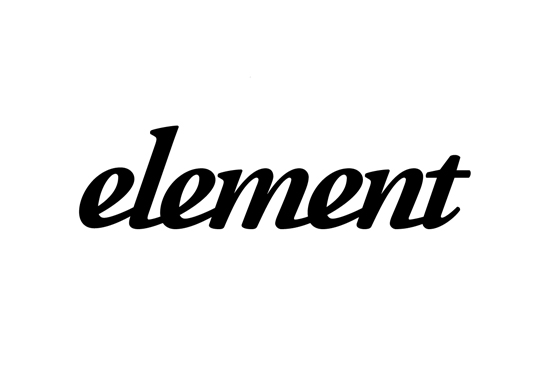
Hi all. I'm working on bit of a custom logotype for a local cafe/bistro. They are pretty much the top place to eat in this town. Problem is, their existing logotype (if you can call it that) is an EXACT copy of the old element logo that used garamond, down to the kerning etc etc. Not customized at all. Their place is also seen as being a little too flash, so i am trying to create a logotype that is more accessible/informal.
I've started working on the logotype below- it is in very early stages. Modelling it off Adobe Garamond Pro bold/italic at this point, but looking toward ligatures- handwritingesque to add informality.
Anyway I would really appreciate some feedback from you guys- I'm working in circles at the moment!
Cheers
Brad