
Client wanted to a classic typographic treatment.
Need opinion(s) on letter spacing. And any other thoughts welcome.
Many thanks.
Client wanted to a classic typographic treatment.
Need opinion(s) on letter spacing. And any other thoughts welcome.
Many thanks.
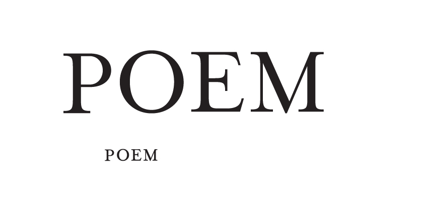

POE is a bit loose. Or, alternatively, EM is too tight, but I think it is better to tighten POE than to loosen EM.
Also, I would have P's bowl fractionally larger. P looks a bit smaller compared to other letters. Looks great otherwise.

Agreed.
Agreed.
Thank you x 3
Captured from web.archive.org on 5 Aug 2014. view this capture