
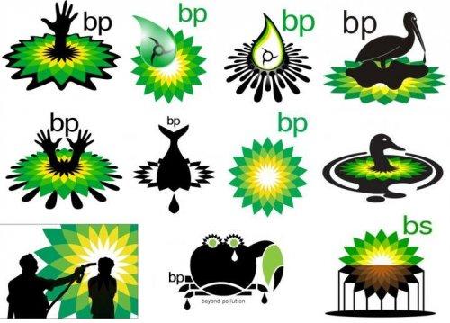
Similar with how type can have negative connotations (blackletter as nazi), I wonder about logos and how events can change how people perceive logos. Like bp (image below courtesy of google images).
Any thoughts?
Similar with how type can have negative connotations (blackletter as nazi), I wonder about logos and how events can change how people perceive logos. Like bp (image below courtesy of google images).
Any thoughts?

Other examples might include Philip-Morris rebranding as Altier, or even British Petroleum moving to BP, or Kentucky Fried Chicken becoming KFC, all examples of cultural norms changing enough that the brand gets a negative connotation. Also: http://logopond.com/gallery/detail/105731
Certainly a logo or symbol can have negative connotations (a nazi flag, for instance).
Regarding the modified/vandalized BP logos, I doubt if they have any substantive impact with the general public, other than with those people who already have negative feelings towards BP.
A more common reason for a logo having negative connotation is that it makes the company look old-fashioned, or highlights a technology that's now frowned on. For example, an old logo for a power company showing smoke stacks with billows of smoke. A few decades ago those smokestacks would be a symbol of power and progress; today they would symbolize pollution.

Not entirely sure what you are asking. Events obviously can influence brand perception. The logo being an indicator of said brand.

The images you showed aren't examples of a company rebranding, they're examples of a well-known logo being turned into propaganda against a corporation: In effect, leveraging its own brand recognition to discredit the brand.
Sometimes companies rebrand to keep up with public opinion: Ronald McDonald is far more trim and athletic than he used to be. And Fred Flintstone no longer appears in cigarette commercials.
Some brand disasters are unrelated to the product itself. The weight-loss candy product called AYDS disappeared after the the disease AIDS became widely known.
Ford is a great master of protecting the integrity of the brand through a series of disasters. The blue oval seems to be made of Teflon, surviving the Edsel debacle, the Pinto and Explorer lawsuits, and OJ's notorious Bronco chase.
Captured from web.archive.org on 7 Jan 2012. view this capture