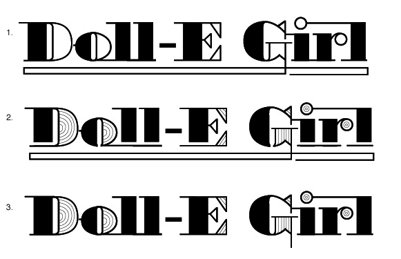
Hey everyone I'd much appreciate a bit of critique on this!
This is a logo for a former hardcore gangster rapper that is trying to revamp her identity as being much more mature, more sophisticated, and a bit more feminine. These possible logomarks are based on Battista, which is in turn based on Bodoni. I like what I have so far, but I want some critique on the letterforms. These are unfinished and I know there are some flaws in the technical exicution, but tha's ok at this stage. I'm mainly concerned about the "G." I really like the way it is Option 1, but it doesn't seem to fit with the rest of the letter forms. Please let me know if there is anything I haven't caught that should be altered. Thanks!!!!