Hi guys,
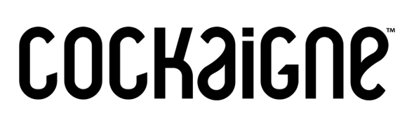
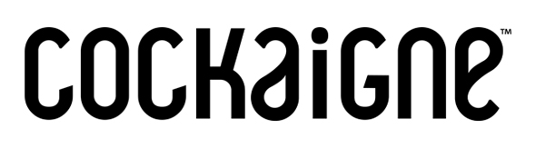
I've been working on this logo for a new magazine about fashion & photography (mostly photography) and I'm hoping to get some feedback from you. My main concern is the kerning. I feel that the space around the "I" could use a little more work but I want a second (third, fourth...) opinion.
Feel free to share any critique and thanks in advance.