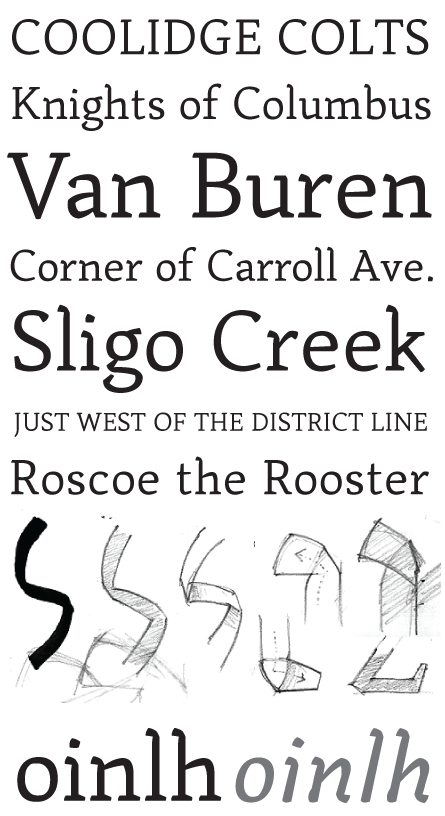
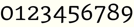
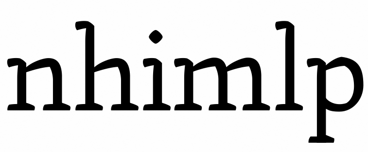
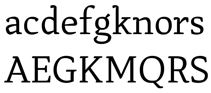
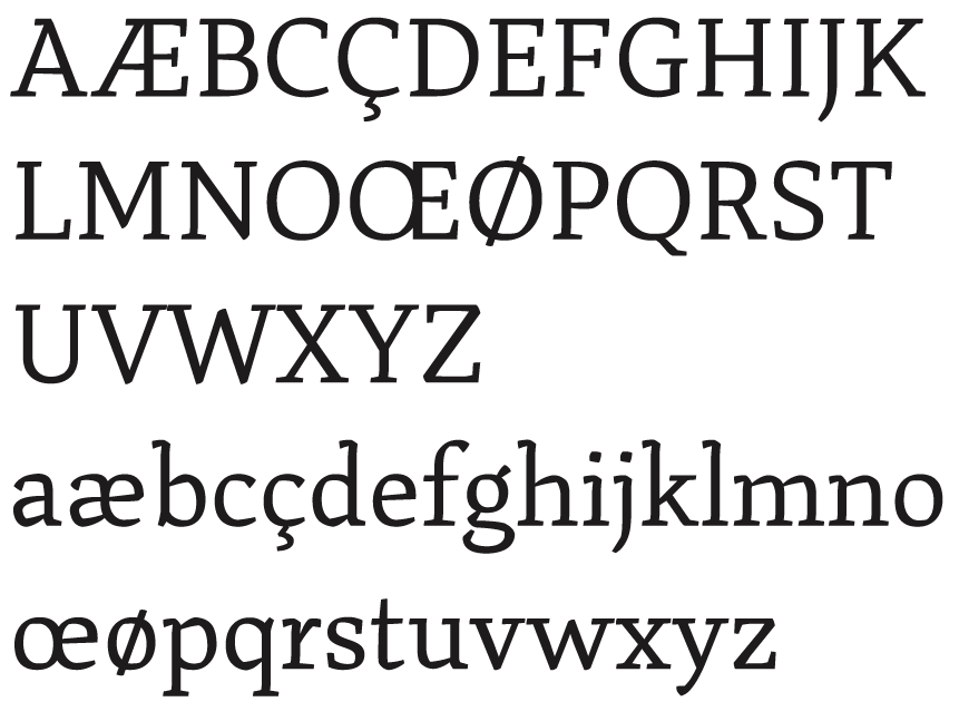
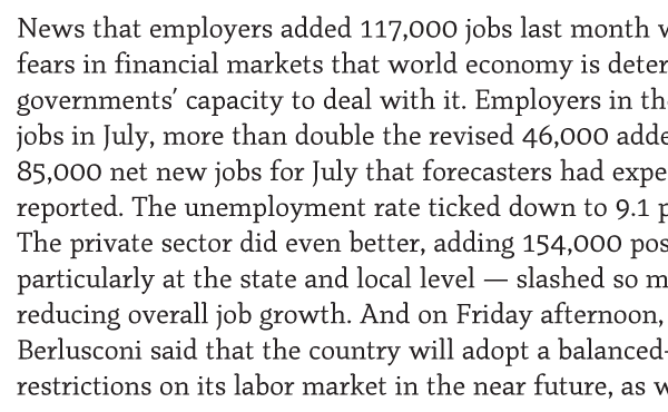
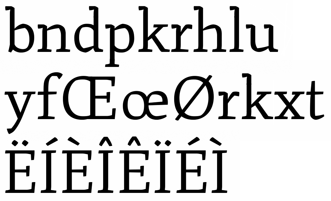
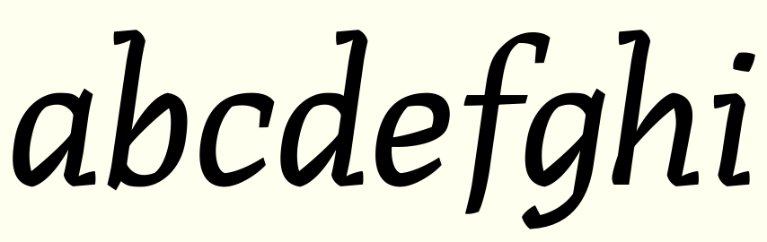
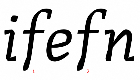
Your critiques appreciated on this one. I'm fond of text faces that manage to pull off readability with some unconventional angles and stroke intersections... so that's what I'm trying to do here. You can see from some of my sketches that I'm visualizing strokes that fold over themselves to create a little tension in the curves and make for interesting serifs, feet, etc. This is my first go at a text face so let me know if this is moving in the right direction.