Starting on my text face with Mark van Bronkhorst a couple weeks back I began by drawing a demibold and derived an ultralight from it, keeping the point structures compatible. My ultralight looked great & spaced fine on screen, but after the first test print I was scratching my head. David: "Yeah, the lighter weight looks much too big compared to the heavier weight at the same size. I get that." Pause. "But why... um. Why does it look like something Herb Lubalin drew?"
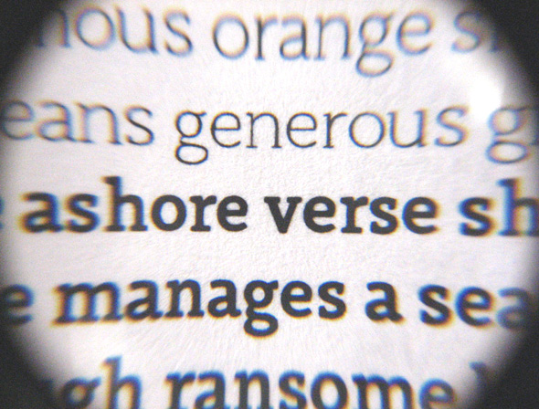
Mark: "Oh it's looking groovy?" I walk from the printer over to Mark thinking 'Is groovy some kind of precise typographic term I'm unfamiliar with?' Mark after seeing it: "Yeah, it's pretty groovy."
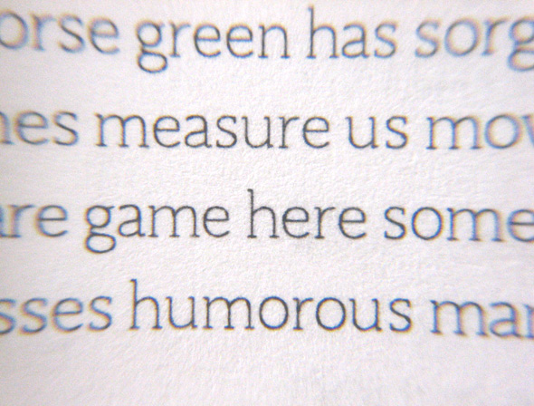
Though not perhaps used as such, in my mind groovy just as well be a precise typographic term. It would mean something like 'a condition achieved when display type appears in a text setting, looking too tight, too light, having lost much of its detail, & generally, like ITC Souvenir set small from phototype.'
In addition to spacing the ultralight more generously, I exaggerated the serifs and got into the habit of regularly taking breaks to view the monitor from about ten feet back, in between trips to the printer.
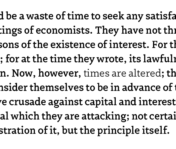
Above: The phrase 'times are altered' appears in an interpolated light weight somewhere between the ultralight and the demibold (also shown), with a little condensed thrown in for good measure.