Typophile

Stadium released

angelsanchez

Hello,

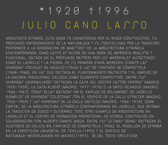
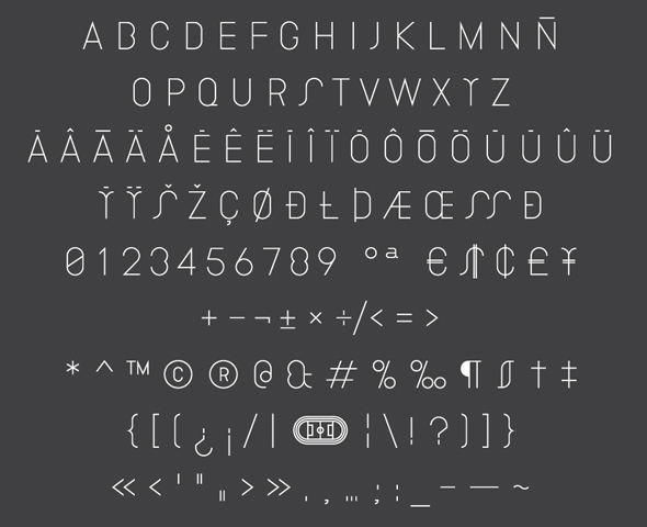
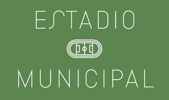
I've released a couple of fonts for the first time, and I'd love to hear to your comments. Both fonts can be downloaded for free in my web page. Both of them are display fonts, letters with no modulation, thought as a font for architectural signs.

Stadium font can be found here:

http://www.angelsanchez.eu/index.php/project/stadium_font


Thank you.

This is rather interesting. Have you had any models for that?

Very nice, can't wait to try it out!

The quirky typeface dept. has been leaving me wanting more of late, but I really like what you've done here. Quirky, but architectural and sexy.

Thank you all very much.

Andreas, I drew all the letterforms from zero. All the design process was made by hand, before digitallization. The starting point were two circles inscribed in a 3:5 rectangle. The restriction I imposed myself was to keep the centres of all the curves in the typeface horizontally aligned.

You'll find more images in the web:

http://www.angelsanchez.eu/index.php/project/stadium_font
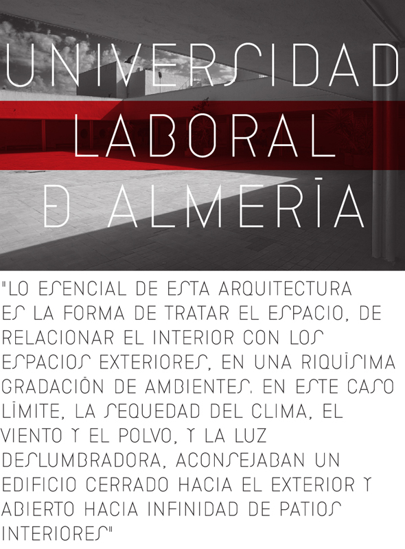
Jeremyloyd, please, let me know if you use it!

I would interrupt (internally) the slash of the zero, so to keep it even more distant from the O slashed. I also think it is aesthetically better.
Nice currency signs.

Piccic, do you mean two gaps beetwen the slash and the 0 path? Or a gap in the midle of the slash?

The first, interruption inside the zero form. I think it would make it stronger, and less crude, besides helping to distinguish it from the Oslash.

Captured from web.archive.org on 19 Aug 2013. view this capture