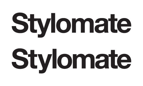
Question on kerning this logo (yes, yes, I know a logo in Helvetica Bold is the most hackneyed thing ever):
The first one on top is tracked at -50 in Ai using optical spacing. The "t" and "y" overlap.
The second one separates the "t" and the "y" but then the spacing is less even throughout.
Which one is correct and why?
Thanks in advance.