
Hi,
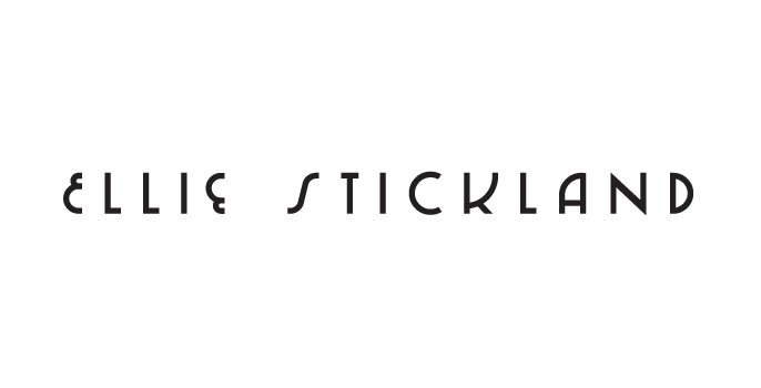
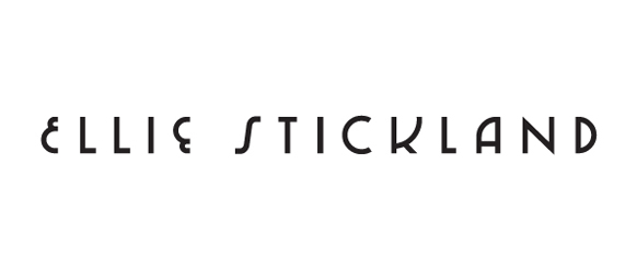
I was hoping to get some letterspacing feedback/advice on this logo. The client is pretty much set on the letterforms. Any pointers appreciated. Cheers.
Hi,
I was hoping to get some letterspacing feedback/advice on this logo. The client is pretty much set on the letterforms. Any pointers appreciated. Cheers.
slightly smaller
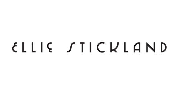

Neat! The S feels too distant from the T to me. There are some challenging forms here.
Yeah, the S is a problem. Here's a slight adjustment.
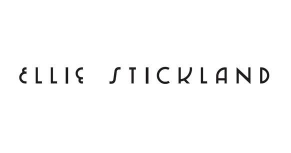
I think the first name looks tighter overall than the second. Look at IE vs. IC. Also compare EL with CK - similar challenges there.
I think you're right, thanks. The E's are much narrower than the C + K also, which doesn't help. Wondering whether to try and stretch them out slightly.

apul. Firstly, nice letterforms. Really nice.
I agree with you guys, Stickland is feeling a lot more spacious than Ellie. I would think about opening Ellie up a bit rather than trying to play around with Stickland.

I'm also seeing some weight issues, especially the diagonal on the N looks too dark.
Thanks neverblink, that does look off. Looks like the same issue with the 2nd i.
Here's another slight tweak.

I like it.
Second E slightly right. "STIC" slightly right, K as well. Both Is and N diagonal too dark.
Thanks lucifer - this was the adjustment.
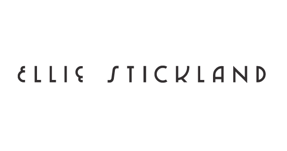
Have you considered making L & T a bit wider? I suppose you looked at ITC Busorama for some inspiration?
I've made a few adjustments if anybody is still interested. L and T slightly wider - thanks Luma.
Captured from web.archive.org on 5 Aug 2014. view this capture