Typophile

Feedback PLEASE?

XssPirito

Hello guys, I'm designing a font (I'm new at this) and facing a dilemma of how to execute some of the capital letter so they are consistent with the rest of the font, please see attached.

Can you put mi into right direction as of which of the K M N W X Y Z sheould I sue.
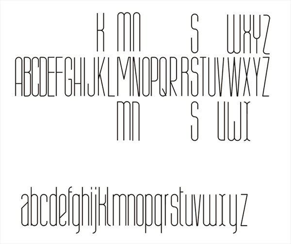
I think it's a matter of personal taste, but I would generally go with the topmost, except to keep the normal Z.

Thanks cerulean

For the /K/, I'd try something based on the I< (look at Meta for example), style construction to minimize the dark spot (if that makes sense).

JamesT, that that makes sense :) Will try that as well, how about the over all font ? I know it's raw yet but ... any thoughts?

Too tall.

I wonder if the median horizontal bar of /K/ and /X/ crossing should more closely match /B/E/F/ (I assume you chose the upper variant, excepted /Z/).
I don't know if it's too tall, but certainly I see /f/ and /t/ suffering.
/i/ and /j/ shouldn't have same x-height?
an finally, I'm not into /x/ form.
But in general I truly like the font face :) let's see figures!

Captured from web.archive.org on 14 Apr 2015. view this capture