Hi everybody,
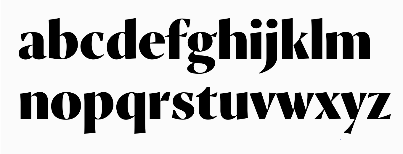
Sensato is slowly but surely comming together. Underneath are the lowercase of Sensato E Black. Uppercase is under construction :-) ALL feedback is much appreciated.
Cheers,
jasper
Hi everybody,
Sensato is slowly but surely comming together. Underneath are the lowercase of Sensato E Black. Uppercase is under construction :-) ALL feedback is much appreciated.
Cheers,
jasper
Oops, sorry for the wide pict. Ctrl-click > view image, should do the trick.

Oh my gosh! this is brilliant! /xyz/ blew my mind! Nice job, Jasper!
I agree with the first part of the above comment. You really nailed it with this one. But "v" and "w" look a bit unnatural and distorted to me, as well as (partly) "x".

Lovely. Check out in small sizes if the spur on the f is big enough. The right one as in t is not really a stroke going through the stem, rather an ›add-on‹.
Thanks guys :-)
This shouldn't, and probably won't be used at text size. I should create the extrabold, using interpolation to check out the spurs on t f g.
I can understand that w looks distorted, but nothing can be about it. What's wrong with v x?
for "v" - the same thing as "w".
and "x" is OK, actually.

Jasper, this is hot stuff. I’m looking forward to the release!
Thanks Frode. I'm gonna have to disappoint yu on that one. It's gonna take sround a year before I finish the typefamily. Furthermore, there's a chance that I'll be selling it with an exclusive license for 1 to 5 years, meaning in the worst case, public release is due 6 years. In the mean time, I just keep working :-)
Even better. I'd love to see you get paid for your hard work.

v and w seem too narrow. This especially goes for v, which looks like a y with the tail cut off. I would make them wider, adjusting the weight of the stems.
I though this one was used for the of "Forbes" magazine logo.
http://images.forbes.com/media/assets/header_baked/forbes_logo_main.gif
Nice Sharing....Thanks
I really like it.. and only if made a hard effort to find some little details just to be sure that's the better option I could pay attention on /v/ and /w/ looks them a very little bit slanted to right, so the right outter space of /v/ looks bigger than another gliph, but I could survive with that and I loved it anyway.. I would like to see the rest variant of this family I think could be so great and a really finest typeface.
Captured from web.archive.org on 15 Apr 2015. view this capture