
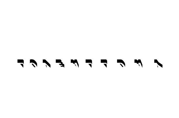
Also: Legible? My brain puts it together fine but I've also been staring at this typeface for a while.
Thanks!
Also: Legible? My brain puts it together fine but I've also been staring at this typeface for a while.
Thanks!

I got it, but didn't understand why it is upside down. Is the kerning supposed to get looser to the right? I guess I would need some more info to critique this as a brand identity. Right now, I am just confused as to what it is all about, but slightly intrigued too.

LOVE ALL DAY, but it took me a while.

If this is to be a logotype, normal (non-type) people do not have mirrors inside their heads for this kind of thing!
Spacing is much tighter on the left than on the right. It's hard to judge kerning until the spacing is even throughout.
A little context: This is for a new record label focused around ambient recordings, so it can be a little bit out there, assuming (by nature of the project) that the audience is more design literate than the average bear. My goal is not instantly recognizable, but hopefully decipherable within 10 seconds. I have it treated on the label a bit differently to where it can only be read while the record is playing. Quiet transmissions.
It is intended to be progressively spaced out (like the music), and want to make sure that it looks like an even progression. I also don't want to start too tight on the l-o-v nor get too loose on the d-a-y, which makes the job a bit more difficult.
The reason for the upside-downness: I want the viewer to look up at it. Like hot metal from heaven.
I like the idea. Coming back to the question of legible though: either because of, or in spite of the fact that I'm a designer, at first I saw the shapes as alien (there's something Arabic about it at first) and so I'd be very wary of alienating people...if there's too much figuring out to do, people give up and feel bad.
I definitely see an alien, arabic form to it, and to me that's its strength! It's very much like the music, in which familiar sounds become alien, but the harmony of all the elements keep it from alienating the listener (or registering as just plain noise). I certainly don't want people to feel bad! I want it to be more of an a-ha! experience that ends positively and leaves the viewer feeling a bit more clued-in. I'm assuming from the viewer a heightened state of visual receptiveness in the same way they need to be open to new sounds as a listener.
I'm also considering how people will be accessing this logo, which will, for the most part be from a spelled-out URL. So it will be less about what it says and more about how it says what you know it is.
...and I think we DO have mirrors inside our heads! We can watch TV sideways and read AMBULANCE when it's flipped...
In the context you are working, I do think that the initial confusion works OK. I think you actually have too many concepts here. The tracking increasing from left to right is too subtle, and in my opinion not a very compelling concept. I do like the idea of meditating to find the text among what initially seems like an unknown script, and I think it could work as if we are looking up at the letters, but I think that could be accomplished without it oriented as if we are looking at the back of the letters. Hopefully that helps!
I appreciate the feedback.
Luma: I think you're right in that it's doing one too many things, and spacing the letters evenly is the right move.

i would try to incorporate some ideas that make up ambient music. To me, the music is more about the textures and the synergy that is created when those textures overlay. Though bare in mind, that when I say that, i'm thinking of artists such as Jefre Cantu-Ledesma, Rafael Anton Irrisarri, Deaf Center, Tim Hecker etc.

Might wanna tweak the perspective a bit? Not sure hmm..
Haven't read it all but I think I kinda like the concept.

I couldn't get it. I had to cheat and read the thread. I like the idea, but not sure you need to go the extra step of flipping it. It looks quite nice right-side-up.
Captured from web.archive.org on 23 Apr 2015. view this capture