Typophile

Baseline grid and spacing after subheadings

slivers

I’m designing a book of poetry with all the text aligned to a baseline grid. Just a couple of the poems have sub-sections with titles. I don’t seem to be able to select a spacing after those subtitles that looks right to me and still keeps everything on the basic grid—though I can keep it to a twice-dense grid so that the lines “come back” a little later.

What do you think looks better: losing the baseline alignment for a part of a page, or having unnecessarily large spacing after a subtitle?

(I’m talking about Garamond 10.5/13pt text with a 6.5 pt space after the subheadings, which are Garamond Bold 10.5/13.)

Thanks!
-Courtney

The "twice-dense grid" will grant you the best control.
Or you could leave no space after the subheadings, since they're already bold.
(If they span multiple lines, in InDesign you could apply the "Align only the first line to the baseline grid" option)

Yes, I did try it with no space, but it looked confusing since there are breaks of 13 points between stanzas of the poem, and not having a space between the subhead and first stanza of the section made the title seem to refer only to that first stanza, not the whole section. BTW I also have breaks of 26 pts after the poem title (Garamond Bold 13/13pt) and before each new section subhead.

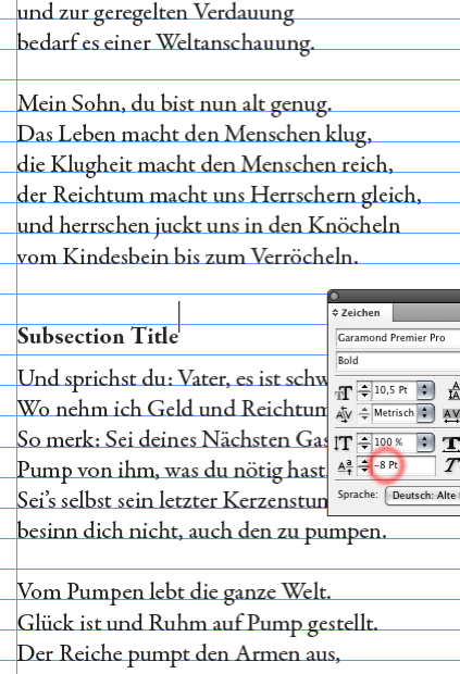
Have you tried a baseline shift for the titles?

Florian, what do you mean?

Genius! Thank you!

You are welcome.

Florian, I should have asked you -- did you come up with 8 pts for the shift based on any special calculation, or did you just eyeball it?

That was just a random value, to demonstrate the principle. I would have a look at a printout, in order to determine the exact value. Eye over math.

Thanks!

Captured from web.archive.org on 19 Jul 2014. view this capture