
The Double Acute accent, or Hungarumlaut, is a character that practically only occurs in the Hungarian language. Months back I posted a thread about it, because I feel there's a basic problem with the way the glyphs /ő/ and /ű/ are normally drawn, based on what I percieve to be a set of faulty guidelines for how to draw it. Not sure it matters immensely, but this site is for detail fanatics, isn't it? :D
The Diacritics Project claims, in line with how most faces are drawn, that the double acute is meant to be optically centred over the character. Quite a common practice is also to set the accents tight next to each other, see for instance in Proxima Nova. I percieve both these aspects as "wrong" - I admit from the start - because the diacritic is used as a "long" version of the umlaut, and should therefore as far as possible be spaced apart as much as a diaresis, and also (because it's "rooted" in the umlaut) lean significantly to the right, not optically centred but right of optical centre.
I was on holiday in Hungary recently and took the opportunity to photograph some signs around town with double acutes on them. I decided to focus mainly on lettering, because this I think gives a good impression of how people "instinctually" draw the glyphs. But let me start with a stickerier tale of two /ő/s:
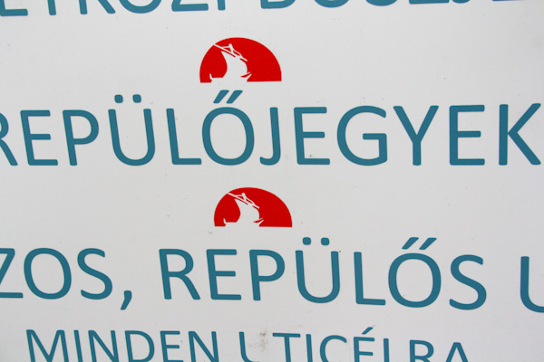
Now, this is clearly not lettering, but I think it reflects the dilemma quite well: In the top row, the sign maker has put the diacritics off the stickers as originally intended in the typeface, close to each other and optically centred; in the bottom row their feel for the writing has slippd in and they've spaced the diacritics wider than intended and put them futher right. I saw plenty of other examples of this "mis-stickering":
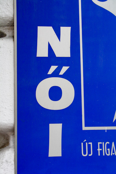
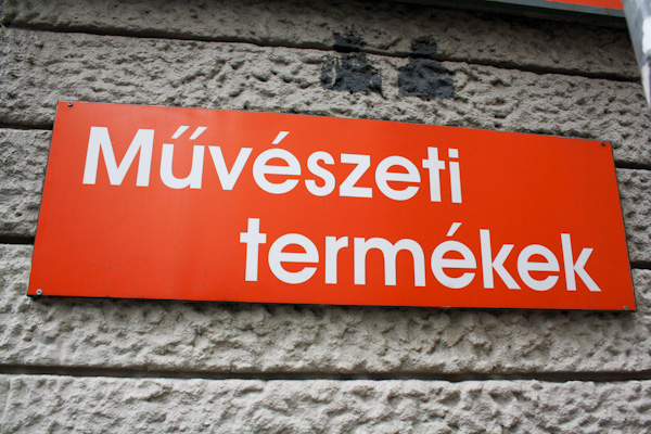
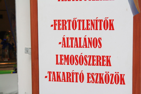
The last one is tight but still "too far right" by convention.
Most extreme right-misstickering I saw all trip:
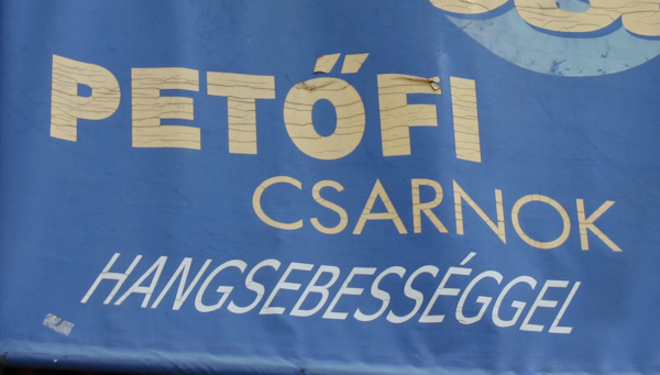
Thing is. When taking pictures of signs my original impression of what was "right" or "wrong" got several more complications. To be fair, there are examples of several kinds below - pure lettering examples, some draughtsman's lettering, some engraved, some digital, some hand-painted:
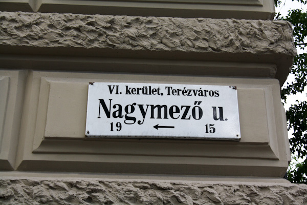
Traditional Budapest street signage. BIG accents, right-leaning.
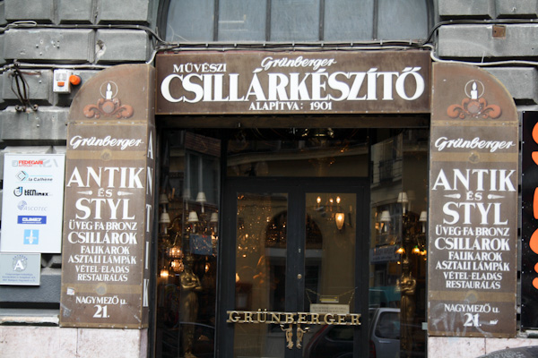
Sort of a counterexample, but still clearly derived from and related to umlaut - low, flat, centred.
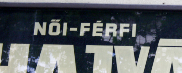
Another sort of counterexample, but again clearly related to umlaut in shape and placement as before. This one is actually left of optical centre!
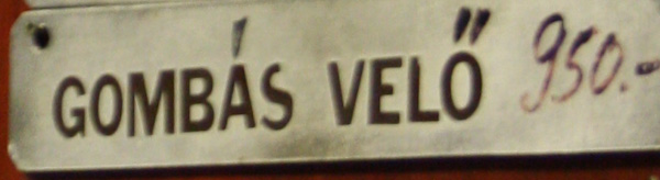
Some ****-off accents right there!
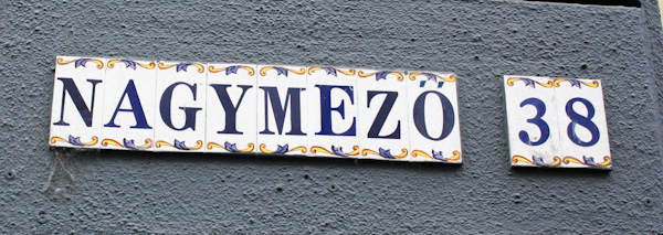
Sort of centred, but very widely spaced apart.
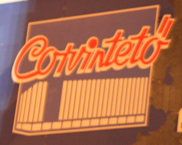
I realise it's script, but look how far right it goes compared to convetion! It also introduces another (still, I want to point out, umlaut-derived and related) variation I saw quite a bit on the hungarumlaut theme:
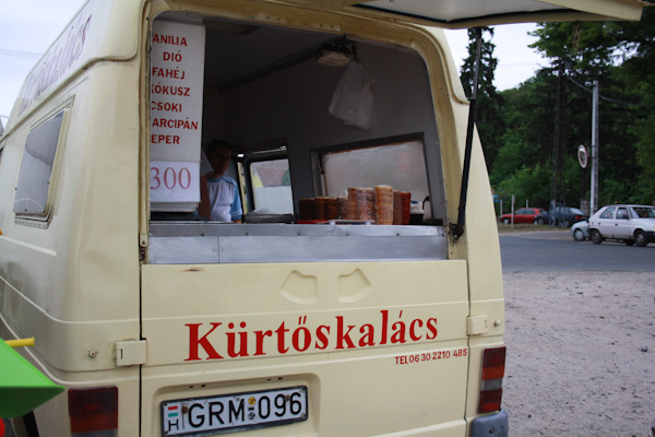
Long, tall, vertical lines for accents. The idea is similar to how they're drawn in hungarian handwriting.
(I also had this great example of DIN-Engschrift-like draughtsman's lettering with entirely vertical lines for accents, which I think worked quite well. Seem to have lost it in my directory though, can't seem to find it alas.)
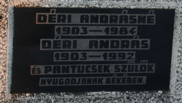
Off a gravestone. Mostly still the "enlongated style" - very relatable to the umlaut!
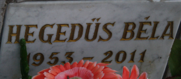
Part of a memorial wall in the cemetary. Right-leaner.
-------------------------------------------------------------------
So. What do you think? If I've learned anything it is to clearly relate the double acute to the umlaut. Am I right in thinking that?


