
Here is a project I've been working a couple of days on.
Do you think it has potential? Also, are there some similar typefaces out there?

Will post more pictures soon.
Here is a project I've been working a couple of days on.
Do you think it has potential? Also, are there some similar typefaces out there?
Will post more pictures soon.
Jos Buivinga did something slightly similar.
http://www.exljbris.com/geotica.html
I've seen it actually, and yes, the same idea with the engraving.

> Reinstaedt.
I recommend you first working on the basic letterforms in order to get them sound. Then apply modification (engraving).
@ Andreas,
Great work, and good advice.
lowercase is ready.

what do you think?
a major rework+ some caps added:


I like the new slanted counter. But then s should be revised accordingly.
And I liked the previous contrast better.
The main reason I changed the contrast was to make the serifs more visible, but I will experiment with it some more.
And what do you mean with "revised accordingly", about the "s"? can you give me an example?
I was thinking something with this kind of construction:
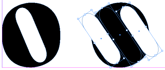
:D

@riccard0 I will definately try to make it work...
the new s - much better than the old one...

:-)
Dificult to say seeing it so large, but maybe it's a bit top-heavy.
Also, some curves could use some smoothing.
I finally had some time to work on my typeface again:

(quotes by Mark Twain)
Revise c, f, g, k, w, … –?
Why k and g?

Probably because /k/ thin arm is quirky.
And /g/ because well... it isn't tasty yet. Lacks balance.
/t/ looks more like Polish stroked /l/ that actual /t/. Fix the crossbar (on /f/ too) and make whole letter shorter.
The dot on /i/ is too big.
"Unclog" bottom part of /c/. It doesn't need a spur there.
Very helpful feedback.
Drop adain in a couple of days to see the result.

After I redesined the "f" and the "v", the typeface started looking like a cursive one. And that seemed like the right direction, so I decided to redesign some more characters to fit the new look and then slant it a little.
I also started working on some alternative characters in order to make my tipeface more interesting. I am really curious to hear your comments.
Nice. How about making the q_u ligature less straight, more akin the right side of y?
Might be a good idea.
Do you have something specific in mind?
I originally had similar ligatures with b, d, k, l. I dropped then, because I couldn't make them work, but I still think they were a good idea.
What's with /qu/? Looks like a glitch.
Thinking about redrawing the "t" (it is too different from h, b etc.). Any ideas?
It should be different from /b h/ - so for me it's good as it is.

To me it is the /o/ that feels odd because of the strong back slant.
Thanks for the feedback, luma. I'll consider it.
The backslant is made in order for it to form 90 degree angle with the lines that connect characters to one another (dunno the term).
Thanks to all, who participated. All your opinions were considered and all characters are finished. Take a look at the pdf specimen.
When I say "finished", that doesn't mean that I am no longer interested in your comments. I need feedback more than ever.

This is coming along nicely.
Caps height strikes me as quite short.
Top ball terminals of /3/ and /6/ look too big to me.
/E/ and /F/ crossbar is awfully short!
/G/ might need more of a crossbar - looks like a /C/ to me.
I wonder if the ampersand should be caps height instead of ascender height.
Did you try an /@/ with the ring staying thin all the way around?
Inline whites of asterisk are too small.
Thicks of /O/ and /Q/ look too heavy to me.
Are those connector pieces added with OpenType code? How does it look without them?
Nice advice, and right on the spot with most of the stuff. Click.
about "@": I tried, but it looks even worse than this version.
About connectors: Are you asking because you don't like them, or are you just curious?
One more specimen.
(this was done before I updated the "o")
About connectors: Are you asking because you don't like them, or are you just curious?
Just curious.
I'd try a /G/ with a thin crossbar coming out on the right at a diagonal.
Connectors are part of automatic stylistic alternatives. You can see an example of my typeface without them, around the middle of this thread(an earlier version).
And I can also show you the code if you are interested...
Didone or not?

Share your opinion.
I'd work on the /one/ it's rather unreadable compared to rather clear other numerals (could even be an l with a left swash).
Why is the /t/ minimally cut off a the top-left? I'm not convinced by the transition on the top bar of the /7/
@DieBuche You managed to spot all my faults. "t" was a challenge from the beggining, in fact, if you scroll up, you will see that this is the third redesign The first version looked good, but didn't look like a "t" at all, and the second seemed perfect as an individual letter, but less so in comibination with other characters i.e in "th"). I am with you on 1 and 7 too, but I couldnt come up with better ideas.
is this live?
http://new.myfonts.com/fonts/boris-marinov/alecko/
/Space/ is too wide. Ouch...
@Luma - Yes.
@Minerva - too late.
My typeface is featured in the Typedia blog. Thanks again for all who helped me with their feedback.
/Space/ is too wide.
too late.
You can (and probably should) update it.
Come to think of it, I really can...
Captured from web.archive.org on 16 Apr 2015. view this capture
