Typophile

Magenta typeface

Mark Davis

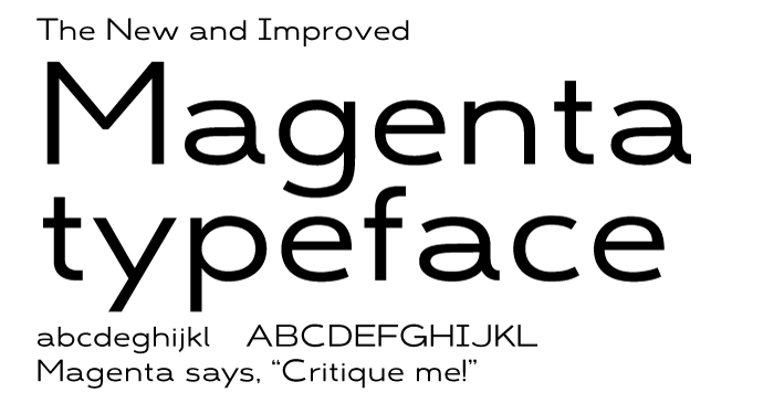
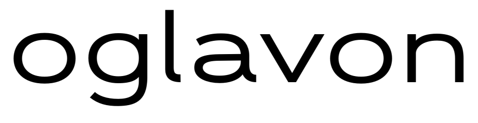
Magenta is an extended geometric sans serif typeface designed for legibility at larger sizes (not sure about body text).
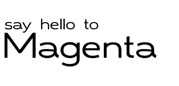
This is my first type design, and i'm excited to hear how to make it stronger.
Please, critique every last thing, because this needs some work, specifically width of characters, styling, width of strokes, everything.

I drew from typefaces like Gabriel Sans, Salvo Sans (esp. Salvo Sans Black), maybe Neutraface (subconsciously hehe), Futura, Gotham.

AttachmentSize
Magenta spec sheet update 7-16.pdf33.9 KB
Magenta update 7-17.pdf34.04 KB
Magenta update 7-22.pdf34.38 KB
Magenta update 8-30.pdf41.48 KB
Magenta update 9-22.pdf52.08 KB

Really not bad for a first go! I'm not a pro so take my comments with plenty of salt and sugar.

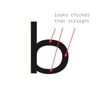
I'll come back later in a day or three with a more expansive crit, but there are two main things that poke my eye. Spacing is too tight and rather uneven. I'm only slowly learning spacing myself, but I reckon you can open it up a lot more, even for large sizes. The other thing is the stroke thickness. On the whole, it looks rather monoline, which I'm guessing is what you wanted. But look carefully at /b/ for example, and you'll see that where the bowl meets the stem, there are quite dark areas that mess up the overall colour. I can see you've already noticed how your inspiration typefaces have dealt with that problem, but I'd take it a little further.

Ok, two more observations. You've angled the top terminals of K and N but not L. (And similarly on I but not T.) I don't understand the logic, and frankly don't think the angled bits add much to the design and personally I find it distracting. Following a similar idea, look at the terminals of your uppercase and lowercase Cc and Ss...the counters in one case are much more open and the angles are cut differently.

Ok, those are my general observations. Hopefully I'll be back to think about individual characters.

thanks! I'll look at the characters you mentioned, can't wait for further critique!

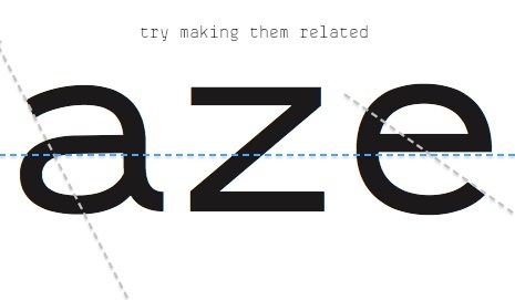
First thing that catches my eye is /a/. It's bowl seems unbalanced and middle horizontal bar needs more logic: why is it a curve when other bars are straight? If it's intentional, then why this angle? Such questions about style's unity are irritating the unconsciousness - like Arial's unknown angle terminals :)

Can't see the combos here, but /J/ seems too wide. Try /LJ/ or similar pair to test.

Is /m/ made from 2 unchanged /n/'s? It might work to condense it a bit.

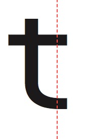
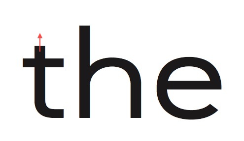
/t/ bar's right edge most of the times is supposed to be same width as a terminal.

/G/ angled leg is the only such one. Again - breaking the stylistic unity.

/M/ middle connection is a no-no.

And it's better to upload curved .pdf's - that way people can zoom in at desired level in browser - no need for an image app.

Interested to see darker weights :)

Here is an update! Thanks for your critiques, it’s looking REALLY GOOD! Keep ‘em coming ; )

Update=PDF at the top.

Hi Mark, I'm sorry I don't have the chance to look thoroughly at this for the next few days, hopefully at the weekend I'll have a bit of free time. In the meantime, think balance, contrast and tension...if you manage to make every decision based on those lines of reasoning, you'll be going a very long way. This is a real improvement, and it shows a lot of promise.

One thing for now is that you've got very unusual proportions between the uppercase and lowercase. I think this can work but look what happens with 'Ma' in terms of the comparative counter spaces between this version and the previous one. Also, check the lower join of the bowls of /d/ and /a/ for consistency.

Oh, off the top of my head, i think “M” would look better if it was wider? right now it is just taller, but it needs to be balanced out with more width (and a lower middle connection) to balance out the diff. would you recommend that I make the bowls for bdpgq more extended so that they match the more subtle curve of the a?

oh, an you can do what you need to, and take what time you need. I'm just excited about everything!

Nice!

For inspiration I recommend to also check Frantisek Storms Zeppelin if you haven't yet.
http://www.stormtype.com/family-zeppelin.html

also for the letter I check http://www.radimpesko.com/fonts/fugue

Since I don't have a long history in design I rather not comment too much on details.

Inspiring work!

Thanks Jaakko! wow.. definitely never seen those fonts before, but i can definitely pull from Zeppelin 42.. love the sizing of the caps compared to the lower case,

Fugue has interesting character.. the I is something i can look at, for sure.. Thanks for sharing!

Now /a/ looks way better!

/M/ short middle connection creates an optical illusion of diagonals getting narrower in the middle. It makes letter look fragile too.

To human eyes, same width horizontal lines look darker than verticals. So there is balance work need to be done. Some examples:
/H/ bar and /b/ bowl top/bottom look darker than verticals.
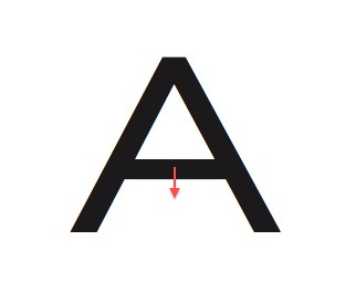
/A/ bar looks narrower than diagonals.

/&/ "falls" to the left.
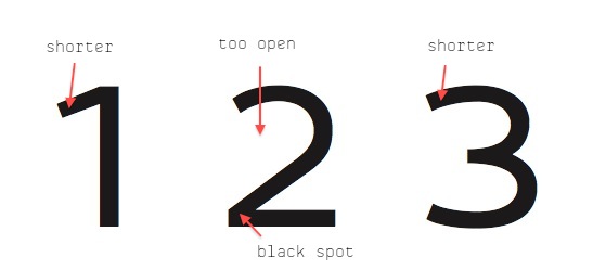
/1/ is too short :)

Use some font identification service and always keep looking look for analogues (similar fonts) everywhere:
1. It helps to avoid unintentional copying.
2. Analysing analogues helps solve various problems and questions about your own font.

Thanks Eimantas! The font identification program gave me a lot of grotesk fonts and Antenna light (I’ll take that as a complement..)

something that I don't quite understand is shaping of the bowls of the /dbgqp/.. should they follow more after the curves of /a/, or more after an /o/? or is it a sliding scale between them both to make continuity and distinctive style:

Cillian seems to match the the curves of /d/ to /a/, as does Antenna

however, neither Gabriel Sans nor FF DIN does so, in favor of more conventional letterforms (Grotesk-esk) all the while not pushing letters to unusual or uncomfortable appearances.

It seems the former makes typefaces that are distinctive, since traits are carried through to more letters, while the latter make more “accessable” typefaces since they are more usual. If my purpose was to have a recognizable typeface, but not to the point of uncomfortable letterforms, which side should i err toward?

Also, how does the darkness/line-thickness of /o/ look when compared to the rest.. I'm not sure if it's too dark or not.

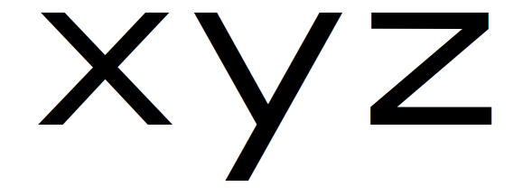
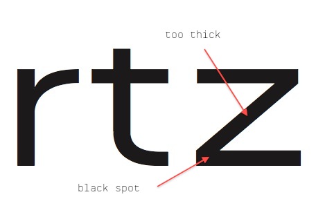
It's looking good. The /o/ looks fine but the /x/ and /z/ stand out to me as too dark.

Also, both the /o/ and /O/ seem heavier at the top and bottom, as opposed to the sides; I assume this was intentional? The /p b q d/ seem a little awkward where they join the stem. Maybe you could try moving the top and bottom most points on the bowl a little further away and making the change in the stroke weight a little more gradual.

All in all, it's coming together nicely.

here's what i did with d... that's a great improvement, thanks!

Yeah, I made /Oo/ unconventionally so they look more geometric but wider, like the rest of typeface. If it's too distracting, i can make the sides a little heavier. Do you think i should?

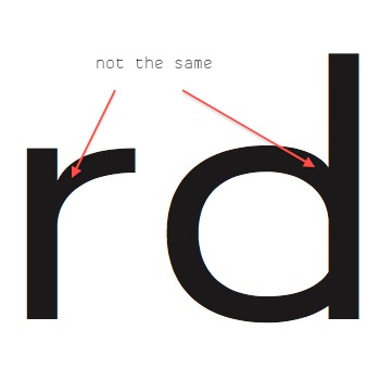
What I meant was to look at the way the bottom of the bowl of d thins towards the stem, it looks like the same area of a is treated differently, though they're the same feature.

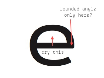
In the latest sample, the bowl of d and the curves of e look quite different..d looks more symmetrical and e more humanist.

Regarding the /O/, I just wasn't sure if it was intentional or not. The change in /d/ seems to reflect the intent with the /Oo/.

Ok, thanks Ben:
Geometric /e/

Fixed the constriction of the top of the /e/
Is the flexed bowl with a perpendicular terminal at the bottom of the /e/ considered humanist? I wanted it to match the bowl at the top of the /a/

Thanks for the clarification James.. I have only observed the rules of type design, and wasn't sure if that was a hard and fast rule or convention.

Another core principle of font design is:
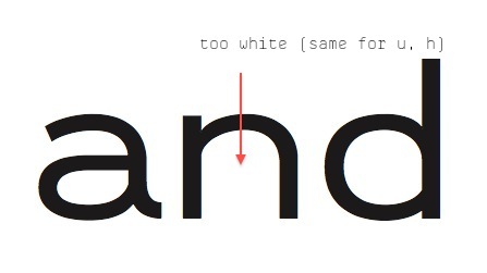
The counters (inner white spaces) should have same volume (or LOOK like that) across all lowercase or uppercase. In other words, optically there should be equal amounts of inner white space in /b/, /o/, /e/, /n/ etc.
Right now, /b/ seems too wide, /e/ seems to dark.

Yep, just realized last night that the the counters weren't matching after I made the change to the /bgqdp/. I like the width so much, i made all of the other letters wider to match! Also changed the darkness of the e.. and i'll get to the /nmh/ later.. would the /s/ have to change as well, since it is often a different width than /opgbqpae/ and such?

do you have any tips for looking for identifying consistant darkness, because I keep struggling. =)

Lower the monitor (background) contrast, squint your eyes and move back from monitor.
By doing this, /b/ in the picture still looks too white.

And /s/ is a tricky part - you'll have to trust your eyes, not the numbers.

Anyway, it's getting better and better. I'm starting to like this :)

(Why I can't edit posts?)

Also don't look at individual letters - try to view word "as a whole".
For me it helps to look somewhere slightly above or below it.

That's a great idea Eimantas... I'm always just tinkering away with the letters that seem to have a problem rather than seeing if everything is cohesive.. I'll definitely try that! and thanks for the screen contrast bit.. that's already helping i think.

One more thing I remembered - it's often a good practice to use foreign language words.
We tend to associate our mother tongue words we see with their meanings. And it becomes more difficult to look at letters (or their sequences) as pure graphic elements.

(I know, it's kind of meta - but right now I don't know how to explain it better...)

Here's what I have.. I worked on /nmu/ so their open counters are optically equivalent to the counters of other letters.
worked on /e/ darkness counters compared to both /a/ and /o/
took off the tail on /l/ (copying Akkurat for little reason)


yes i know i misspelled doppler... whatever. =P

That's a great tip Eimantas.. would it be a good idea to look at individual letters flipped on their x axis so that the meaning of the letters is even less of a factor?

Absolutely. Flipping, mirroring, BW inverting - all these "routine breaking" things are good (but you don't want to be designing letters upside down all the time though). :)

/m/ is too condensed.
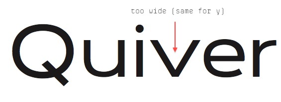
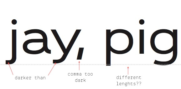
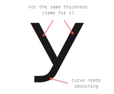
/y/ right bar is too dark.
/t/ bar and /r/ terminal heights don't match.
/t/ bar looks darker than /e/'s.
And I still would condense /d, p, q, b/. Letter /o/ should be the widest of them.

I know how in beginning it is fun and easy to work with modular constructions (o+l = b, d, p, q) (n = u, r, m), but it hurts legibility and most important (especially for such semi-modular, non-decorative fonts) makes them less warm and interesting. My two cents.

Ohh... lol i was trying to make the open counters put together equal the open counter under n hahaha...
Actually the bowl of /dbpqg/ are different at the connection to the ascender/descender.. but i thought almost exact copying of parts of characters was a usual way of creating continuity through all the characters.

Also, didn't know /o/ should be widest compared with /dgbpq/.. working on it!

And thanks for the encouragement to take the hard but rewarding route, instead of the easy route.. needed that!

Yea, (maybe it was MY bad explaining) I was talking about letter's whole inner white space (both enclosed and open).
In very decorative and very modular (therefore hardly legible) fonts, copy-pasting works well.
In more sophisticated designs like yours, you have to trust the eyes, not raw geometry.

P.S. It can be anyway you want, but fore me /l/ tail gave the typeface one more stylistic feature (and not being just a bar) + it would help to differentiate "Il1" combo.
For stylistic unity /a/ also should lose the tail, but then it would look more boring. :/

I think you're right.. i'll un-nix the tail.


any more tips on the bowl and descender connection? It's looking dark there, but I'm trying not to use inktraps to lighten it up b/c they break the geometry..
should it be a small inktrap?

PS Also, when I make the bar in /e/ match the bar in /t/, it looks to heavy compared to its eye.. should i split the difference between the 2 widths so both match, but /e/ looks happier?

Updated alphabet spec sheet at top.

Just try moving the lower connection point up a bit too see what happens. Again - not the geometry, but eye judgement is important here.

The bars HAVE to match - you can't have different stroke widths.

Lol, why sometimes I can't edit posts?

/o p b q d/ looks better!
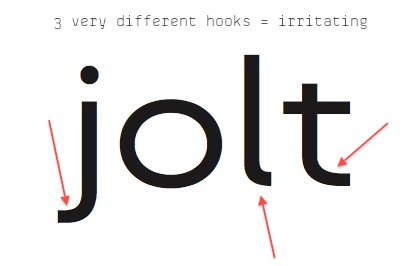
Now /j/ falls out of style. Connect it with either /l, f, g, y/ or something.
/y/ upper inner space is unbalanced (asymmetrical).
/x/ has too evident "pyramid" shape.
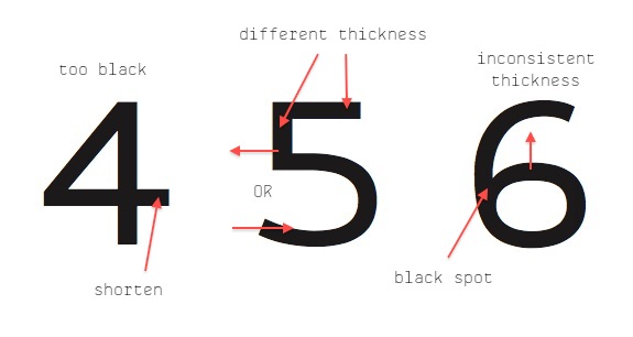
/2/ diagonal is too thick.
/3/ connection has to move higher.
/4/ diagonal is too thick.
/&/ is falling on it's back.

I still have doubts that wide /J/ - I myself always try it with "ALJAZEERA" or "ALJANS":)
And I would make /I/ narrower - to differentiate it from /T/

I'm a bit worried most of the comments are mine - it can lead to subjective results.
Also I highly recommend getting hold of Karen Cheng's "Designing Type" - it's an anatomy analysis book for every letter (serif and sans) + most of accents and punctuation. The book even has sections about spacing and kerning. You can get a used one for cheaper. It will help you in a long road.

P.S. and by "lower connection point" I mean "outer connection points" (can't edit previous post).

i haven't been working super hard on the numbers and /&/ yet just trying to get a start on them, but I will polish them a little

I already changed the width of the horizontal stroke, because it felt wide, and it didn't match the width of the horizontal stroke of the /a/ and that letter's my baby.

Im putting bars on the top and bottom of /I/ so that it has character. Most sans serif fonts do that, and with mine, it will help make the I look more extended like the other letters, but you're right it should be narrower than /T/

working on your suggestions..

Apparently I'm having trouble editing too...
Looked at other fonts and realized that J was narrower than L! wow!
Working on it..

PPS Karen Cheng's "Designing Type" book.. looks facinating!! I've bout a couple of type books but none are about design..

So i've worked on the /xy/


How's that?

Also, do you have any tips on punctuation letterspacing? Should /’/ be kerned close to letters so they aren't distracting? Should I use kerning to automatically place periods close under letters?

Ohh, just made a big connection.. darkness of a letter is not only defined by the thickness of the line, its how big the counters are in comparison! ohh, duh type is design with BOTH the positive and negative shapes in consideration..

Oh my, I think I have to apologise...
What I mean by "same width bars in /t/ and /e/" was same VERTICAL width = thickness.
Words - the source of all misunderstandings.

/x/ looks better.
/y/ looks better.

What about giving /d/ a tail?

Period is about the same size as dot on /i/. And it has to connect to to that shape too.
Can't tell much about punctuation spacing - just make your eye judgement. Of course the will have to be kerning involved for specific letters.

One thing that is important to know: some fonts advertise themselves by having thousands or gazillions or kerning pairs. Don't be impressed much - it means that their metrics are bad, so they require so much kerning to fix that. Even 500 pairs can be enough for properly spaced fonts that have all the accents and punctuation kerned.

A tip for kerning that I try to follow: less is more. Like Minerva said, try to fix most of your spacing issues with metrics and use kerning sparingly.

Yeah, i knew what you mean about the /t/ bar


should the /e/ be narrower than the /o/ and /a/?

Thanks for the reminder about kerning pairs.. when i started 3 months ago I made all the metrics the same and kerned the difference haha, now I understand what metrics do most of the work, and kerning is for the exceptions.

I'll try a tail on d.

Nice work on /j/. I just would shorten the hook a bit to differentiate from /t/ and /f/.

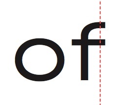
/f/ right side of the bar has to be aligned with terminal. Same goes for /t/.

About /e/ width - again, the equal inner space is the waypoint. And it looks almost fine as it is now. When put along /a/ it looks s l i g h t l y bigger, so it may help to narrow /e/ a bit. But it's nitpicking.

/K/ has problems:
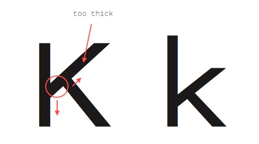
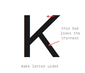
Middle diagonal is too thick and it's height doesn't match capital height.

Try raising /R/ bowl to differentiate from /P/.

Is /L/ bottom bar as long as /E/ counterpart? If yes, it needs to be shorter. /L/ naturally has a too much white space, so we need to solve that.

Both of /A/ counters have to share the same optical volume. The bar needs to be lowered.

P.S. There are lots of methods for spacing, most of them start with two symmetrical letters: /o and n/ /H and O/.
Start with /n/ - space between two letters should NOT be similar to bars or counters.
Then start to incorporate /o/: nnonn nnonon nnoonn nnnonoononnon.
This initial spacing is the most important, don't be afraid to spend a lot of time on it. This is your foundation for all other letters. You will not enjoy respacing everything because of improper beginning.

Important: When doing metrics, use as big letters as you technically can (pixel distortion). Also keep moving away from monitor and x-flipping everything. Squint your eyes, look slightly above letters and see whole sequence as one element.
Set a value and then undo. Did it look better, worse? Look for inconsistencies to remove.

Yeah, I saw the thread where Speikerman was talking about using the HOHOHO technique.. if its good enough for him, it'll work for me, and I was sooo helped by reading the technique about dividing the letters into 3 classes based on what the lefts and rights look like.. That's what i was doing, but with kerning, so I fixed that...

Here's /E and L and T/ (I made /T/ narrower, following the logic of the /L/) and also I fixed /G/ its arm at the top looked wierd..

Here's /d/ with and without a tail. I like it either way.. the tailed /d/ has the same sort of disarming novelty that the tail on the /a/ has. I also like the negative space in between the letters..

That tail is charming indeed, but now it seems that /d/ is better without it. Too much is too much.

It will be an alternate! Actually, is there a methodology for including alternates? like less is more ; ) or making a style set with more stylized letters?

Hi Mark, I was going to give some crit but I think you are doing very well without...often you'll find as you work recursively through the glyphs you'll automatically be balancing the forms to better fit together, and I think you're doing exactly the right sorts of things.

If you want my opinion, my main concern would be that the overall aim of the face is not clear enough. I'm not sure if this is intended as a text or a display font. Thinking through what you want the face to do will help fix the brief and determine some of your choices. For example, what's the thinking behind the ascenders being lower than the caps? I'm very much for experimentation, but something this fundamental could restrict the usefulness for some people. I'd want to put the font into the intended typographic space (a paragraph, headline, poster, website, logotype) and see how it looks before settling on these sorts of parameters. Another thing I'm struggling with is the width...is this planned to be an extended width to go with a narrower cut? Normally one would draw the regular width first, as an extended cut would be less suitable for extended reading, and therefore difficult to appraise in its own right.

I'm intrigued by the way you're blending humanist and grotesque influences here, something I'm quite keen on myself.

If this is merely an exercise in drawing letterforms, at the next level of detail I'd suggest:

Your K and k need some attention as they're not harmonious.
I can see you're attached to the shape of your /a/, but I'd suggest making the curves tauter, more defined and less flabby.
e does look a little wide to me.
I'd make f and t wider.
G has a very dark spot.
Bowl of R is rather large.
Curves and proportions of ampersand are bad.
Curves of B don't quite harmonise with the other bowls.
Does I need to be so wide?
The bowl and stick letters still look dark and spotty around the spurs; as the triangular notches are rather shallow, I'd suggest simply pushing their vertices further in towards the bowls.
Numerals look interesting, maybe try bringing in some of that funkiness to the alphabetic characters?

I hope this doesn't put you off, as I can see you are developing an eye for good curves and I think this has potential.

New PDF spec sheet at top!

Thanks Bendy! I appreciate your critique! Let me apologize for the state of the /&/, I haven't been working that hard on it, but i will be improving it. You have not deterred me in the least!

To begin with the Cap-hight versus ascenders, (to quote Samuel Johnson) “Sheer Ignorance.” I started it as such and i thought it looked good and different..

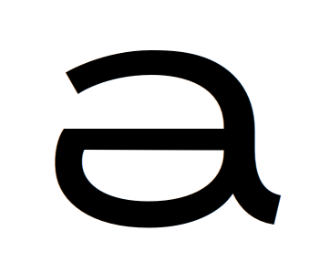
The reason my /a/ is flabby is because I trying to make a distinctive /a/ letterform. When I started the typeface, i was scribbling letters and I made an /a/ that looked like this..


It didn't do well in anything other than very large display sizes, and even then It was very grating to look at, so I adapted it to what it is now so that it would feel like the letter i made originally, but be more accessible.

I do realize that most type begins narrower and is re-drawn for extended sizes, but I saw Gabriel Sans and I loved how it was natively set extended. This font is still largely inspired by Gabriel Sans: It is fairly mono-line, is natively extended, and I believe it mixes humanist with grotesk (which I didn't realize I was doing when I started this face).

I think you're right, I haven't really decided if it is going to be display or body or logotype.. I think it would be a strong typeface for display and headlines.
Maybe some other time I could condense it so it can also be a body-text face

What changes should I make for this typeface to be effective in display and headline settings? I can make the caps less extended if they are too pronounced, i thought it was interesting character, but it might only be disregarding rules of Type, yielding unattractive results.

What Bendy said: knowing the intended purpose of typeface is crucial.
Display typefaces are used at larger sizes, so every inconsistent curve or black spot is more visible.
Big sizes allow room for details - use that.
But space in headlines or posters are quite limited, so you need to make your font economical.

This is a good starting point. All the above is important. I would go for Display. Text fonts simply require a greater understanding of lettershapes, proportions and balance. Display type doesn't have to be flawless, though off coarse, that's what you should aim for.

Give S more whitespace at the top area.
Make the terminals in C end at the same horizontal point.
Try adding a vertical (not horizontal crossbar) to C, to make G. I'm not saying it's better, but you should at least try it. It usually looks cleaner.
E F K M N P R U slightly narrower (10-20 units)
Consider a descending tail in J (goes below baseline). This also requires a different structure for the tail itself. Right now, J causes a huge white gap.
O and Q need slightly more overshoot.
Complete the numerals. Good numerals are important!
Extend the top terminal in G towards the right.
Move the lef of R towards the right.
I prefer /I/ without horizontals, but it's your choice. Look at the context.

Move the most left nodes in the bowl of /a/ down.
k might scare away potential buyers/downloaders.
Lift the dots (tittles) at i and j up.
s same as S
n m h slightly narrower (5-15 units)

Move the top bowl of & to the right
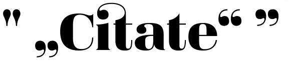
Please have a look at some other options for the comma and quotes. It needs to be cleaner.
@ too light
Move top of ? to the right.

MIND THE OPTICALS!

From now on, drop the measuring tool and trust your eyes. STARE, change, STARE, change, STARE, -coffeebreak-, STARE, change, untill ALL STROKES appear to have the same thickness. Sorry for my poor use of ALLCAPS :-P

Pay special attention to diagonals, and make sure you're zoomed in enough to avoid rendering issues.

Keep going.

Cheers,
Jasper

Thanks so much Jasper!! Really encouraging and inspiring actually.. I have been using the measuring tool too much because I'm meticulous. I'll get started.

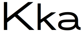
PS. new /Kk/ and working on /a/

Nowadays there is this nice trend of making both optical versions and non optical versions. So when making display, or be it body text, typefaces without too much optical corrections might in some cases look better.

Check: http://lineto.com/img/media/2335.jpg?1

I love lineto! I based some of my /a/ and /l/ off of Akkurat
I might consider taking this route.. I think I might have too much optical correction

When you design, anything really, you want to make it LOOK in a certain way. By not applying optical correction, you make it LOOK as if the strokes don't have the same thickness. Nobody cares if they ARE the same thickness, if they don't LOOK that way. Something's been done in the past without optical correction, that doesn't mean it's good. I can't think of any good reason for you to make the strokes LOOK different in thickness.

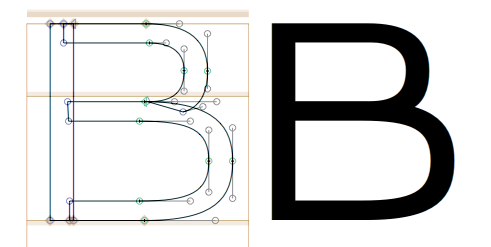
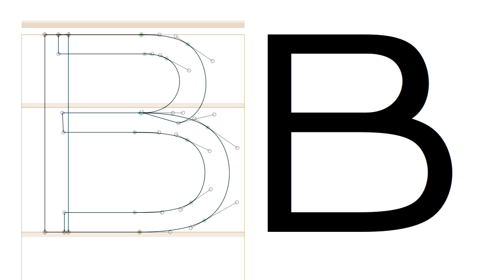
Ok. I'm wondering if I should be using more anchors, because I might not be getting the best curves possible because they are being overextended. This /B/ is an example.


Futura uses few anchors, but does my typeface need more complex curves than futura, and more anchors?
Using more nodes is challenging for me because the only way I know to make the curves at the top of the bowl match the bottom is by using the same ∆x ∆y (but reflected of course).

Try placing anchors at the tightest spots on the curves and then delete the horizontal extrema and see what happens.

Nice! Thanks a lot James. That really helps!


I'll keep going!

Just make sure you put the extreme points back in. I've found that little trick often helps with smoothing out curves (not every time, however).

Anchors? Here you're talking about nodes and control handles. Anchors have a different meaning in FL.

First, the top and bottom counters are way too different in area. Second, try slimming the overall shape somewhat. Then thin the join of the bowls. Then I'd make the curves more approximate a circle (overlay some circles in the mask layer for example), but only slightly. Ideally you want to share out the tension in the curves equally between the two control handles.

Update.

Nice solution on /J/ - have you tried longer roof?
Narrower /I/ also looks better.

/a/ could use a bit shorter roof.
/c/ stands out by being narrow.
Why /j/ descender is shorter than the rest? O.o
/k/ diagonal leg is sticking out too much.
/q/ descender tail is not tasty. Too dark and attention-grabbing.
/t/ top probably aligned to /i/ top. Could be shorter.
All the round Capital letters are WAY too big now. Overdone optical correction. It's meant to be invisible. Like cosmetics.
/H/ too wide. Look how much white spice it has inside.
Sill not sure about /M/ middle connection.
Even though it's aligned, /K/ top arm sticks out optically.
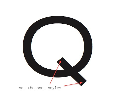
/Q/ tail needs more presence to distinguish it from /O/
/R/ bowl is too high.
/S/ too narrow? Im looking and "STU (DENT)" and doesn't seem right. /S/ looks quite small. Compare O-o and S-s.
I would use enclosed, triangular /4/. Works better with sans + more in theme with your geometrical shapes + you don't use such angled legs neither on /R/ or /K/ or /Q/.

My post was so harsh that it broke the forums for several days ^^

New Update!
I wasn't hurt by you Minerva, I'm a counselor at a camp this week, so I'm a little busier than before!
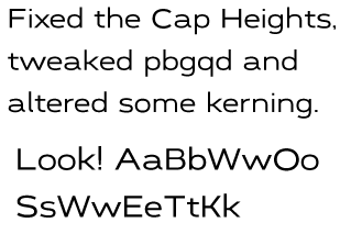
I realized that my Capitals were all WAY too big, so I made them more match the heights of the lower case (I kept the ascenders tall though).

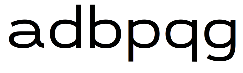
Also, I'm trying to make the /pbgqd/ letters less geometric and match the extended curves of the /a/ (which I have made less wide)
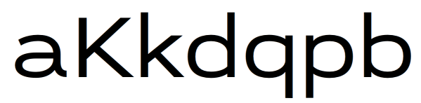
Made /Kk/ more distinctive with a horizontal crossbar so it would match the /a/'s design.

I'm trying to make the lowercase more “together” design-wise, and i'm taking some inspiration from Antenna by Font Bureau: trying to make the curves less geometric, but at the same time not as squared as Eurostile.

Ps, /w/ is looking too wide when compared to the rest of the lowercase, do you guys agree?

I changed /pbqgd/ again, and i also tweaked /a/ a little bit. Comments?

Up to you which way to take the shapes...but the (vertical) middles of your curves will need a fraction more weight to balance the straights..I quite like the more humanist joins you've got here.

You'll get more harmony between the letters (which is the most crucial thing in a typeface) if you set a paragraph and pay close attention to the rhythm of the strokes and the balance between black and white.

/g/ is shorter than /q/; it should overshoot rather than undershoot to look optically the same.

Curves on the bowl of /a/ look like they're not going hand in hand.

/k/ looks uncomfortable. Tail of /Q/ may need to cross into the bowl?

flip the bowls in p and d vertically.

Oh, like Gill Sans!

Bendy, like the /aKk/ now?

/d/ looks a little overdone now, pull back to somewhere between this and the last version. Also if you're going to flip the /d/ and /p/ you should do something similar with /b/ and /q/..think of the way a pen would move in corresponding areas.

I'm still having trouble with the /a/: there's no tension or interest anywhere in it (sorry!)

/K/ and /k/ are looking more balanced, but leg of /k/ is looking a fraction too steep or high to counterbalance the arm. And it doesn't harmonise with the /K/.

Hope my comments are galvanising rather than offputting. I wouldn't comment if I wasn't trying to help ;)

Also, why not be daring with the /q/ and add a slab foot on the tail. The curved thing didn't work at all but it's worth experimenting.

I have been resting my laurels on /a/ for too long: i can make something better than it is right now! I'll look at your suggestions

Well, for me /a/ is fine as it is...
And about these flippings: in antiquas, /d/ and /q/ bowls are heavier at the bottom, /b/ and /p/ - at the top.

Thinking about changing /a/. What do you think?

The upper one is new? Top of the bowl now connects with the new /d/ counterpart, but that's it. In this sample it stands out by not being geometric and by not having a straight line like other letters do.
If you decided to change it because it "didn't have a tension or interest anywhere in it":
If there's only one advice any artist or designer of any field should take, it's "CONTRAST". Because it gives the tension, and tension gives the interest.

    Dark vs Light
    Big vs Small
    Static vs Dynamic
    Sharp vs Blurred
    Grid vs Chaos
    Straight vs Curved

Sure, the new /a/ may be easier to identify from /e/, but we're back to square one: Why such angle? Why not curved /e/?
If you want to add more "tension" (I don't like to use fancy words) to old /a/, you can try raising or lowering the middle to change counter's proportions. So they are less equal in volume (big vs small).

P.S. /h/ too wide...

Update! new round tittles, higher waisted /a/, narrower /nhm/

That's certainly a more interesting form. By 'tension' I actually meant to tighten the curves, which I'd argue could still be beneficial on the wide curves (top right and possibly lower right curve of bowl). I'd pull the handles out more. It looks a bit wide too, I think.

The /a/ is stronger now.
Not sure about round dot, but that's matter of taste.
/t/ looks too wide (same with /a/ and /y/), but can't tell without rest of the alphabet, since your font is somewhat extended.

Is there an updated .pdf sheet?

Yes, this is the difficulty with an extended cut, it's hard to tell how expanded the forms should be...at least for me without having actually designed an extended face.

There is now an updated pdf sheet! forgot to attach it earlier.

Based off of Univers Extended, /a/ is narrower than /houn/ which are about the same size.. going to follow its example and look at the other letter metrics..

Um... which one is it?

I'm not against what you chose, I'm against the way you did it. Look what works for your unique situation, not just "because X did it".
Besides, what you noticed are not a constant:

Helvetica Ex - /a/ wider than /nhu/. /op/ too.

Myriad SemiEx - /a/ same as /nhu/. /op/ wider than the rest.

Tradegothic Ex /ao/ much wider than /nhu/, /p/ the widest of them all.

Univers Ex - /a/ same as /nhup/, /o/ the widest.

Ok.. I didn't realize that relative widths were not consistant.. thanks.
about the update PDF, i've tried to post it 5 times as an attachment to the beginning and it hasn't appeared on the topic..

Here it is on dropbox..
http://dl.dropbox.com/u/13872760/Magenta%20update%208-12.pdf

/a/ too wide. But look how it improved from 1st version! :)
/m/ too narrow.
Get rid of /q/ hook. Please :)
/s/ too wide.
/k/ upper diagonal too thick (lower one probably too).
/A/ crossbar too high.
/B/ too narrow. (D)
Such wide /C/ may create inconsistent lightness.
Try lowering /F/ bottom bar.
/H/ too wide or /N/ too narrow.
/K/ upper diagonal too thick & is "hanging" too much.
/L/ too wide.
/N/ too narrow or /H/ too wide.
/P/ too narrow.
/X/ centre is too high (and it also may be too narrow).

And /t/ and /f/ should be shorter. Or /r/ and /j/ wider. But that wouldn't look good.

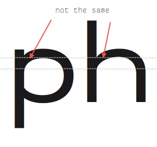
One more thing - these joint inconsistencies:

Since they are at the same height, logically they should be the same.

thanks! I'll work on it.. =)

those joint inconsistancies are because i flipped the /d/ to make the /p/.. should i make all the top bowl joins angular and the bottom ones curved, but keep the general angle they are at right now?

Good question... :/
I'd go for curved top joints (and angular bottoms), because it gives "branched" instead of "stabbed" feeling and looks less amateurish. Both angular and curved joints on the same letter can give that magical thing contrast.
Matter of taste - aforementioned Trade Gothic have angular joints though.
Frankly, it's up to you. Just make them consistent :)

Also, in .pdf, instead of different size pangram (we can zoom in indefinitely anyway), make several pangrams of the same size, like:
"pack my box with five dozen liquor jugs"
"jackdaws love my big sphinx of quartz"
"zombie wolves quickly spot the jinxed grave"
"amazingly few discotheques provide jukeboxes"
"quick..."

I use my "Amazed Discography." thingy that contains almost all of the main structures in nice short form and shows Capital, x, ascender, descender heights and spacing. Good for previewing in shops, where's limited space.

Here's a dropbox link to an update.. the bowl connections are curved at the top and angled at the bottom.. now the bottom is too dark. tell me what you see!

http://dl.dropbox.com/u/13872760/Magenta%20update%208-15a.pdf

They are too dark because curves created "black spots" (or whatever it's called in English).
It means only one thing - optical correction time!


Thank you so much!! Great specific things to fix.
How do I correct the black spots that are created when two bars join while keeping the monolinear look going? am i supposed to break the monolinear construction so that optically the characters strokes appear to be the same width?

"am i supposed to break the monolinear construction so that optically the characters strokes appear to be the same width?"

Yes. It doesn't matter if it's monolinear mathematically, it matters if it is optically.

It doesn't matter if it's monolinear mathematically, it matters if it is optically.

Amen.

Update!
http://dl.dropbox.com/u/13872760/Magenta%20update%208-18.pdf
thanks so much for your critiques! they are helping so much!

Add lowercase and uppercase alphabets.
Let's finish numbers and start doing diacritics.

/m/ still too narow.
/z/ too wide.


quotes

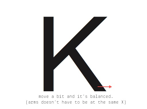
on your lowercase /k/, the angle of the upper diagonal stroke seems to change after the connection to the lower diagonal stroke.

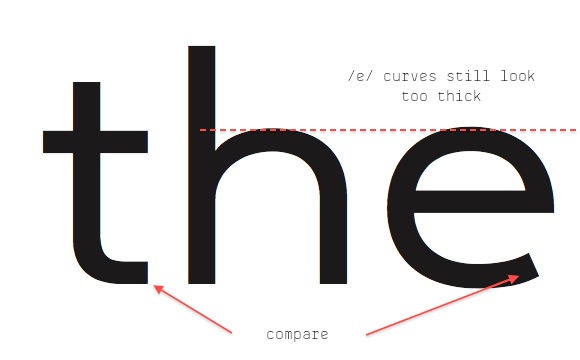
Just noticed - /e/ curves are too thick.

Is it dead?

thanks for bugging me Minerva =)

Update at the topic header. I'm wondering if the Uppercase is too thick in comparison to the the lowercase. Example /M/ and /m/

Yes, uppercase is a bit too dark. But it's really coming together nicely.

Thank you, Bendy! Of course i couldn't have gotten this far without your great criticism. Lemme know if you see anything else!

Sure, I just ran a proof off my printer and noticed a few other things:

• Terminals on lowercase a and c don't match. The a has a steeper slope, the c is more horizontal. Check the e and g and s too. I won't say what my preference is.
• Top arms of K and k aren't quite in harmony yet — the angle looks rather shallower on the lowercase.
• As well as being slightly too dark, I think the caps generally could be a bit too wide.
• Cap X needs a little more offset between the two strokes. Lowercase x looks rather wide.
• Join of Y may be a little too low (top counter is large).
• Draw the flag of 1 out more, it's too short.
• 2 and 3 may need more hood, try bringing it round slightly more. Compare to the openness of c.
• Bar of 4 looks slightly high (counter a bit small).
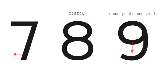
• 6 and 9 may need larger eyes.
• Diagonal of 7 looks too far right, bring the foot across more.
• The two parts of the exclamation mark are getting too close, check your question mark.

Yes, capitals are noticeably darker. But it's not necessarily a bad thing - you can use that go give accent to the beginning of the sentence. Up to you.

Nice solution on /1/. Not sure how if it fits, but looks nice and clean. You can try angular connection from /l/ too.
/2/ also looks better even though there's thickness inconsistency.
Check /A B K 4/ lines' thickness. Looks uneven.
You haven't changed /3 6 7/. See few posts above.


It's getting much harder to find flaws – a good sign!
Also add capitals-only pangrams.

Update! =) All caps included in the preview. Attempted to lighten the caps in comparison to the lower case.

You only changed the caps? Because all other problems seem to be the same.

I Might have add another update, not sure if that's the newest type specimen..

I think you're definitely starting to get a rhythm and evenness that wasn't there before.

I may have said this before but I think you could afford a little more thinning at the stroke junctions, which are still looking a little too dark. I'd suggest also that there could be a fraction more difference between the verticals and horizontals. See what happens if you reduce the sections of /p/ at 12 and 6 o'clock by a couple of units. Of course that might just be my eyes.

I'd pull the tail of the /a/ into a tighter curve. (Compare with /t/.)

Look carefully at /v/. The right side looks heavy because we're used to seeing a bit of contrast on this letter. Even a monoline face needs to forget mathematics. Similarly the /o/ looks ever-so-slightly dark at 10 and 5 o'clock to my eyes.

Curves of /s/ look a bit loose. (Compare with the bowl of /a/.)

Is /j/ too narrow?

Remember this is all very subjective, the best advice is just to keep rebalancing the letters with each other. It's a very recursive process, as I think you have realised. :)

This face is getting very similar to Gabriel Sans

Captured from web.archive.org on 14 Apr 2015. view this capture