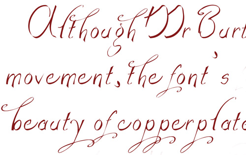
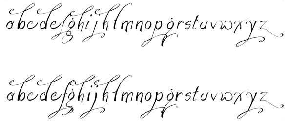
I made this font just over 10 years ago (it's the first and only font I ever made) and I've finally got the courage to dust it off and finish it.
I know the flourishes need work and my kerning's not too hot either but right now, it's the shape of the letters I'm struggling with. The 'f'. the 'h' and the 'n' have different stroke widths but when you put them together they seem to work but when I look at it again, the 'f' needs to become thicker.
What do you think?