Hello!
Nice to be back here again.
Even though I'm looking for a definitive solution, the theoretical foundation of it is also important to me.
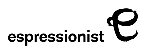
There is a coffee bar opening up soon with a name "e spre ssionist" (written together – I just want to avoid search enging indexing here). Obviously, it plays with words espresso and expressionism which should translate into "the art of coffee". The concept is – the best coffee in town. Though I don't have anything to do with actually selecting coffee and grinders and machines, the identity for the enterprise should reflect the wordplay and make it stand out from the crowd of regular coffee bars.
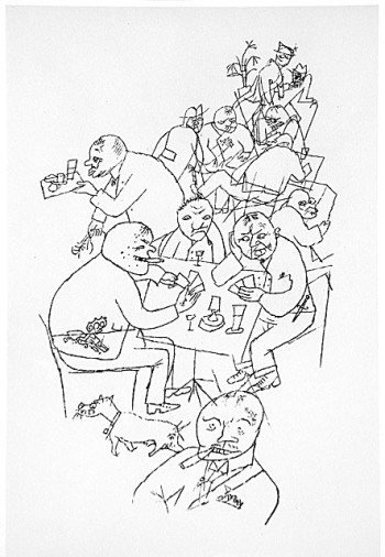
I was doing some research on expressionism and it seems that this art movement didn't influence so much typography as other disciplines, like art (foremost) and architecture. At the same period of time typography was going in a quite different direction – Jan Tschichold's dogmatic views, Paul Renner's Futura, Johnston/Gill Sans, Neuzeit S, etc. The "machine age" in full color, so to say.
So I was thinking of combining these two aesthetics – a sign in expressionism style and a typeface in a more straightforward manner –to play with pictures as the word itself suggests.
And I am lost in type. It seems, I am stuck in a loop. Initially I've started from geometric sans (Futura, Gotham), moving to a more condensed typefaces (FF Good), to "defaults" (Akzidenz). Then I went through a phase of "modern machinery age", looking through monospaced type (Lineto's Excellent and some Gestalten Type) and finally arriving at stencil type (AG Book and custom stenciled Archer). Obviously, I am lost.
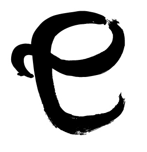
The design has its constrains: the word should sit in lower case, as the icon hints on the lc "e".
Any ideas?
Cheers,
pop