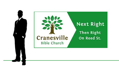
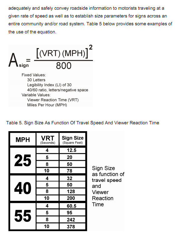
I am working on a roadside sign and the question of text size vs. whitespace came up. I am looking for some practical ideas about this topic. The font will be Fontin Sans regular and bold chosen to keep with brand standards and because of it's large x-height and good legibility. I added generous tracking as well, and the text is white on dark green. The viewing distance will be about 30 feet, in a car traveling maybe 35 miles per hour in town. I am using title case and someone suggested that the x-height (rather than cap height) should be the 3 inches from charts such as this:
http://www.elliott-design.net/letter_size_chart.htm
However, I want to balance letter size with some other factors to keep readability and good layout considerations. In other words, how much do the following specifically enhance readability in this context, and how can good design principles be balanced with the desire to maximize letter size.
- Generous whitespace around the text. Letter size could go up if whitespace is given up.
- Using title case instead of all uppercase. Measured letter size would be increased by simply using all caps.
- Things like hierarchy, additional tracking and well designed layout make maximizing text size impossible. I have already eliminated as much text as possible, and tried to simplify things, but the lower case is around 2.5 inches, or maybe even a bit less.
Comments, thoughts and musings welcome.