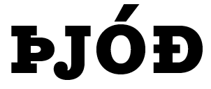
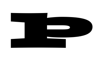
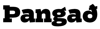
Is there any substantial reason against dropping the right-side serifs in the capital Thorn in bolder weights, rather than making the bowl really flat? How do Icelanders/Faroese feel about this? (Sorry if this has come up before, couldn't find anything.)
Here's what I mean:

This will obviously only be a problem where serifs are thick, contrast low to non existent (or reversed I guess), and target sizes below «huge».
In the way of examples, I've found that Dispatch and ITC Officina Serif use the serif-dropping approach, whereas for instance Rockwell opts for thinning the serifs more than normal. I personally think that's rather ugly (and wouldn't work for all faces), but how attached are Thorn-users to their complete serifage?
Also: I assume all capitals (uppercase, smallcaps, &c.) in a given font/style should be treated the same? (The third weight above would work with the serifs in the cap, but not the smallcap, so I've removed them in the cap too.)
Cheers!
[Edited vicious typo. Sorry]