
Good evening folks.
It’s late. A gentle night.
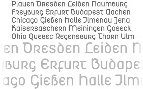
I’m dreaming of my possible next typeface…
.
.
what do you think?
Good evening folks.
It’s late. A gentle night.
I’m dreaming of my possible next typeface…
.

It looks like you're just mixing uncial forms into DIN. Some of the forms are really interesting, especially P, B and R. But it's too rational in a way that drains it of life; I think this is most apparent in L and T which resemble the horrible £ in Univers. And that neon-sign M is just plain lazy. Find a way to bring this to life and you could have a winner in the way Sowersby just hit two huge geometric sans home runs with Metric and Calibre.

Wozzat? A turbo-modernised Schwabacher? *scratches head*
*blink* *blink* I looked at the sample and saw a book. An atlas, I think. Must be all these place names... Anyway, it was a large (ca. A4) hard-cover with plain, white covers. the sample had ca. 3° list to the left, filling up the lower half with medium grey text. The title was black, the subtitle red, both in a heavy Helvetica.
Future vision? Too much tea? *shrugs*

Andreas... I think you are off to a wonderful start but at this point it is only lightly sprinkled with the quirks of the Uncial/Half Uncial genre. If you are "gonna do it" then look to the "pinched" terminals in the m, n, h, u, w, y etc. And feel free to explore the 2 story "a" and the rounded T. Look at reference for the capital N... Just a few suggestions. Victor Hammer spent a lifetime on these forms and GG Lange did a very nice "version" with Solemnis. I think it has real potential (subjective, of course) I would like to see more idiosyncracies.

Might be better off as a single-case type. Or you'll have to do some tweaking to get the caps to balance--right now, many of the counters are too big relative to the "lowercase."
Well!
[ good lord it’s alive again at last ] ;-) was a miserable time …
First of all, it is not meant to become any sort of historically faithful rendition of Uncial. V. Hammer, yes, but that hardly counts for me here.
On the opposite, I’m tempted to make it look techy, even quirksome.
Unicase is surely worth consideration. The majuscules too big – I think about it.
There might be an alternative set with some capitals more 'common'. There may be about six (?) weights at the end. Variants with higher ascenders.
And don’t ask me for Italics :-)

Great idea!
The critics are premature—if you develop this as a typeface, then the issues which they have raised will be resolved when you add weights, especially bold. As it is, this is the germ of an idea. A huge number of light weight sausage faces have been published, because they are so easy to make, and for this reason they don't amount to much (they are indeed lightweight).
I don't consider this at all modernist. The nearest would be if one imagined Rudolf Koch had done something similar.
Certainly DIN rounded seems modern, but its antiqua forms are much more reductive and geometric, and one might imagine them being produced with a Rotring barrel-nib drafting pen held vertically, with a plastic template.
In contrast, I imagine your uncial as being written freehand, using a "Speedball" round-nibbed calligraphy pen.

Andreas, I love the idea! What looks most awkward in your example is the "o". Perhaps start with a more football or rugby shaped o and see if it finds that neitherland between flat sided sans and true uncial. Think about the blackletter "o" as an origin?
The "a" is really a tough sell as well, perhaps double bowl is a better start?
Thanks, Nick.
Yes modernist is perhaps not the term, maybe rather *constructivist*. Medievalist-constructivist.
A huge number of light weight sausage faces have been published, because they are so easy to make …
yes and because the ladies like them (according to magazines) … ;-)
I tried to make the capitals a bit smaller and not so heavy. I suppose this blends better with the rest.
.
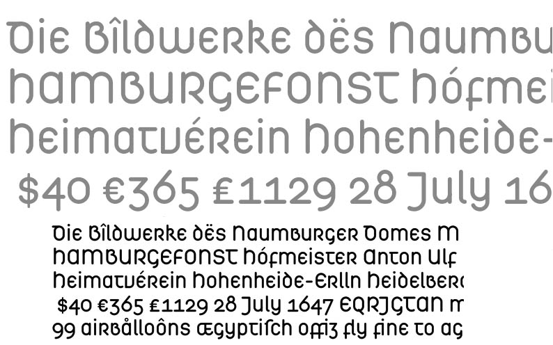
Dezcom,
I’m afraid but the o is – in this case – the the very basic shape for the whole design.
This is where my inspiration came from:
.
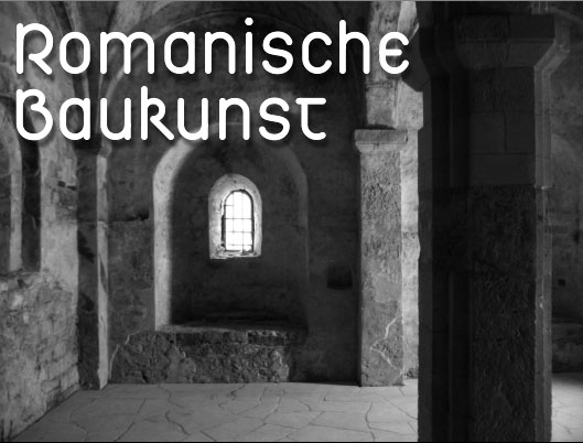
Andreas... I said I was impressed... I was not critical in a negative sense. Just thought the subtle "turn in" (as you have now used on the H) might give it even more personality.
Andreas, I guess I was picturing more gothic than Romanesque.

Interesting Typeface! A rounded finish is in fashion right now (Klavika?), but besides that the treatment looks good here, in my humble opinion. Out of curiosity I am interested in your disinterest in italic faces? I remember there is no italics in your latest sans too. Do you follow here typographic conventions from the time of Blackletter type? I think it is an interesting position and I would like to understand the reasoning.
Floce, I’m not disinterested in Italics. But here it is, as was with Lapidaria, that the core of the design principle is rather a static one which *by itself* does not suggest italization (–does that word exist??).
However it is possible to make Italics for that, and for Lapidaria. Someday, who knows …
Thank you, I think I understand.

Nice! Few faces have a really new look, and this does. Good luck with it.
Thank you William, and all others.
Hope to can go on with it stadily next time, though other commissioned work will have to come first. I’ll keep you informed.

I have to look at this more closely, and I haven't read all the comments yet, but I do want to encourage you by simply stating something I've believed for a few years now: there remains great potential in uncial.
hhp
there remains great potential in uncial
I believe so. But – WHY?
WHY?
The secrets of reviving the worship Crom-Cruach may be hidden in the uncial forms. And once we revive virgin sacrifices to the time maggot his servants may be chosen to eat his eggs and live forever.
To me the potential lies in the relevance of uncial to reforming
the conventional Latin UC, which is sublime of itself, but as a
companion to the lc, sucky.
hhp
Hello again.
Here is the alternative take on capitals mentioned before:
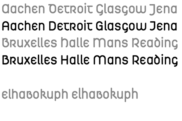
The bottom line of this shows elongated ascenders (escenders), a path that might be gone further, even to extremes.
This is what an unicase version may evolve to look like:
.
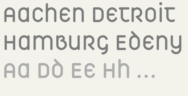

Very nice. Keep at it!
That's not a unicase.
In Unicase, there is a mixture of majuscule and minuscule forms, but only one glyph shape for each letter.
***
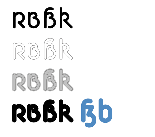
Before you go any further, you should resolve what b and ß will look like in the bold weight!
That's not a unicase.
Well, than it is probably something else. I though it may be interesting to retain an upper-/lowercase distinction just within the limits of the x-height. Will become peculiar with things like o, s, x, though.
you should resolve what b and ß will look like in the bold weight
yes this is going to be interesting as well.
Maybe I do a trick like this:

Some time has passed us by these last few months
(Half-way again in orbit 'bout the sun),
But surely this is not the last we'll see
Of your modernist,
mediævalist-constructivist,
uncial?[!]
K.
Karl, good morning.
I’m pretty sure it is not the last we have seen of this. However: – time. This is going to be a more extended family, so it will take me more than a month to master.
Please remind me again, after a while.

Hm, the "ß" does not look very uncial, does it? (I'd still work on that one).
the "ß" does not look very uncial
well, not in the strict sense. But this is not a historic project.
The ß always gives you the opportunity to choose from many options. From more options than with any other Latin letter perhaps (the & left aside).
I've wondered about
"the very basic shape for the whole design"
& just now thought
your inspiration isn't
romanesque architecture;
it's that arched window within the arch,
isn't it?
In your Græco-latin nomenclature*,
what shall you name this one?
"Feneſtra"?
K.
* Andron, Linea, Lapidaria, Hibernica, &c.
Captured from web.archive.org on 14 Oct 2013. view this capture